
ZangZang – Amazing Colorful Effects
In this tutorial we will learn how to make an illustration that can be applied to any interior. We will make some amazingly colorful effects using layers styles and also will practice how to select good colors to make the image more colorful.
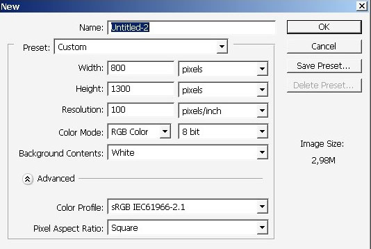
So we go now. Create a document with dimensions 800x1300px.
Note that it very important to create a new layer instantly, when you are just starting to create something.
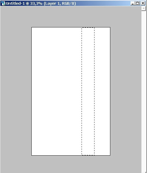
As you see it has now quite standard aspect ratio. Make a basic selection.

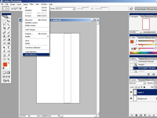
It is better to save this selection. So do it.
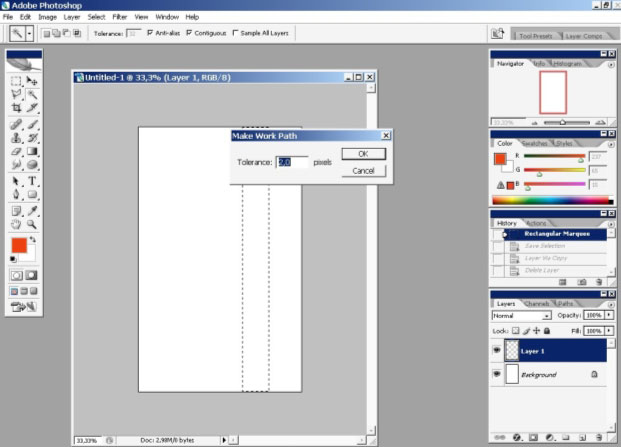
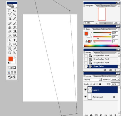
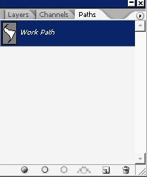
Save the selection and Make a work path with pixel tolerance = 2.
So now we have a work path to work with. We can warp, fill and transform it like we want.
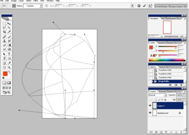
Now we will transform our path a little bit and not just a little bit :).
For transforming a path in Photoshop you can use any shape selection tools like Pen Tool (P) for curves or Path Selection Tool – the white and black arrow (for straight transformation) above Pen Tool.
I will use so me of them now.
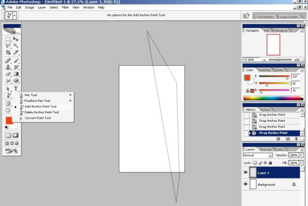
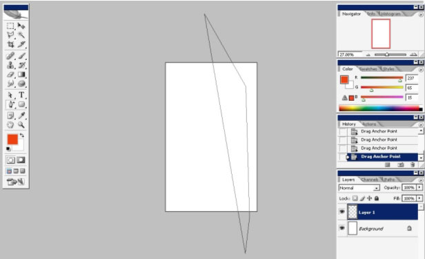
I’ve changed anchor points here making this wonderful curve.
And finally my favorite Transformation Tool – Warp.
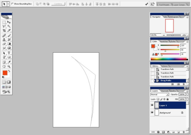
Here I’ve mad some warping to my path and my basic Shape is ready now.
Here we have this path in our path box. To make the path into a selection (and we need that) all you have to do is to Alt+Click on the path itself.
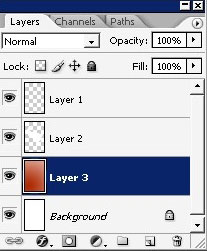
When you see that the whole path is selected into a selection, just copy it to separate layer.
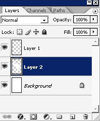
I will create some kind of background.
Well, definitely it is not a proper way to create you image I think.
You should always make a structure how your image will be built.
You
should start from something – maybe a background and finish it before
making a foreground. But it is also very important to free your mind
and not to lock yourself into something or just somebody has said to
you. So here, it is up to you to decide how to build an illustration
how to build your proper method of creation. It will take a wile.
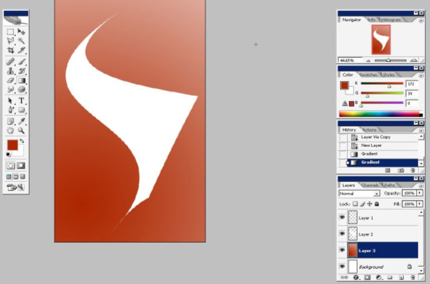
So I’ve just created a layer underneath our object layer and filled it with (MY) background to foreground gradient.
Now
I really like to texture things. In digital world a lot can be gained
by texturing. And there are also different ways of texturing, you can
use a brush a pattern or even an image. Moreover you should handle with
texture carefully because when you are using a pattern it will change
the tone and maybe you don’t want that.
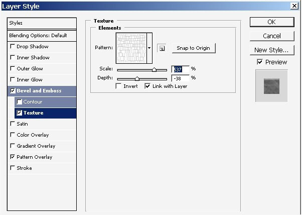
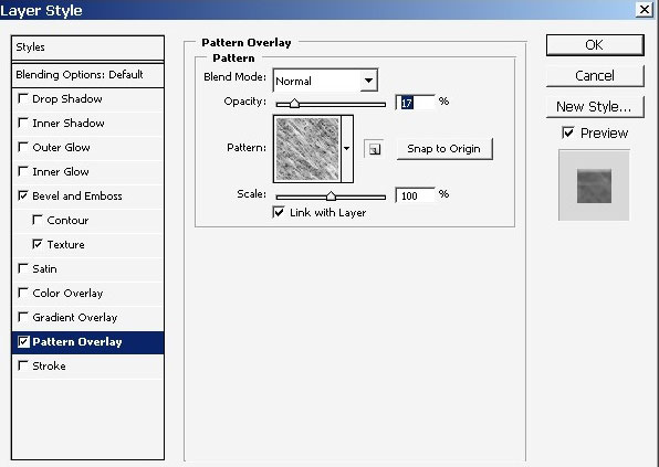
I’ve applied some layer styles to my background.
As you can see they are all connected to texturing.
#imi#img14.jpg
Here is our result.
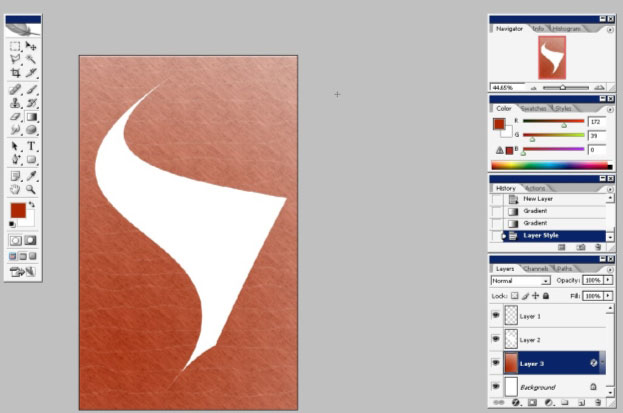
And our pattern has changed the tones even on this plain tones image. So be careful if you are working with something Big.
Now I want to works on my object. Here is my layer styles applied to my foreground object.
Yea 🙂 a lot. Just watch the pictures carefully. Switch OFF the Global Light. (Not like on the image).
I
really don’t understand why this Global Light is turned On
always, when you start. I try to never use this option, because even
with changing the angle of light you can reach many interesting
effects.
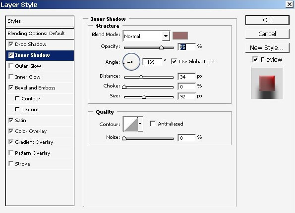
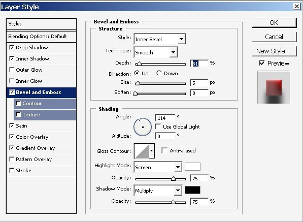
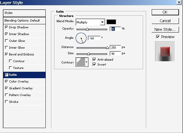
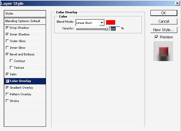
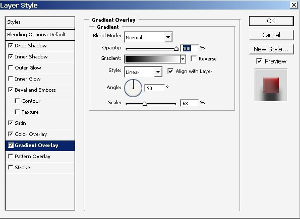
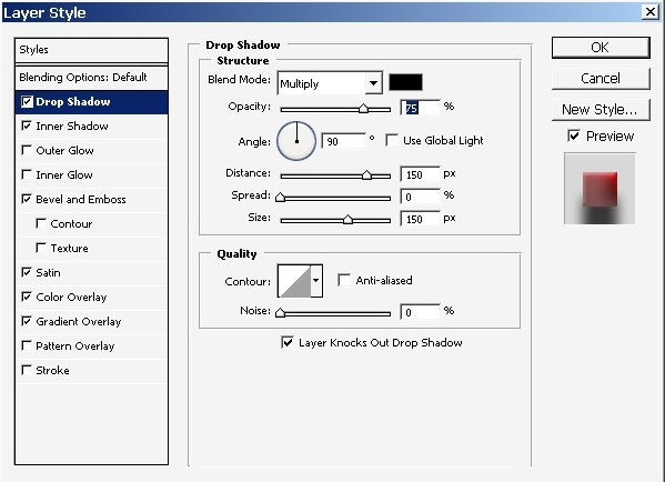
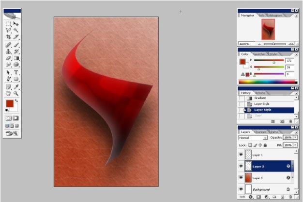
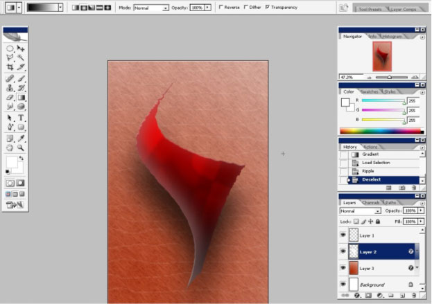
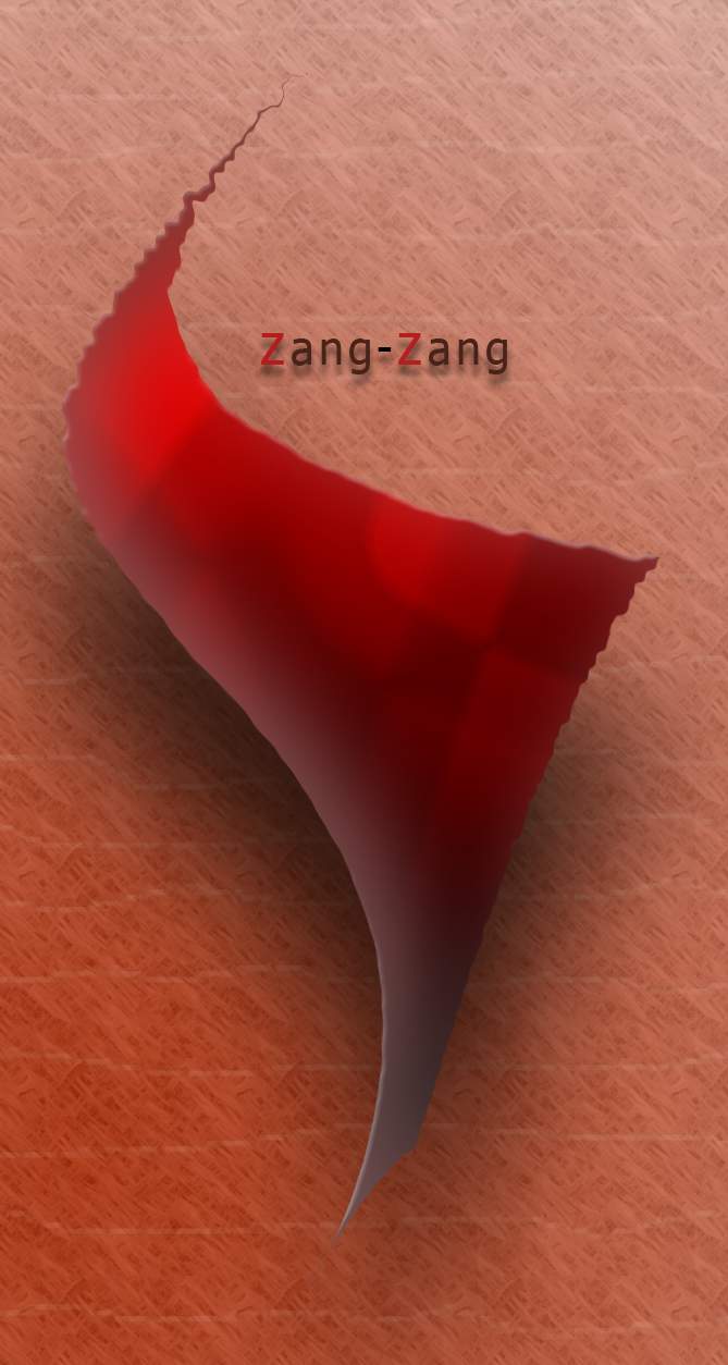
Here is my result. Man I really like this Bloody Red color.
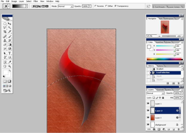
I’ve
created an Alpha Channel. The Alpha Channels are basically masks. When
in Alpha Channel work only with any paint tool or gradient. Moreover
work only with black and white. The White exposes the image to an
effect; the black part hides the effects. The alpha channel works like
mask but not like a quick mask – SO you have to LOAD the
Selection.
Use Select > Load selection > Alpha 1 (default name).
SO here is my selection made using and alpha channel with ROUND gradient in the bottom.
And I’ve used Ripple Filter in Filter > Distort section.
As you can see the Effects Blends smoothly with the bottom are that stays without effects.
That is why I’ve used basic (smooth) gradient.
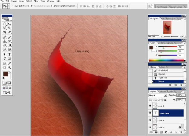
Now
my image is basically ready here. The only thing is remaining is to
paste some text here. I also like to use text as a part of my image.
Firstly – I think that text is a very powerful element of
design and secondly – as an artist I think that the text is
like and object that has edges tone and so on with what you can just
fill the picture and make it better.
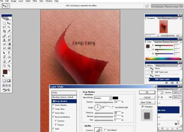
I just make and accent to Z s and drop a 90 degrees shadow.
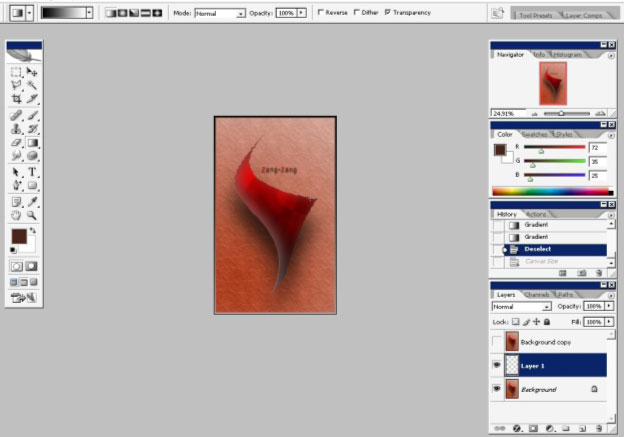
Enjoy your art!
Comments