
Vivid Light Blending Mode
Photoshop’s describes Vivid Light blending mode as combining the effects of Color Dodge and Color Burn modes like this: Vivid Light: Burns or dodges the colors by increasing or decreasing the contrast, depending on the blend color. If the blend color (light source) is lighter than 50% gray, the image is lightened by decreasing the contrast. If the blend color is darker than 50% gray, the image is darkened by increasing the contrast.
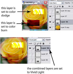
In reality, however, Vivid Light brightens images similar to Color Dodge mode, but doesn’t darken quite as much as Color Burn. In this diagram below, I created two layers, one with a light grey box, one with a dark grey box, and set the former to Color Dodge and the latter to Color Burn. You can see that the Color Dodge layer lightens the image dramatically and the Color Burn layer darkens the image dramatically. But in the second sample, I took the two boxes, put them on the same layer, and set it to Vivid Light. The light box does result in a lighter image comparable to Color Dodge, but the dark box has significantly less contrast as compared to Color Burn. The thing to remember from all of this is that Vivid Light mode will take the blend layer and make the lighter areas a lot brighter than it will make the dark areas darker.
For my practical application, I’ll use Vivid Light mode to overlay text on top of other images. Because Vivid Light doesn’t really “show” the blend layer, but just uses the blend layer to affect the colors of the base layer, the text will look more like it’s “part” of the picture, as opposed to being a slightly transparent layer on top of a picture.
Comments