
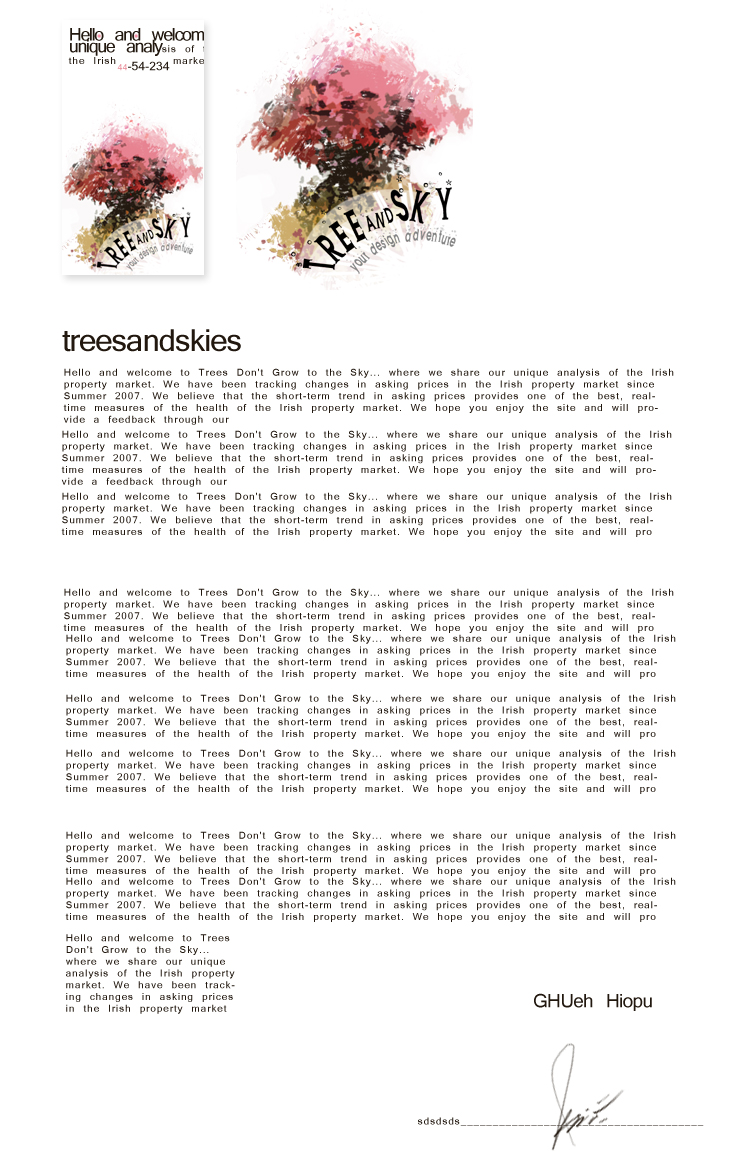
Tree and Sky – your design adventure
In this tutorial we will make a logo – a style for some imaginary company and try to represent the company through this style.
So let’s make any king of document and remember when you work with print in Photoshop the document has to have CMYK colors and 300 DPI.
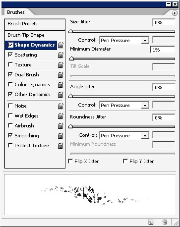
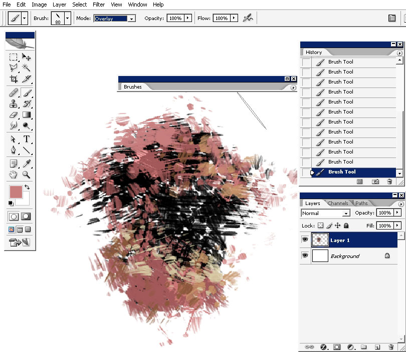
I’m going to create a dual brush – I really take my time to set the settings and the brush itself first, depending what I want.
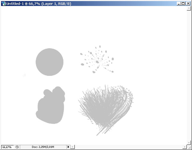
So here are my 2 Brush tips: the hard round will be the initial brush and the hairy one will be the 2nd (dual).
And here is my already dual brush.

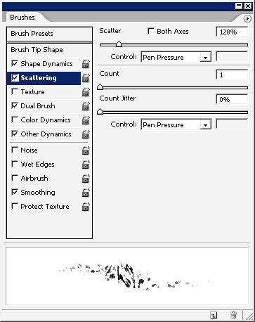
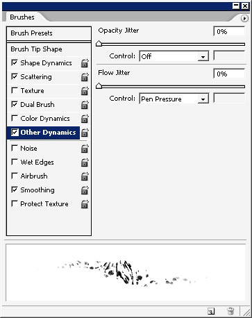
And here is my brush action depending on the pen pressure.
And let’s begin – I’ll begin with pure black as my base.
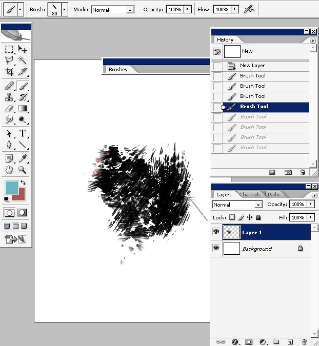
Note that I will be flipping the image through the process. So watch carefully.
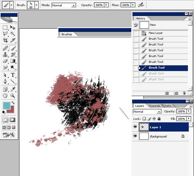
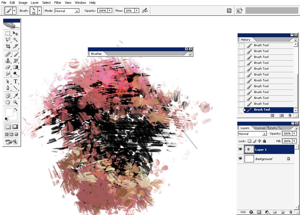
Adding the color:
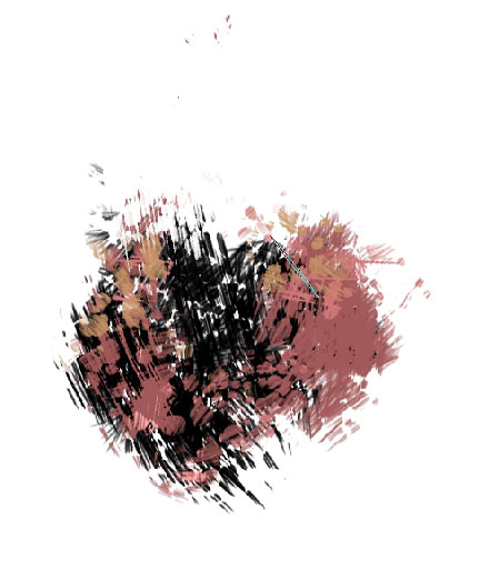
And another:
Flip: no I think I no what I will do with this thing). It’s going to be a tree.

Overlay a little bit:
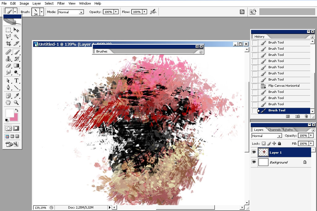
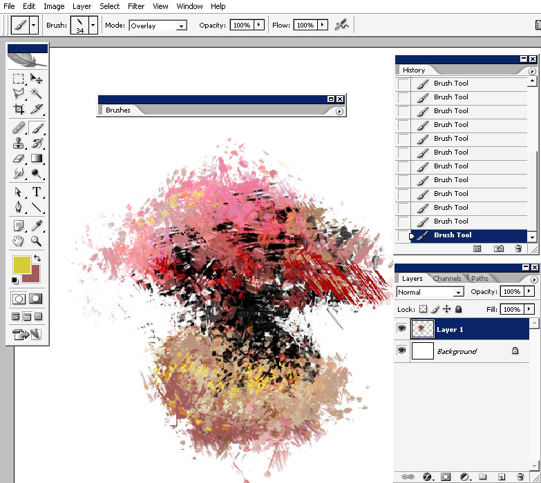
Flip: add some saturated reds:
Now let’s take care of the grass. Add some yellows.
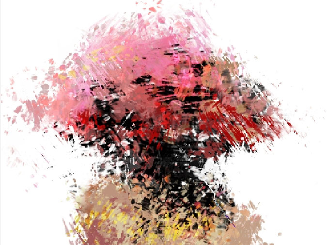
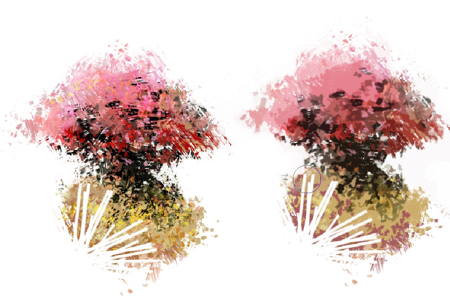
I’ve decided to erase some part of the illustration that is almost finished.
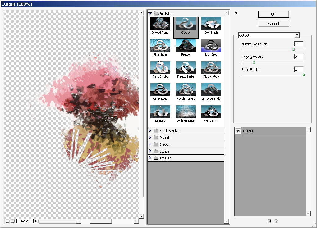
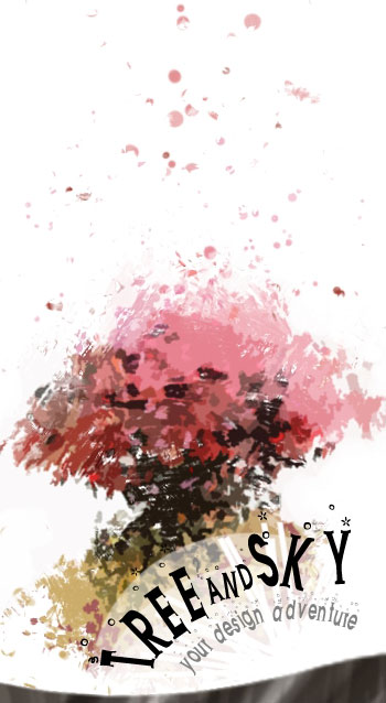
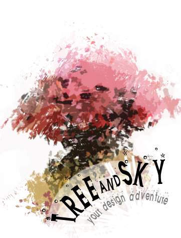
I’ve decided to apply a cutout effect to the image. Even if you lose the details I think it will do better for the logo means.
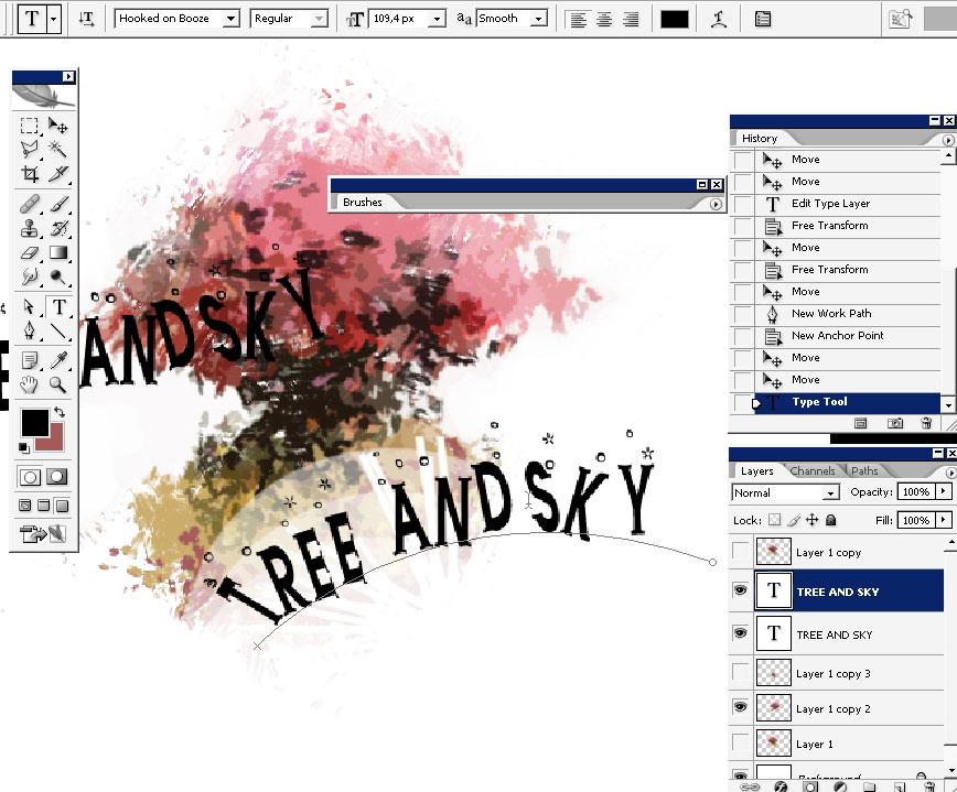
Now the text so here is my font. Don’t remember the name properly but you can pick the font you think will stay better there.
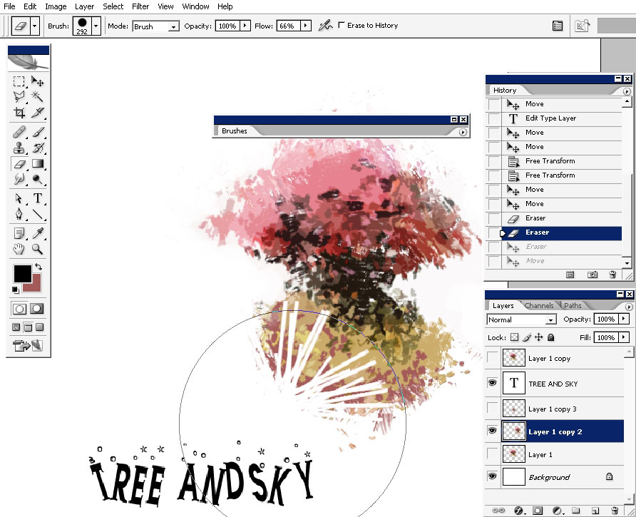
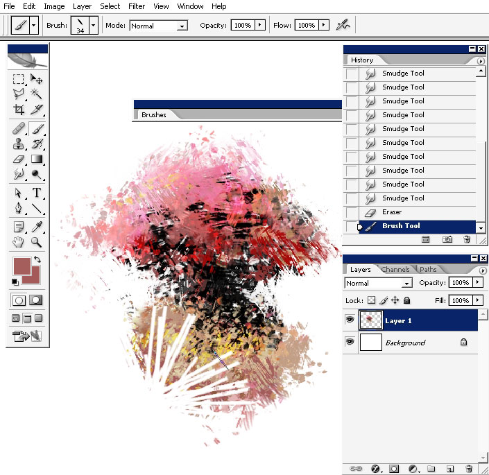
I’ve erased some areas with round rough brush and set the text to go on the curve – you create a curve first and then type on it with the same font.
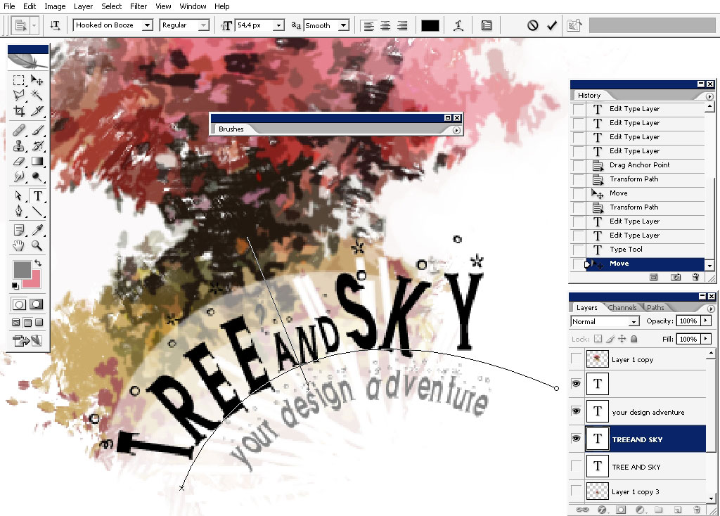
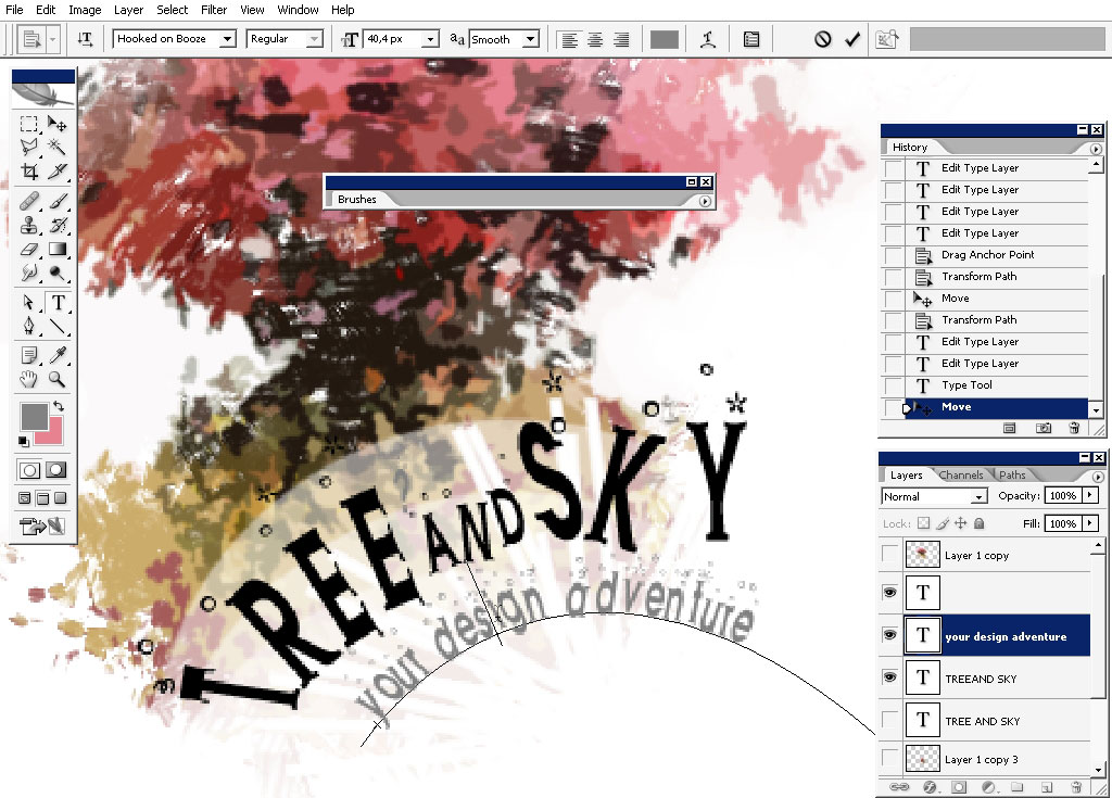
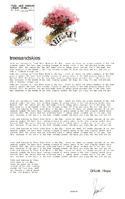
And a little bit of dots there and we are ready here. We’ve created a major element of our graphic design now we can use on letter, greeting card and any type of corporate stuff.
And this is it:
Comments