
The Power of Blending Options
After publishing my last article on the Process of Making an Icon, I got a few requests for more indepth knowledge on Blending Options, and a more explicit walkthrough of their direct usage.
Now, Blending Options are one of the first things Photoshop Novices
stumble upon. The infancy of adding layer styles often leads to a short
period of horrible drop shadows and cringeworthy bevels. Ironicly, this
easily available styling is one of the harder things to master.
Blending options is all about manipulating individual layers to obtain
a certain effect. It’s a key aspect of creating icons, and will help
you create textures, shading and highlighting.
To give you a better idea of how Blending options can be used, i’ve chosen to take you through a recent project I did for Jeffrey Lynch Development, Ltd.
Inspired by the ancient Yin & Yang symbol, Jeffrey Lynch requested
a simplistic icon to be used as a company logo. The reason, this
examble is so well suited to illustrate the power of blending options,
is because of it’s simplicity and most importantly the fact that it’s
only made up of 3 handdrawn vector layers!
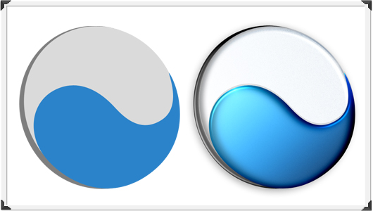
The above picture shows the same 3 layers, that makes up the icon
with and without layer styling. If anything, this shows how much can be
obtained with simple blending options. Let’s go through the steps, that
gave this seemingly flat icon a life of its own.

Gradients
Let’s start with something I´m sure most people are familiar with;
Gradients. A Gradient is, as you might know, a colourfill that blends
through a selection of colours. Gradients are the salt and pepper of
the average photoshop user. A Gradient can add life to even the most
boring element, and with the right combination of colours it can help
you control object lighting.
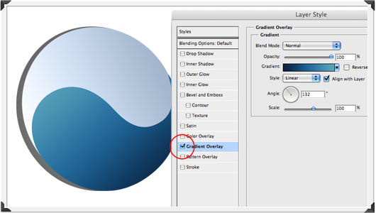
Gradients are fun and easy to apply, and I´m sure most people have
fooled around with them, so i won’t spend more time dwelling on this
particular Blending Option.
Textures
Not everything should be shiny reflections and smooth surfaces,
textures can add realism to an icon. Blending Options can help create a
simple gritty texture, that will contrast the abundance of shiny
surfaces in the web 2.0 world.
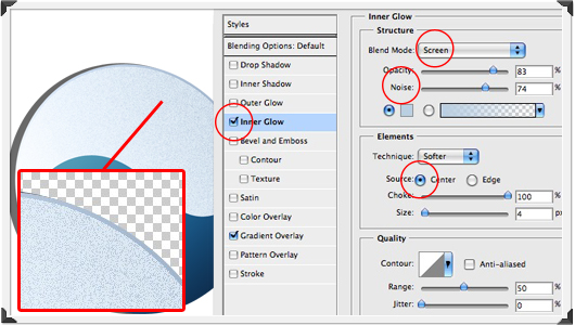
In this instance I’ve used Inner Glow with a high noise
level and a centered source. Remember to set the blending mode
correctly – if the noisy color is lighter than the background, it’s
gritting up, make sure that drop down is set to ‘screen’ – if it’s the other way around, use ‘multiply’.
There’s hundreds of ways to add different textures to your surfaces,
This is an extremely simple texture – what appeals to me with this
solution is that you avoid using filters, which will often render your
layers rasterized, in which case you lose scalabillity.
Using Inner glow to create a gritty texture might seem odd.
Trust me, this will be a reaccuring theme, when you work with Blending
Options. Don’t be fooled by the labels Adobe has given the individual
options, find out what´s possible with said functionality, press it to
the limit and learn, how the options can work together. Before you know
it, you’ll be doing highlights with ‘Drop Shadow’ and shadows with ‘Satin’.
Shadows
As with many other things, there are alot of ways to do shadows.
Shading your objects correctly helps add depth and perspective while
mimicking a source of light.
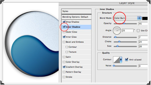
In this case. I’ve used ‘Inner Shadow’ with the ‘Color Burn’
blending mode at a middle opacity. Color Burn looks at the color
information in each channel and darkens the base color to reflect the
blend color by increasing the contrast. Play around with the Angle,
Distance, Choke and Size until you got something interesting. The image
above has also got a subtle ‘Drop Shadow’. A common mistake is to overdo the Drop Shadow- turn it down guys, nothing casts that dark generic drop shadow.
Lighting
At this point our icon is looking alittle dark. Now we could just go
in and brighten up the gradients, but another neat trick is to add some
‘Satin’ with curvey Contours and a lovely low opacity Color Dodge blending mode.
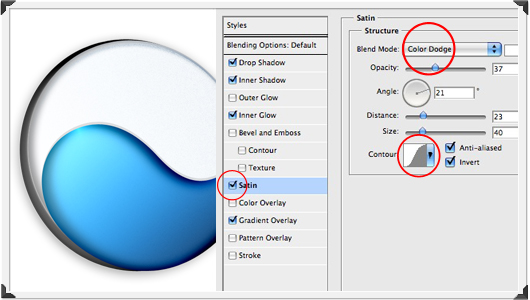
It’s a personal preference of mine to use Color Dodge for highlights
– it adds some really interesting lighting if used the right way. Color
Dodge looks at the color information in each channel and brightens the
base color to reflect the blend color by decreasing the contrast.
Highlighting
Let’s try and take that Color Dodging highlighting to a more detailed level.
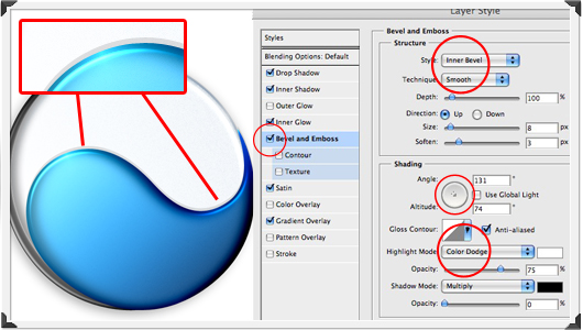
Believe it or not, but Bevel & Emboss is actually
useful beyond doing funky looking bubbly text. Here I’ve used Color
Dodging angled with an Altitude of around 70 to create a sleek
highlight slightly displaced from the edge of the layer to add a sense
of thickness to the object. The thinner the higlighted line, the
sharper the curve will seem.
Last words…
As you might have realized by now, Blending Options is a pretty
powerful tool. There are so many ways of obtaining various effects,
that every good designer has their own little tricks. My advice is;
forget the names and learn the limitations of the individual options.
Play with the subtle symphony of the respective styles, flip the dials,
turn the nobs and eventually you will end up with something useful.
Author: Michael Flarup
URL: http://pixelresort.com
Comments