
The Grudge Illustration
Today we are going to do some kind of grudge illustration using only Photoshop. You should know that grudge illustration as usual consists of several effects. One of them is noise and of course some special colors.
So let’s get started.
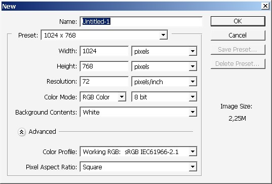
We need a new layer.


Fill the layer with gradient or simple black color fill.

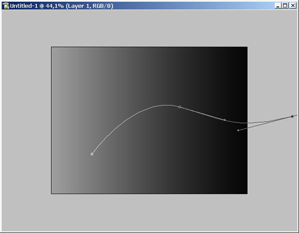
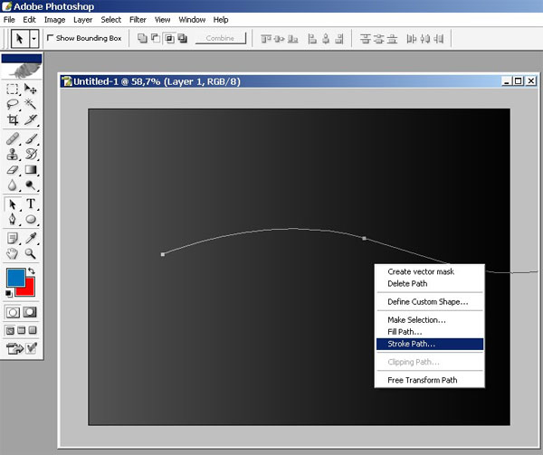
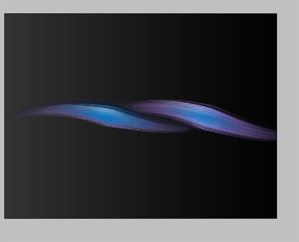
Now chose Pen tool (P) and ad some curves. I did it like so.
Create another layer right now.
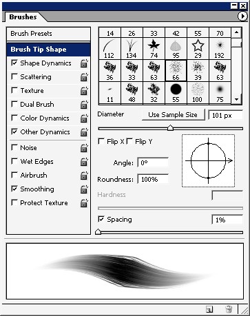
Now it is time to overlay the path with brush strokes. This function really gives a lot of creative opportunities for graphic designers.
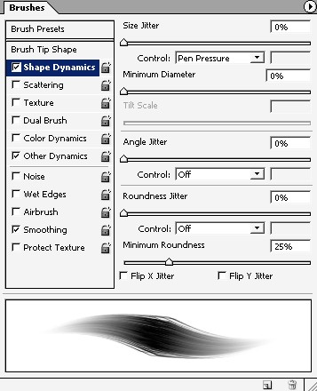
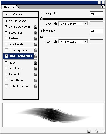
But do remember to chose the brush and brush settings first.
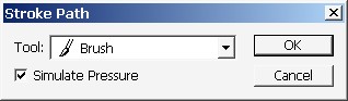
And there we have it.
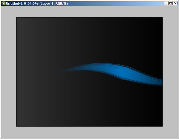
I suggest you to copy this (brush) layer several times.
Let’s say 4. But maybe we will note some of them, will see.
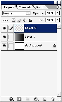
Here is the layer order
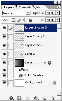
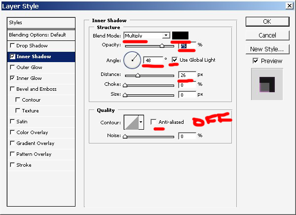
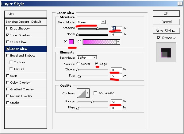
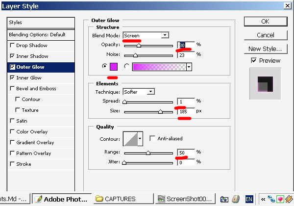
Maybe some layer styles will help.
Result.
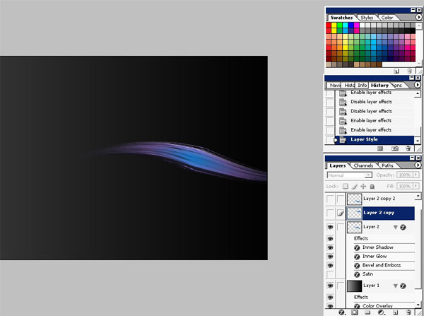
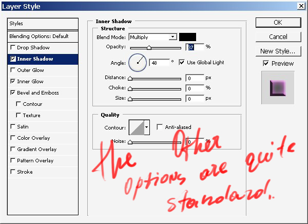
Place one of the copies right here and use layer styles too.
.
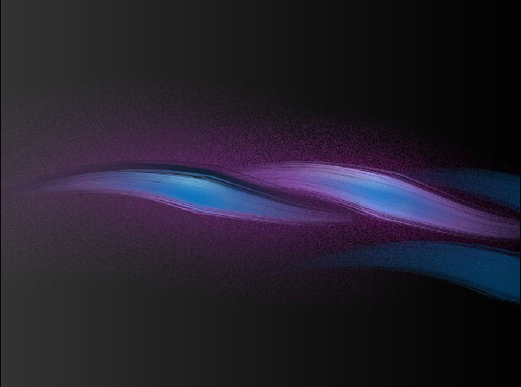
Result.
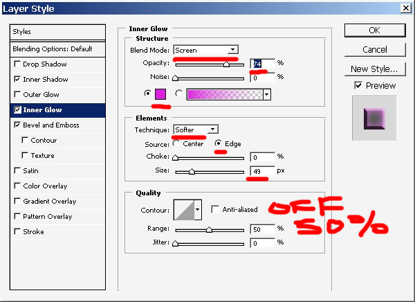
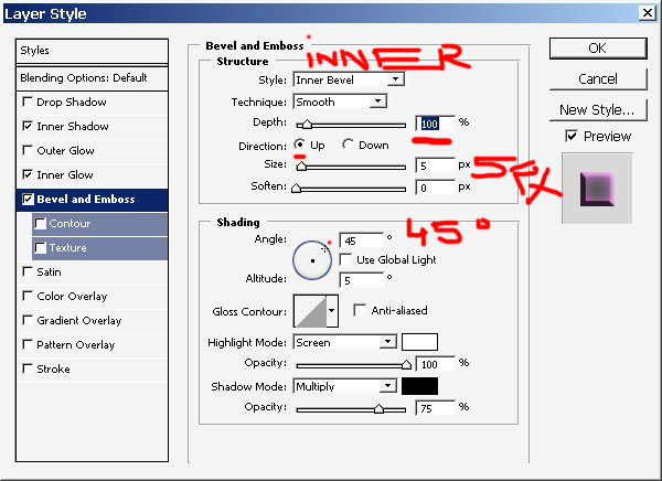
Add this layer style too.
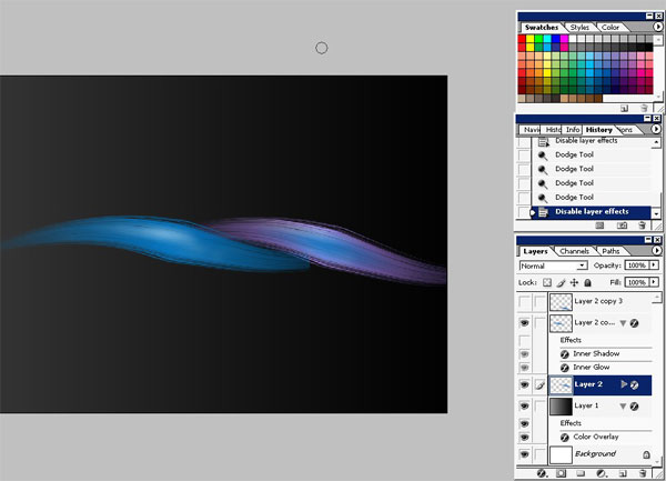
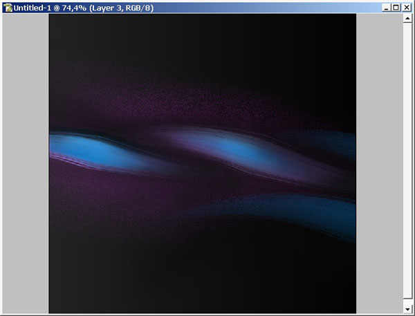
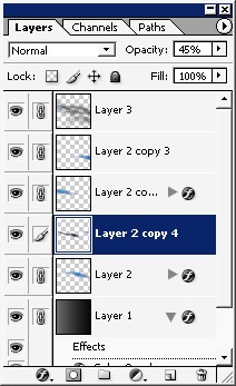
Switch on the 3rd copy and set it’s opacity down to about 40% ? 45 %.
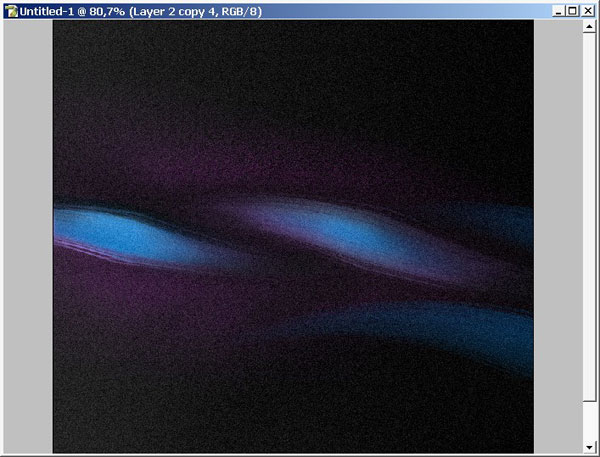
There are more details. And I did some painting here using mere SOFT brush. Crop the image if you like.
Now link the layers (with black background) and merge them.
Use noise filter.
Add a HueSaturation layer and play with settings to fix the colors.
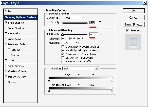
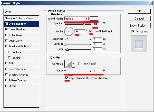
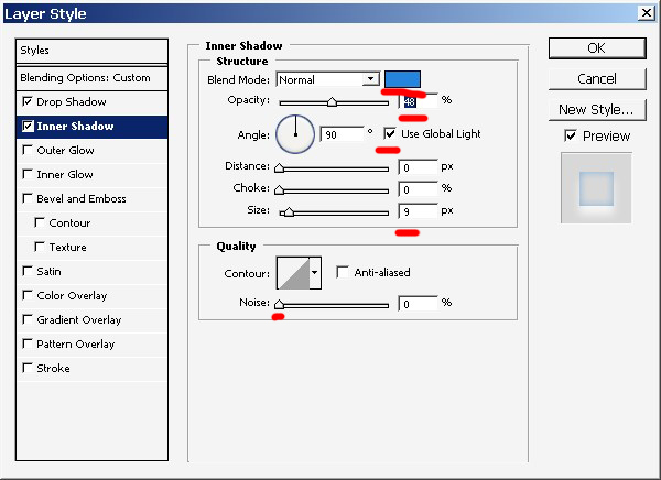
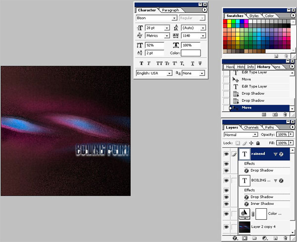
Now it is time to use text.
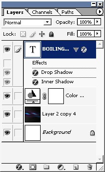
Use these text layer styles:
And we are done here. The text RAiNEND has just one layer style. A little bit of white (mode normal) drop shadow.
+ View full size image
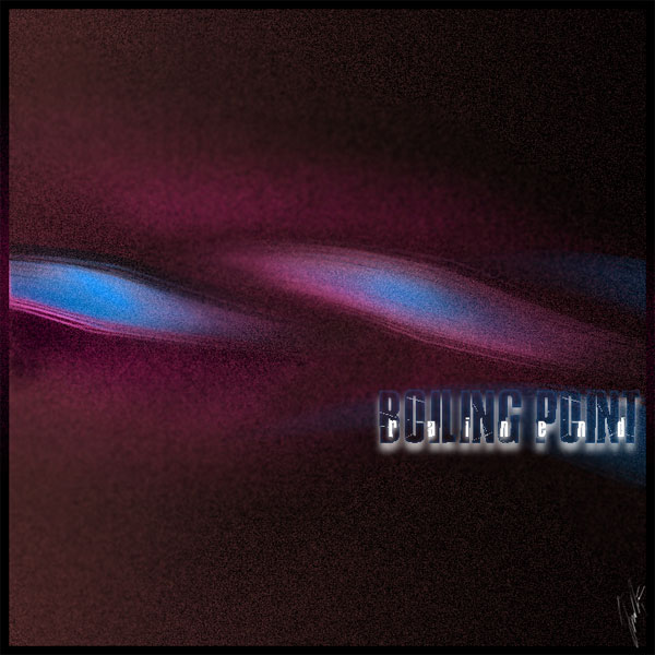
Finished!
Comments