
Text Handling
Text Handling
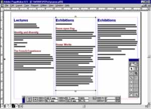
With the basic grid ready, we can load up the text to see just what we’ve got to deal with. PageMaker automatically picks up styles from supported word processors so features like the headings are already picked out. With frame-based packages like Ventura, the text would automatically flow through the columns from beginning to end. That would be fine if we were producing a book, but for a folded leaflet we need to paste the text in non-consecutive order so that the pages read correctly when folded. PageMaker allows this to be done easily with its freeform text blocks which are positioned and sized manually. The process demands more intervention, but allows more control.
By sizing each text block so that the right text is positioned on the correct panel even if it runs over the bottom of the page, we can get a good idea of what’s involved. At the moment the text blocks are all linked so that if I drag up the window shade on one block the overflow text will automatically flow into the next. To break the links, it’s necessary to select each block, cut it and then immediately paste it back. It’s an unnecessarily nerve-wracking process and PageMaker’s default of slightly offsetting pasted objects is infuriating – though this can be avoided by using the power paste shortcut Ctrl + Alt + V.
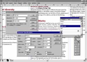
With all the text in place, it’s a good idea to load up all the graphics (shortcut Ctrl + D) onto the surrounding pasteboard. This is important as we need to know roughly the amount of space they are going to require before we take the next crucial step of choosing our body typeface. This decision is determined by a combination of factors. The typeface has to be appropriate to the intended audience, but also suited to the particular circumstances. In our case this means a typeface with a contemporary but classic feel which reads well at small point-sizes. The solution I came up with is the sophisticated but highly legible Optima which is a modern interpretation of the Roman lettering on triumphal arches – if only it was the Italian Institute!
With the typeface chosen the next step is to choose the point-size and the interline spacing or “leading”. For easy reading of long sections of text, point-size should be between 10 and 12. Unfortunately even at 10 point it’s clear that there would be no room for white space – or even the pictures – so I settled on 9.5. In fact on text-heavy jobs like this that’s by no means bad going and it also means that each line contains around 55 letters, within the accepted maximum for comfortable reading of 65. In terms of leading PageMaker defaults to 1.2 x the point-size which would be 11.4 points. With our relatively long lines I’d prefer larger leading to make the travel easier for the eye, so I can afford to round it up to 12 points.

This body copy leading is particularly important because it sets up the horizontal structure of the grid. To tie the separate columns/panels of our spread together it’s important that the lines of body text actually align across the design. The reader probably wouldn’t consciously notice if they didn’t – so long as the bottom of the columns lined up – but subliminally the design is tighter and has greater internal logic if they do. In other words, if I want my design to win an award it’s a must. The problem is that, as the grid is invisible, it’s very hard to work to. However, this can be overcome with a bit of effort and with the help of PageMaker’s Grid Manager utility to add repeating baseline guidelines (see this month’s Real World Publishing article).
The formatting of our body copy is almost complete with only the indents and alignment to be decided. In terms of first line indents these are only really necessary to indicate paragraph breaks, which will be clear enough anyway in our freeform layout, so they can be dispensed with. Setting the text to be justified produces a more block-like and so modern look and has the added advantage that it fits in slightly more copy into the given space. It will also allow us to add variety and to highlight information by using left-aligned bullet points and dates.
Of course all of these formatting decisions could be being applied directly to selected text, but far more powerful is the ability to group attributes as named styles that can easily be applied and edited. The easiest way to apply styles within PageMaker is by clicking on the style name on the Style palette (Ctrl + B). Local overrides can always be added and are then marked in the palette by a plus symbol after the style name. Existing styles can be edited by Ctrl-clicking on them in the palette, while new styles can be created with the Ctrl + 3 shortcut.
Apart from the body copy, the most important items of text in the design are the headings. Their relative difference and significance has to be identified which is most easily done by increasing their point-size, emboldening, and centring. This has to be done while still ensuring that the following paragraphs fall back onto the interline grid. This means ensuring that the combination of each heading’s leading and its above and below spacing adds up to a multiple of the 12-point body leading. We also need to clearly identify the separate category headings but, with absolutely no room for manoeuvre, have to find other ways of marking them off.
One of the most obvious ways to do this is by using upper case, but this is generally frowned upon because it interferes with the recognition of word shape that is the basis of easy reading. For single word category headings, however, this shouldn’t be too much of a problem. I’ve also marked off the headings from the body copy by using a ruling line below – perversely this is hidden away as a sub-dialog in PageMaker’s Paragraph command (Ctrl + M) – and by introducing a second typeface, Gill Sans. Used in its bold condensed form this will give the category headings considerable weight while opening up some surrounding white space.
Comments