
Speed environment tutorial
Hello and welcome to part 2 of making a speed environment tutorial. We’ve stopped on making basic shape of our environment. We’ve also picked a color to our image and now we will paint some shadows and refine the image.
So, follow me.
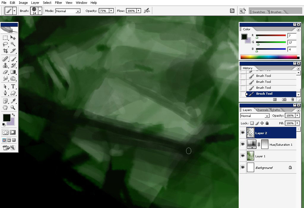
I will begin to put some shadow right now. Here are the marks from where I’ve started.
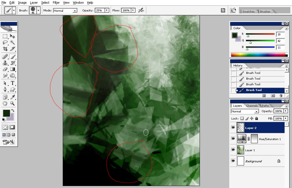
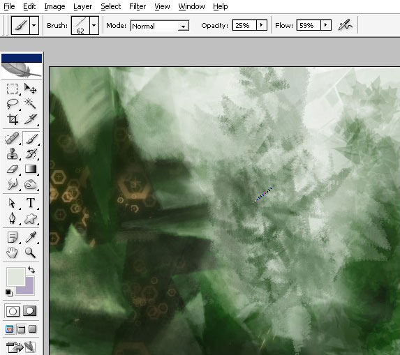
To do that you’d better pick a basic brush with low Opacity settings. I’ve used 25% opacity.
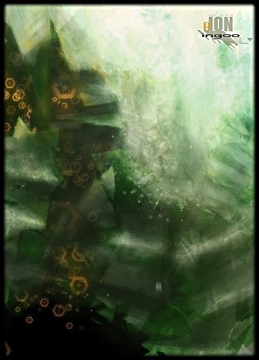
Here you can see even the strokes – I also tried to balance color gamma here. As we have only one ambient light source here, the most lighten areas will be on the upper edges of the picture. These parts will also Pop out if imagine all this in 3d.

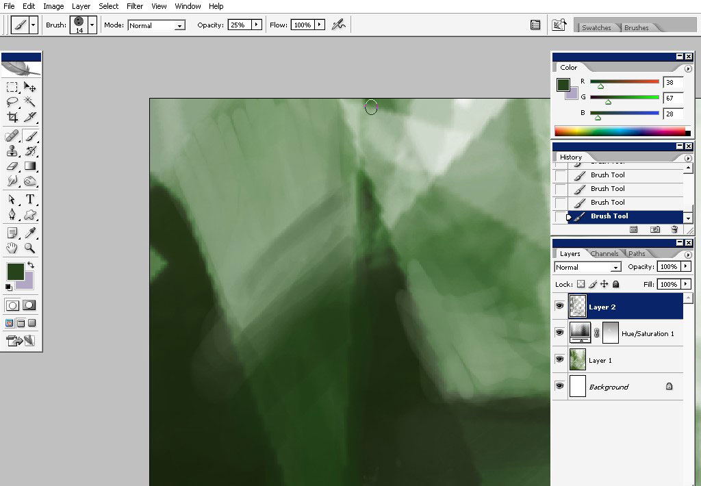
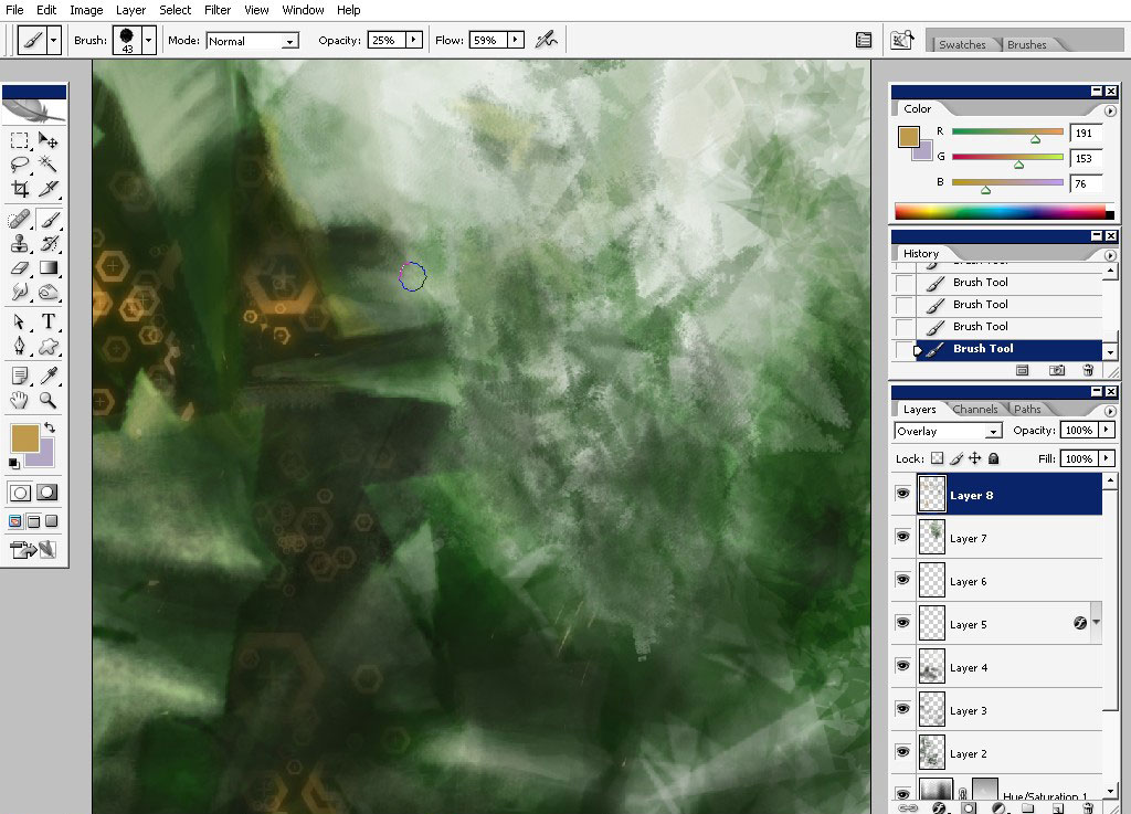
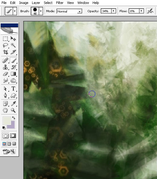
On this screenshot I’m beginning to refine and to drop some shadows on the lower part of the image. The same 25% opacity basic brush (the color is black or dark green for the shadows).
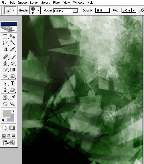
Here you can see it zoomed in. on this stage I’m picking colors only from my original image and not from color swatches box.
As my image goes down the blacker it will be there. So in the lower left part it will be a lot of black and little green.
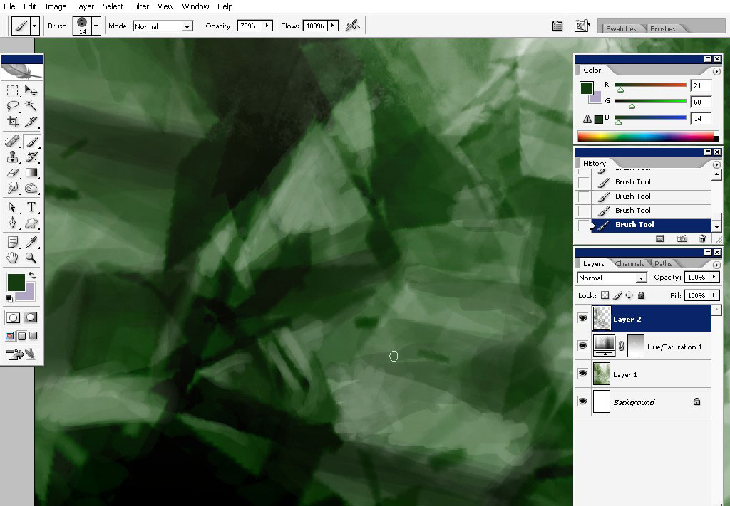
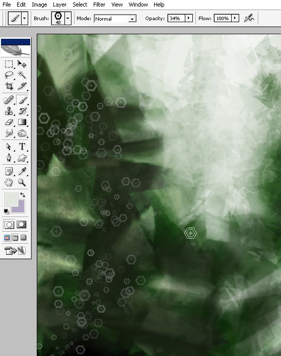
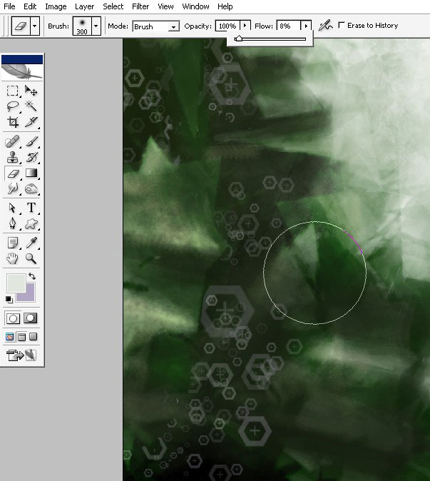
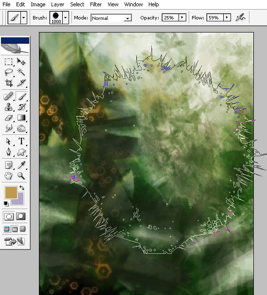
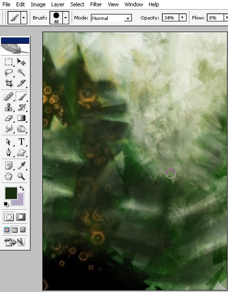
I’m now picking the other brush – the dot brush. I’m also creating a new layer for this effect.
I’m using this brush to add some texture to my image.
See my brush settings- the Opacity / Flow = 35% / 22%
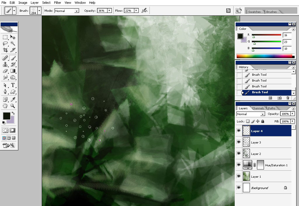
You can see the texture now in the left part of the image.
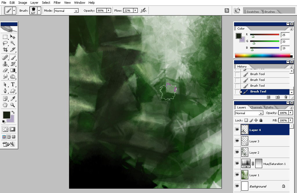
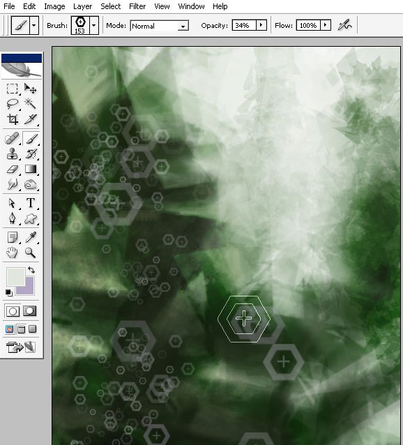
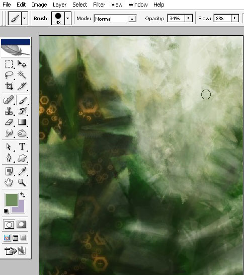
Now, pick another brush – it can be any Sponge brush – you will have it in Standard PS brushes but you will also be able to download my Antiscale brush set.
I will use Sponge brush to work over my background. The Flow is set to 22 % and Opacity to 80% (perfect combination for my Graphire 4 in this case)
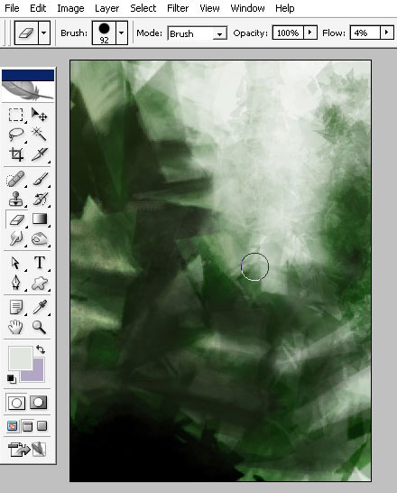
The Low flow (only4 %) brush is used to balance the objects. It is all about the Value here: the objects which are further (nearer to horizon line) obtain the colors from horizon objects and lighting.
Now about this brush which will be also available in my Antiscale set. The color dynamics is turned on along with scattering. Paint this on the separate layer.
You should paint this on the separate layer so you can erase back what you don’t need there. The idea here is to create an illusion the this shapes are inside of the structure.
…something like this.
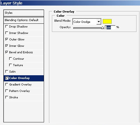
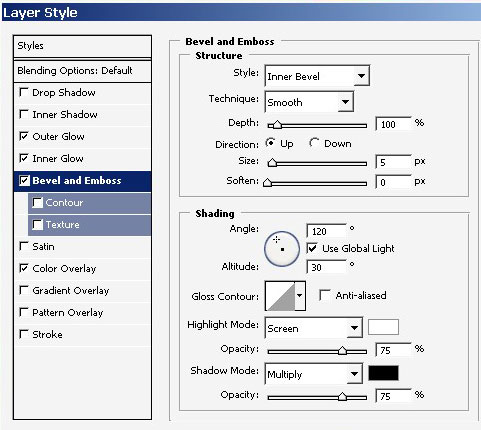
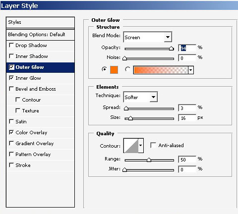
I will also give color to my little shapes. You could do it manually,
that I recommend you to do, but I will do it using layer styles.
…outer glow.
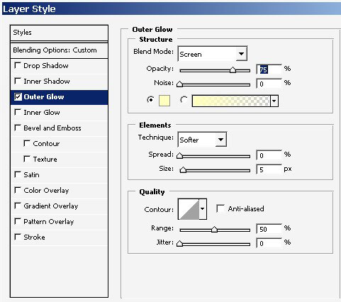
Here I’ve changed outer glow color.
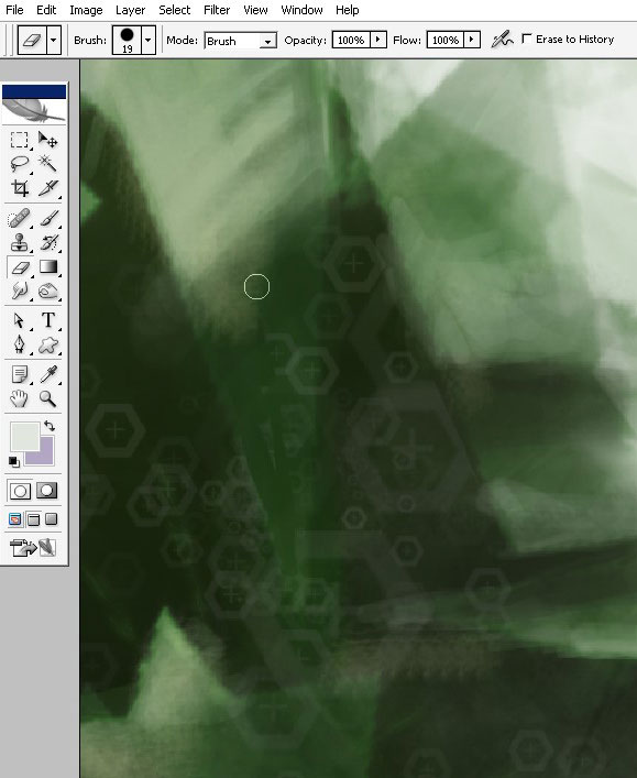
Some details to my background. I’m using Flat brushes for that.
Now I’m adding some color to the image by using low flow any king of torn or texture like brush.
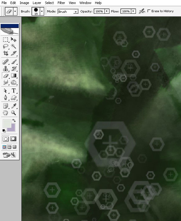
I’m erasing back all the elements that I don’t need to be on my background.
The background must not have a lot of contrast.
And my final step in Top down gradient.
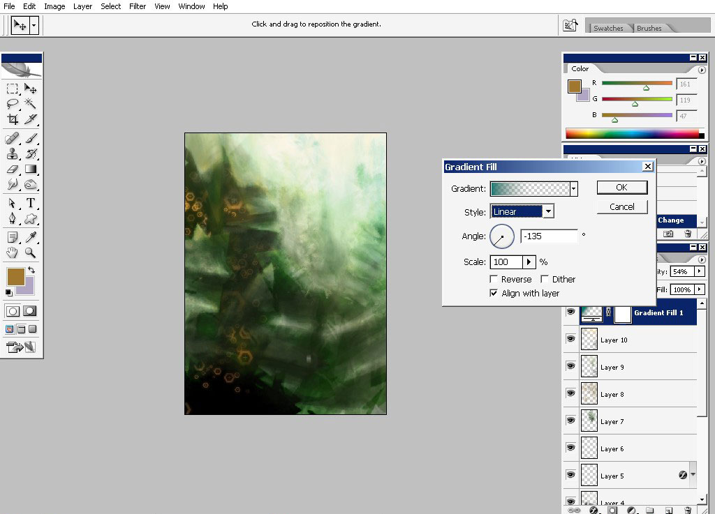
Oh, almost forgot just use Sharpen filter on that it will create and amazing effect.
Hope you’ve enjoyed my Speed painting tutorial. Practice a lot: speed and quality will come in time.
Comments