
Slightly commercial tutorial
Welcome in a slightly commercial tutorial, where I will show you how I do different banners or billboards or whatever. It’s
an easy topic for me because I’ve worked in a company that sells PC’s and computer equipment: so this defined the theme of
the tutorial actually. This was some time ago so this will be a practice for me too.
So let’s go.
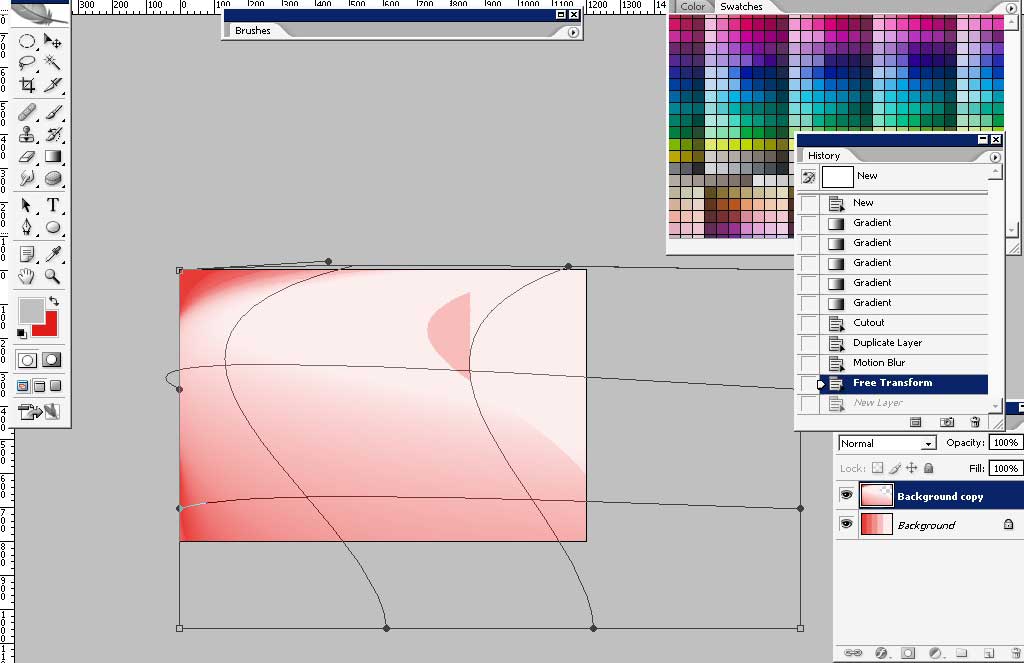
I’ve started with a white to red gradient for one side to another.


There was a feeling at the moment that it will be a good idea to divide the gradation on tone levels and to set each tone as
a space for a product and its info.
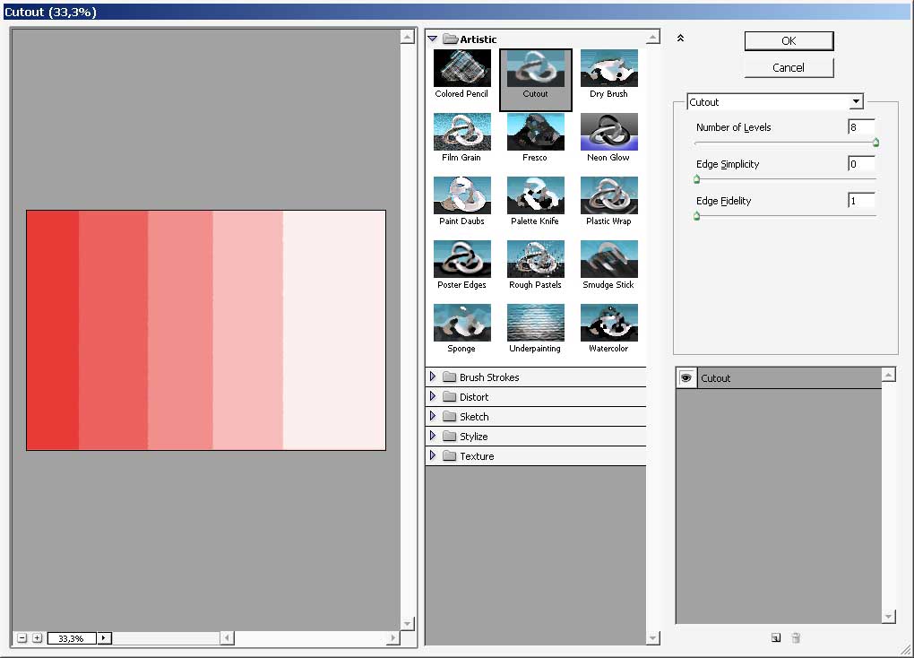
So I used Cutout filter: in Filters > Artistic > Cutout.
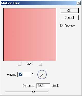
But it wasn’t a good idea after all so I decided to leave this cutout effect but correct all this by copying the layer and
applying a motion blur filter to it.
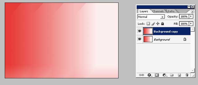
Something like this:
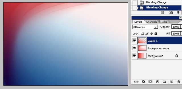
Then I really want to add some fractal like effect. I’ve chosen to warp the whole top blurred layer.

I’ve also added another color – because simply red is too much like used color.
So, I’ve added another red but I did change the blending mode and it suddenly game me bluefish tone. I think this color
combination really works.
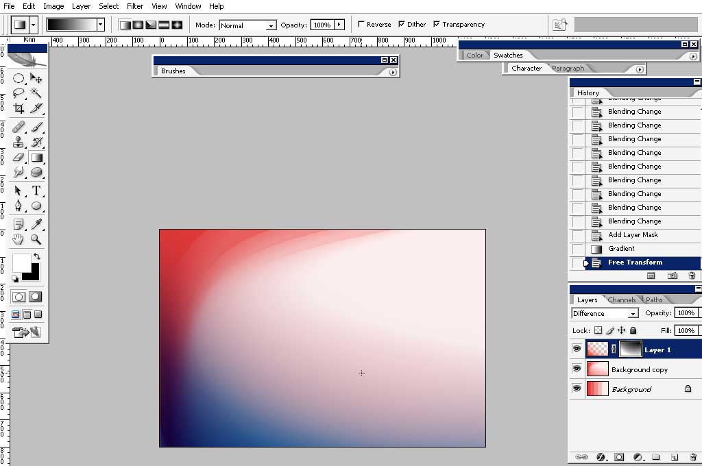
Expose some areas too.
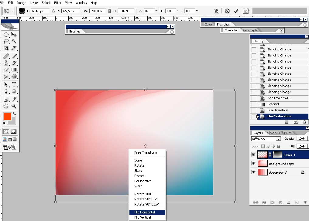
I’ve flipped the thing horizontally and changed the hue a little bit.
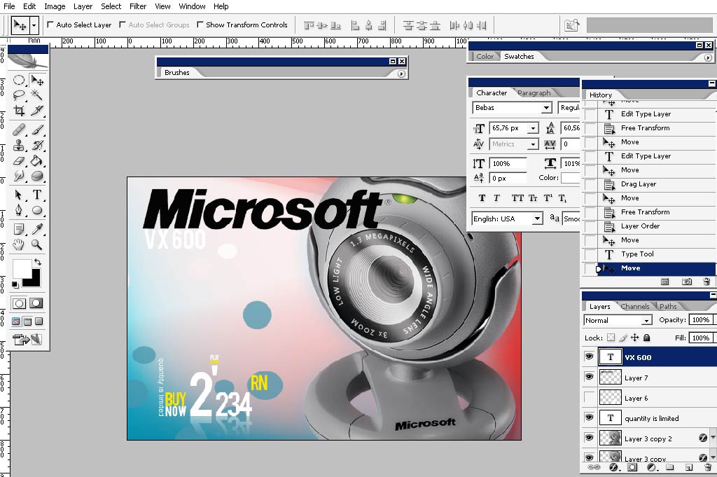
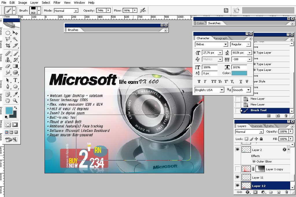
I’m beginning to work with text now. Defining the color for the fonts:
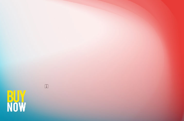
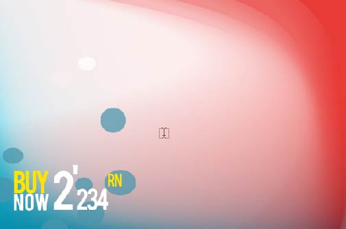
The price should pop out at a client so we’ll make it more noticeable by dropping a reflection.
Do a copy , flip it horizontally and then 180 degrees.
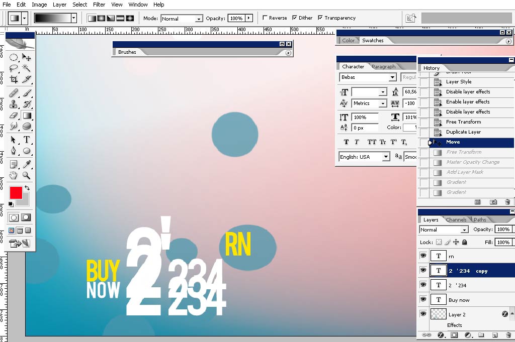
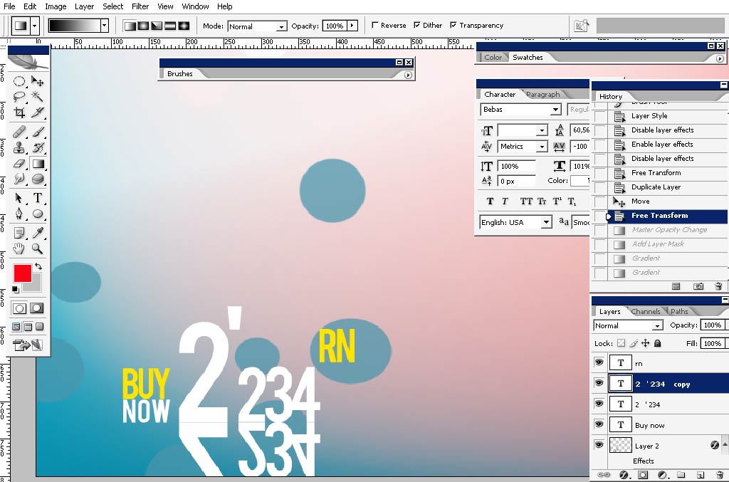
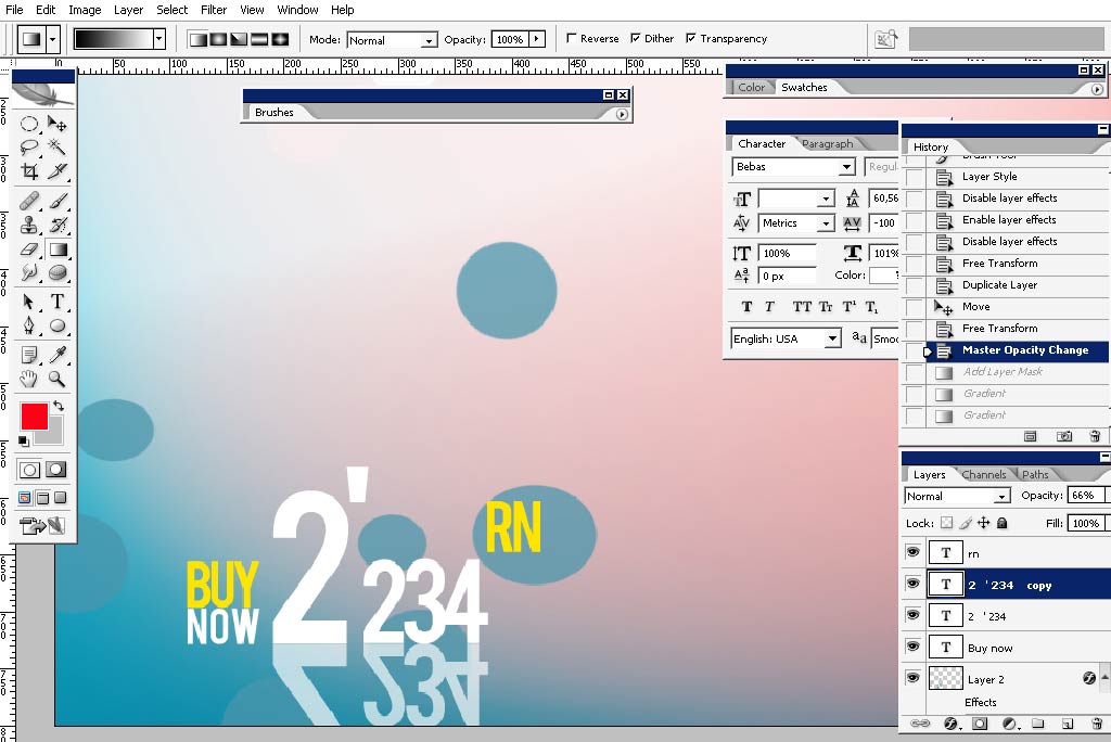
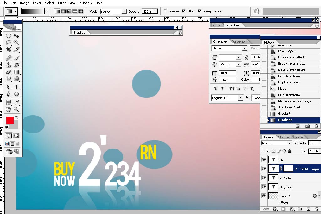
Apply a mask and use black gradient to hide the image part smoothly.
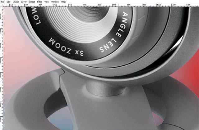
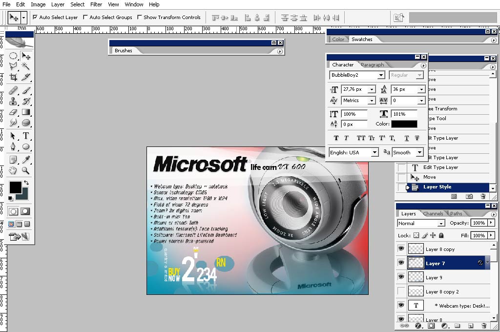
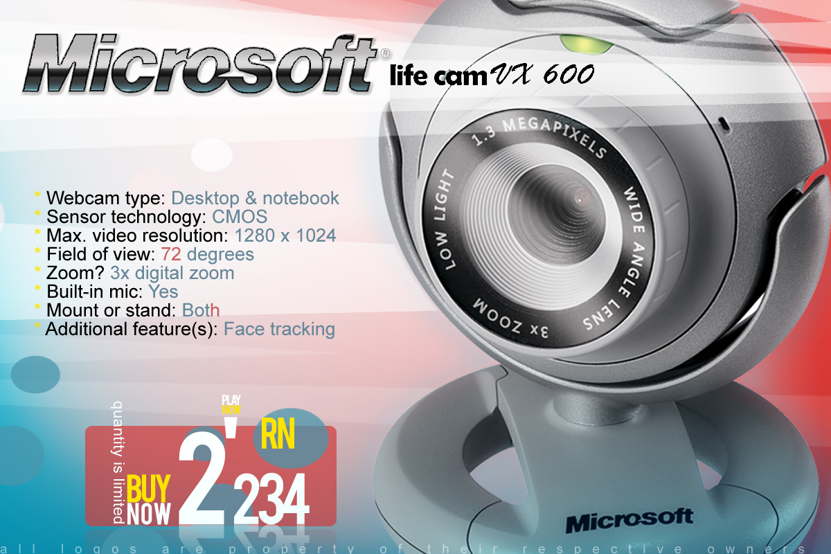
Then comes the product. I’ve chosen this web cam because I found high res images of it.
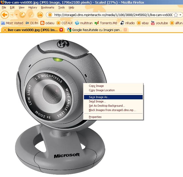
Copy the image.
Paste it in our design.
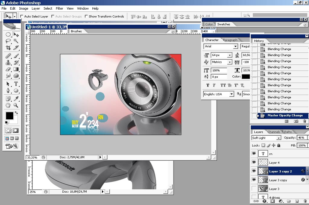
I’ve actually added a layer style – inner shadow – normal – red, to paste the object into the environment.
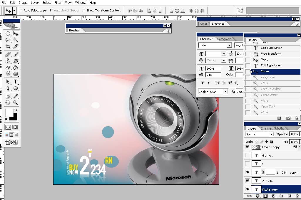
I’m still pasting the text here. I’ve found a logo of Microsoft.
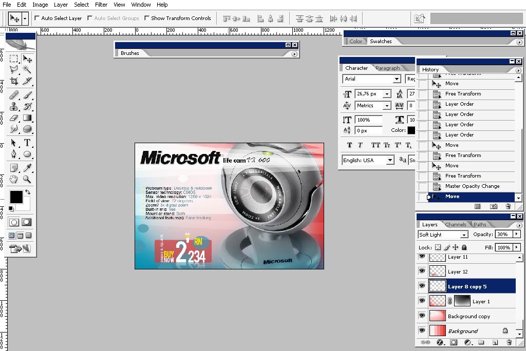
Adding some additional elements like these semi transparent line things:
Product info which is usually difficult to find a place for:
Some other elements:
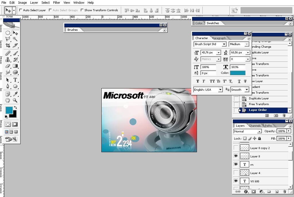
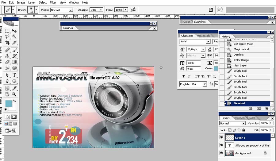
And we are ready with a banner of a product. Time: 1.30 hours.
So thank you for reading this. Actually I’m not really like this kind of work – I think it has less art in it then anywhere.
And I really don’t know why but when you flip this image horizontally it get’s mush better for the eye (inho). See you next
time.
Comments