
Preparation
Preparation
The first decision to be made is the size and shape of paper to be used for the programme. Often no thought at all is given to this, which is why many beginners find that they have actually designed their masterpiece to the software’s default of US Letter! In many ways, however, this decision is the single most important one we will make as it determines the canvas on which we are going to work. Psychological tests have shown that taller layouts tend to seem formal, while squatter designs seem more informal. They have also shown that a particular shape, the golden rectangle, tends to be selected as the most aesthetically appealing – a fact the ancient Greeks discovered long before market research.
This aesthetic ideal is slightly shorter than our typical pages – A4/A3/A5 – but there are practical reasons for the appeal of the ISO sizes. A0 is exactly twice the size of A1, which is twice the size of A2 and so on. What this means in practice is that an A4 sheet, for example, rotated on its side and folded in half will produce two A5 pages. This has huge advantages in terms of conserving paper and so in keeping costs down. Because the ISO pages are such universal standards they also have the advantage that they will easily fit into their corresponding envelope sizes – and into the post box.
Slightly reluctantly then, I think we should fall into line with the vast majority of users and select A4 as the page size. At least by selecting a landscape orientation we can break out from the absolute norm. The next step is to set up the grid onto which we will fit our text and graphics. With a number of separate categories of events to include, together with background information on the Institute and an eye-catching cover, our single A4 sheet will have to be divided into sections. Folding in two would only give us four A5 pages, but folding into three will give us six taller sections. These will be slightly out of the ordinary, slightly formal and well suited for carrying large amounts of information.
To set up the grid we have to set up the margins and columns. Again many users treat the software’s in-built defaults as if they are givens, but each publication will demand different settings. The general rule for multiple page layouts is to have a wider bottom margin than top and a wider inside margin than out, although like most design rules these can be broken for effect. It’s also important to be as generous as possible with margins as the resulting “white space” should not be seen as wasted, but as a crucial part of the overall look of the document. Without decent margins your design is always going to feel cramped.
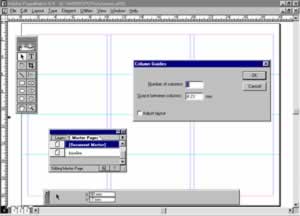
In fact it’s often worth shrinking your body copy’s point-size to gain space to add to margins, but that’s a luxury we’re not able to afford. Instead we’re going to have to be comparatively mean with left, right and top margins of 7mm and a slightly larger bottom margin of 1cm. The next step is to set the number of columns – three – and the “gutters”, the space between columns. Because each gutter is actually going to be a fold we have to make the width exactly twice the size of the left and right margins – 14mm – to ensure that each panel is correctly centred.

Comments