
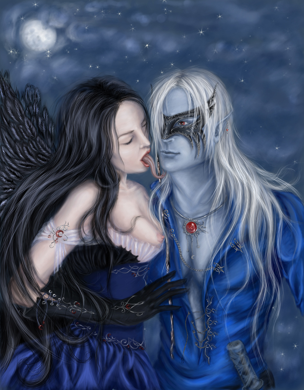
Oblivion. Part 2
This is the second part of my lesson of representing the “Oblivion”. The previous lesson I’ve shown you methods of picturing the human figure ant his clothes. This part I’ll try explaining the process of picturing a woman. It’s not necessary to choose the same used by me colors’ nuances on the picture. I just show you the approximate colors. Try to get the experience in every step you make.
1) On this stage I’ll show you the order of pictured by me elements. Start by making the skin and then pass to the clothes and jewelry. I’m very fond of them, so I am of the small details. Have an attentive look at the basic draft and don’t forget about the face and figure’s feminism.
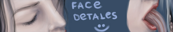
2) The first part of the lesson I already explained the method of picturing the skin. Here I must notice that I didn’t work with the skin’s structure intentionally, but the flares should be of lighter color – because I pictured a goddess, so she has a less usual shape.
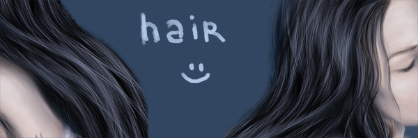
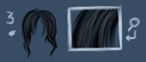
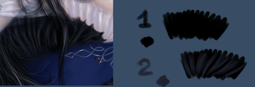
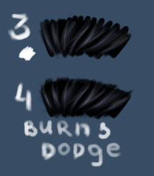
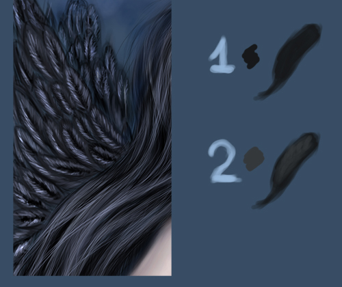
3) You may see the enlarged fragments of hair. I like the contrast created by the black hair and light skin. You may notice the flares and the places on transition. Let’s explain how to get this result more detailed.

4) The first step includes mentioning the basic layer with black color, which should be of the darkest color and be the same on the hair’s ends. Next I’ll select a lighter nuance and represent several of the locks. A little negligence makes the picture look more real.
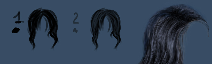
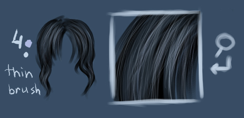
5) Select on this stage a thinner brush for the hair locks. You may see an enlarged fragment of how I use to work with the elements. Choose now a lighter color to draw several lines, getting the locks’ placement. Try not to cut out all the lines in the first row. Some of scatteredness and sharpless is just welcomed on the picture.
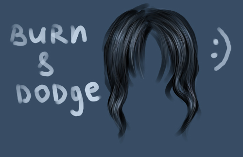
6) I use two nuances of lighter color to process the already represented hair locks. You may see on the enlarged fragment the flares represented with light color. Choose a darker color to insert it on the other zones. As I already explained in the first part of the lesson, you may concentrate yourself only on those parts of the hair that are more visible on the picture.
7) Select now the Shadows regime and the Burn Tool to work with the darker zones, to get the effect of contrast. The Dodge Tool and the Highlights regime help us in accentuating the highlights.
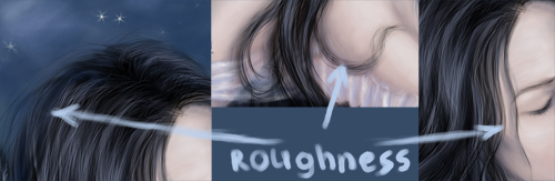
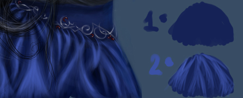
8) The hair looks livelier if representing several locks coming out the common shapes. Falling down on the forehead, on the chest and on the back of the head – these small details play a huge role on our picture. I’ll remember you that representing the hair is possible to do with different colors that fit with he background and the rest of the objects.
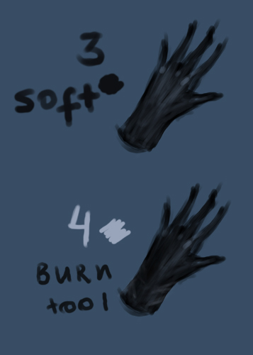
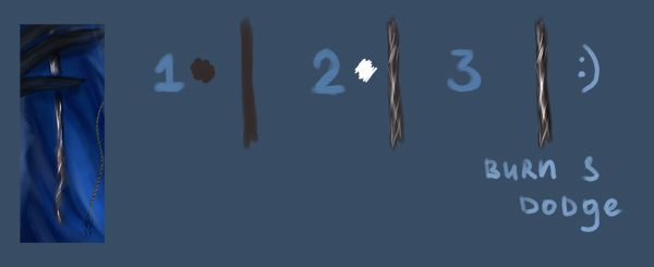
9) The gloves. I didn’t care of the textile’s texture, so I tried not to get some sharp highlights and shadows. On my picture they look very simple, because when drawing I care about smoothing out the elements. Choose black color for the basic elements and then select a lighter color for drawing the shape itself.
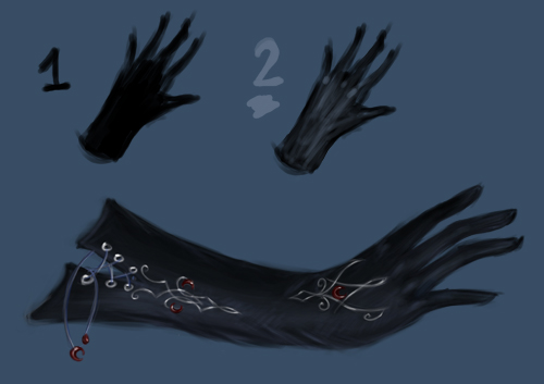
10) Select a smooth brush of black – grey color to introduce shadows. Choosing a lighter color is possible to mark out the plaits on the textile. The rest of the elements must be darked out with Burn Tool.
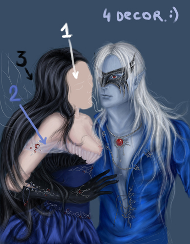
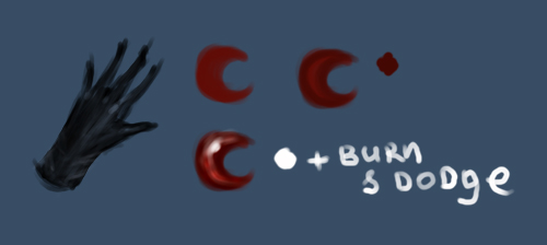
11) Insert a red ornament on the made glove – the symbol of the moon.
It should be done in three stages. Firstly – the basic layer and then
select darker shadows and finally the white highlight for more
brilliance. Insert some contrast on the elements by choosing the Burn
and Dodge tools.
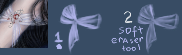
12) Now it’s time to draw the semitransparent textile. For the
beginning try to draw the basic element with blue – light color. I try
not to use dark colors. After that we may erase with the Eraser Tool
those fragments looking too bright.
13) Introduce several highlights with white color. Then we have to
process everything with the Burn Tool. Next step includes adjusting the
nuances with the objects the textile falls over.
14) The dress’s textile. I tried for the textile to look like silk or
satin. It’s necessary in this case to use a lot of shadows, highlights
and smooth overflow. Choose the basic color. And then select s lighter
nuance of the main color to draw the plaits’ shapes. They must get
wider on the bottom part of the stitch.
15) Mark the highlights with even lighter color. It’s not necessary to
use in this case a nuance of the main color. You may select a different
one which gives the picture more interesting effects. Select a dark
color to deepen the shadows. The Burn Tool and the Dodge Tool will be
helpful in getting the usual contrast effect.
16) The plaits on the corset may be introduced by applying the same
method with the silk on the skirt. But give it this time smother
brilliance. The black color is reserved for the main elements and then
drawing the plaits themselves with a lighter nuance of the color.
17) Use again white color for the highlights. The Burn Tool will be
selected for the shadows and the Dodge Tool – for the highlights.
18) The cane the mask holds on. I didn’t think about the material it is
done of. Let’s make this brilliance less real and look like magic. The
basic layer must be colored with brown. The short thin strokes must be
done with white color. Burn out the darkest part of the cane, using the
Burn Tool. The Dodge Tool should be applied on the white strokes,
making them shining.
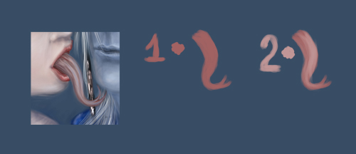
19) The tongue on the picture created a lot of controversies among
those who saw the picture. Some of the people considered it to be an
original one, others thought it to be awful. Even so, but I’ll try to
explain the process of drawing it. Choose a kind of color close to red
one. It will compose the basic layer. A lighter nuance will insert a
kind of volume on the picture.
20) Apply a brush of dark – claret color to represent carefully the
shape and the deeping along. Select a transparent brush for the
highlights.
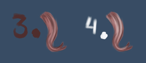
21) It’s time for the shadows that must be pictured with the same dark
– claret color or brown one. Select blue and dark – blue colors to
insert on the picture more diversity.
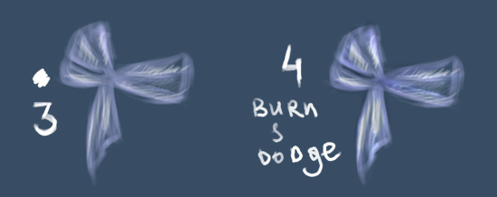
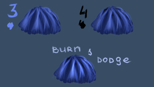
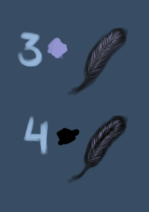
22) Now we have to stop on the feathers on the princess’s back. The
basic layer has black color, but the lighter nuance will be selected
for processing the middle part of the feather.
23) Select a lilac color or another lighter one for the strokes. Choose
black color for inserting the longitudinal stripe on the middle part of
the feather and the same color for the tints along the feather’s edges.
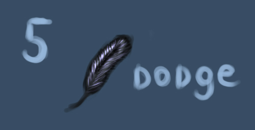
24) Select the Burn Tool for the shadows and the Dodge Tool for the
lighter zones and for the strokes. As you may see the feather shines
on.
25) The ornament is very easy to draw. Select for the beginning a
neutral layer of the color you wish and then apply the blue color to
represent the planned highlights.
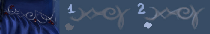
26) Choose again the Burn Tool for the shadows and the Dodge Tool – for
the brilliance. That’s it! I hope you’ll enjoy it. Naturally you may
add some elements of your own, because I only stopped on the method.
Everybody must have a result of his own.
Comments