Mini logo stylistic challenge tutorial
Welcome in mini logo stylistic challenge tutorial. In 2 words we will try to create a logo in 2 or 3 different styles: vector like and web 2.0 with all that reflection and shadows. So our imaginary company or whatever will be called “6.am” and we got to make a logo, just like for the real client.
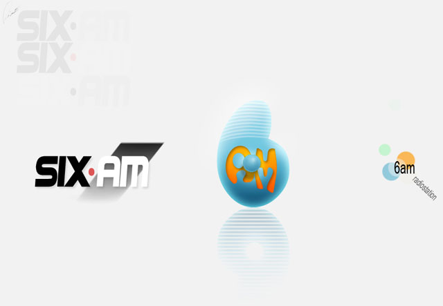
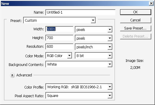
So let’s begin then. Create a new document. The good advice is: fill the background with gray or something desiderated, because sometimes you will miss the point o the logo or whatever – cause white is too shiny. Actually – I recommend you to do all the text and logo work in Adobe Illustrator or its analog. This is why I’m setting 600 DPI print resolution.
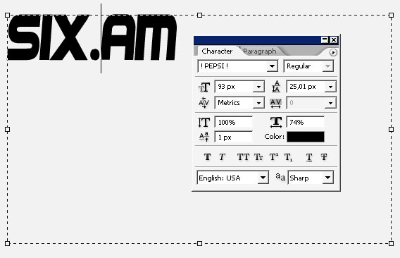
So our first variant will be all about text. So what we got to find is a good Font. I like to use something Bold on this one. Here are my Font settings.
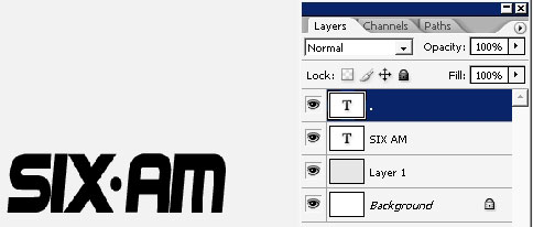
I think I will drag the dot to the center. This will be a little design step.
Here are some variations on this logo. You should always think that the client probably don’t thinks like you do, so the minimum that you got to care of – is just change some colors on the logo. Moreover it is good for the process too.
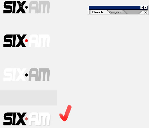
A little bit more adding gradient line on beneath the white – and dropping the shadow.
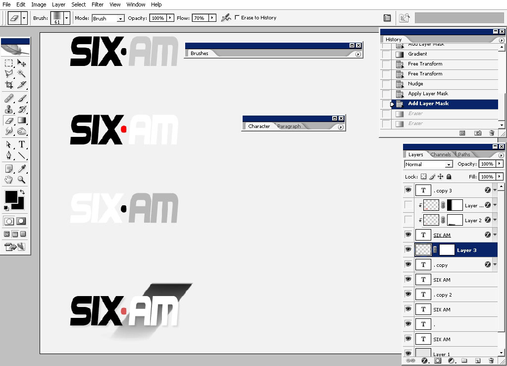
Order the layers – this will save you time in the future.
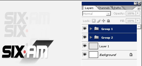
So our first variation is ready.
Next step the web 2.0 logo. I would like to make a big 6 as a major design element of this logo.
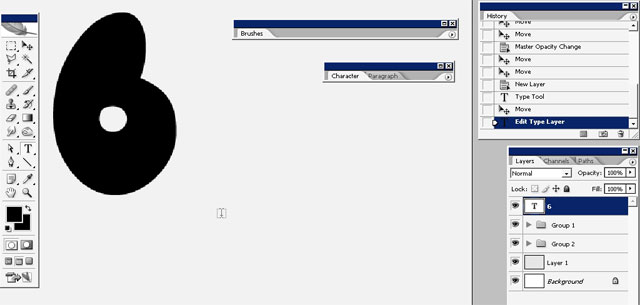
Let’s drop some layer styles. The initial color is blue and not black. So here are my layer styles.
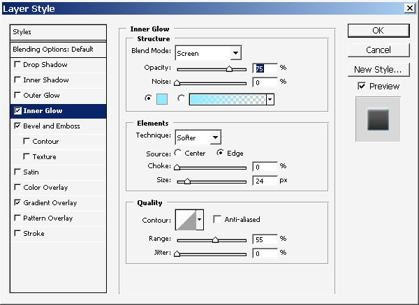
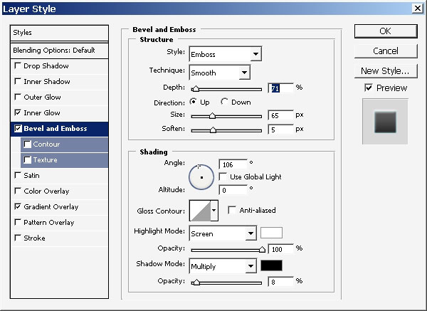
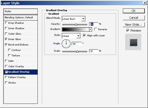
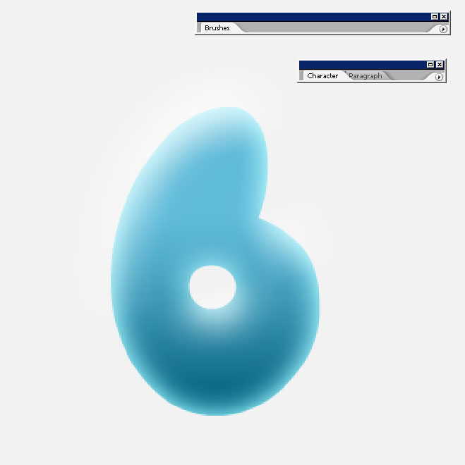
I’ve erased the upper part with my line brush a little bit. Moreover I’ve added a value there – near the hole of 6.
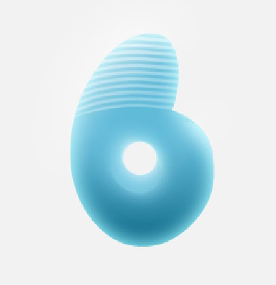
Here is it in color so you can see it. It is a Round selection with gradient overlay.
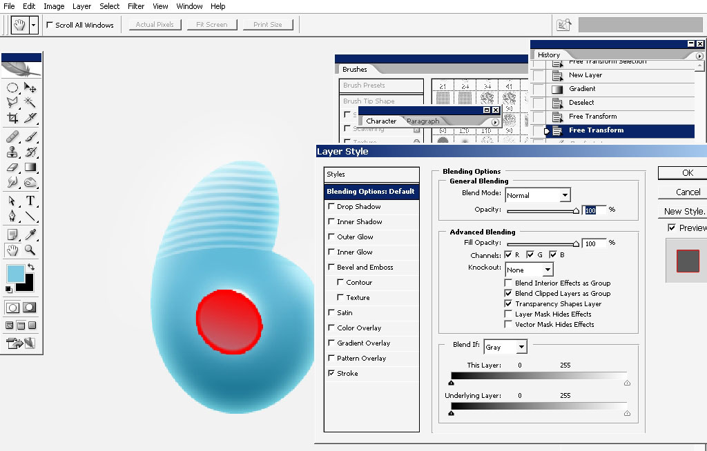
And the candy like 6 is ready. Merge all the layers together (or don’t) and create a copy of 6.
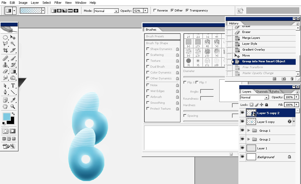
Note: of you will transform this 6 layer you will see that layer styles are moving like you don’t want to see them move.
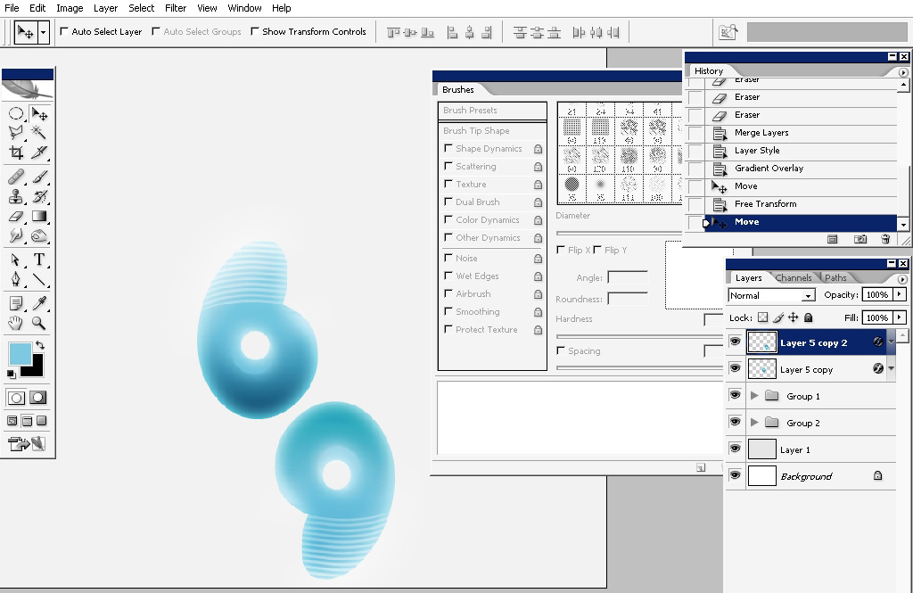
So convert the layer into a smart object. Rotate 180 degrees and transform it.
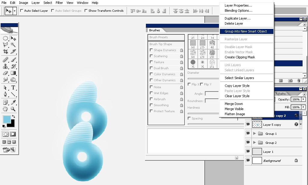
You can also see on the next screenshot my orange – set to overlay – AM letters. I’ve also selected the circle in the center on 6, created a new layer and filled it with soft edged color.
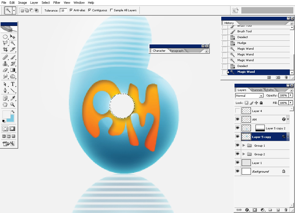
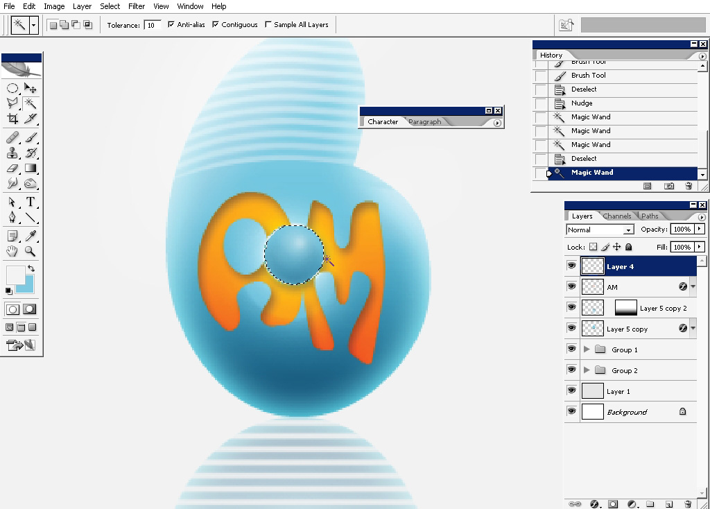
Drop a hardly seen shadow for the 3d like effect.
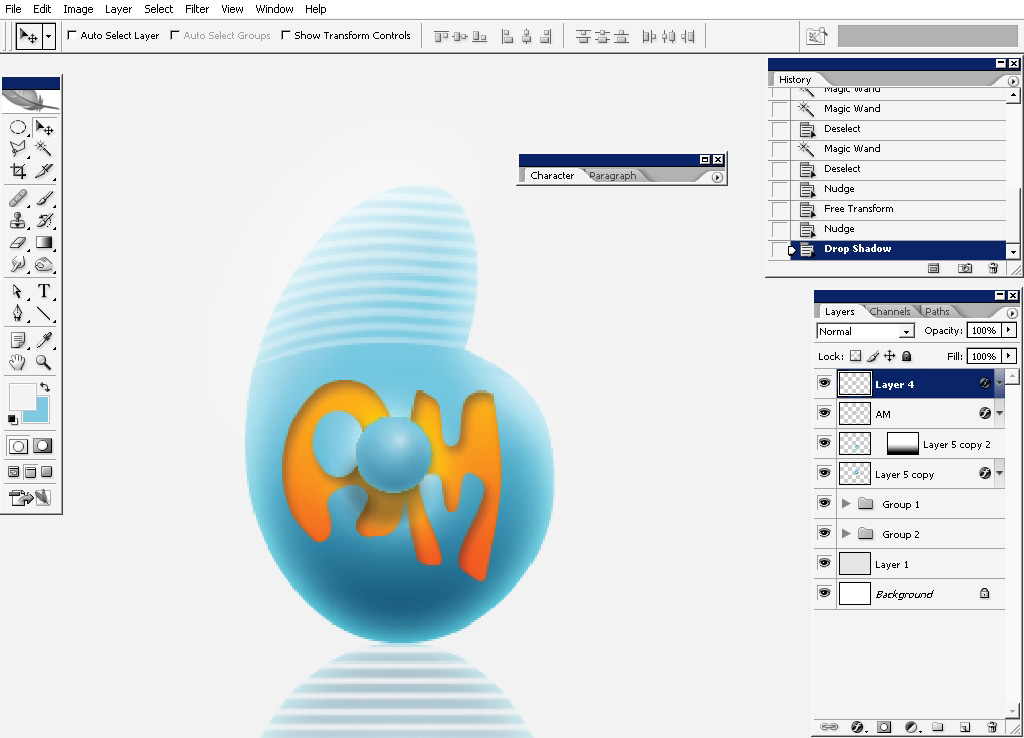
Web 2.0 style logo is finished.
Next step: minimal logo
For the minimal logo we will only need – a rough round brush, some colors (we have several millions in PS)).
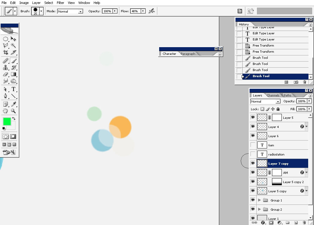
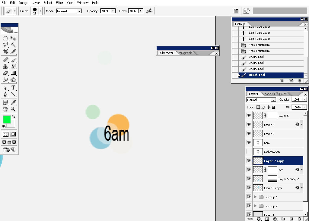
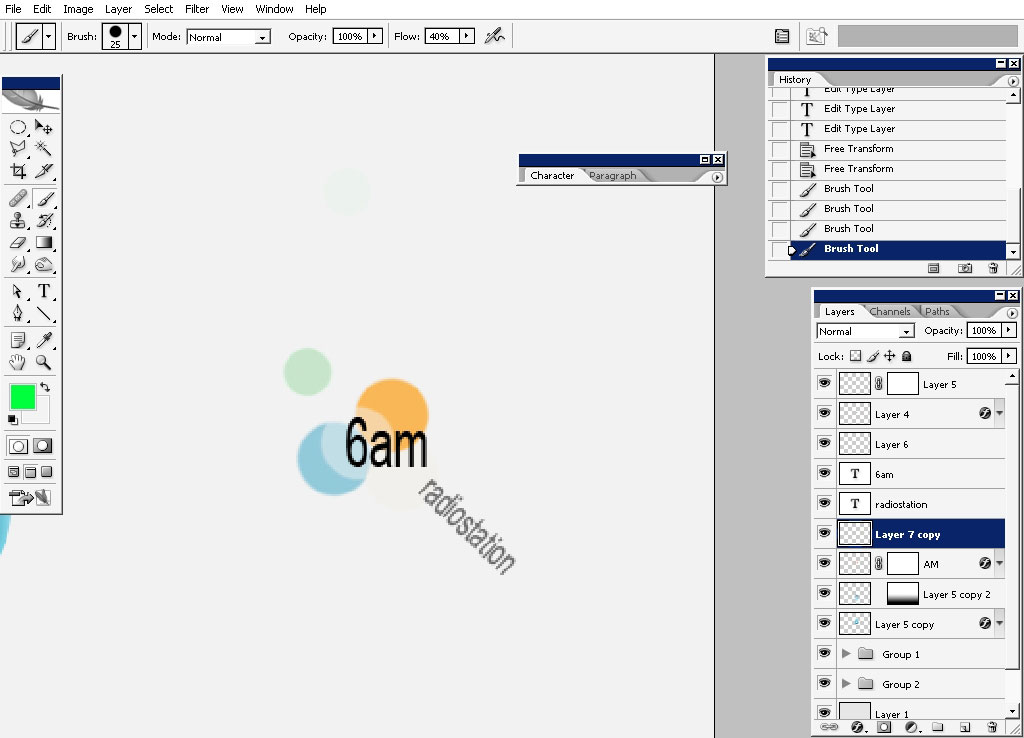
Super fast one:
So and here we have it:
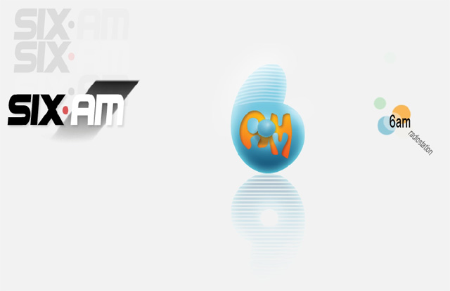
1 company: 2 different styles: 3 different variations: millions of colors): 1 satisfied client.

Master your skill and don’t believe if you will hear that making logos or something is very easy and needs no Knowledge, taste and idea.
Comments