
Landscape design
This is a tutorial where I will paint some landscape along with structures image. For this one I will use my good old, out of
production Wacom Graphire 4. So for the users who have no tablet will be difficult to paint this, but I do know people who
spend weeks painting really master pieces with a mouse.
So let’s go:
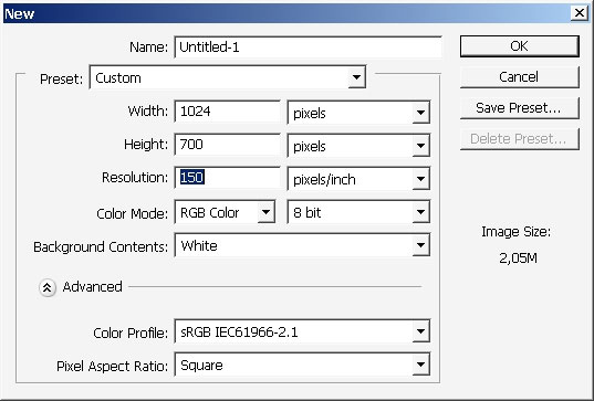
I’ve taken a document with 1024×700 sides.

Every artist does the thing differently, but the more ways to realize a painting you will know – the better and easier it
will be only for you. I often start from grayscale sketch and then drop the colors – I think you can value the tones better
this way. But now I will start with colors. Use basic dry media PS standard brush.
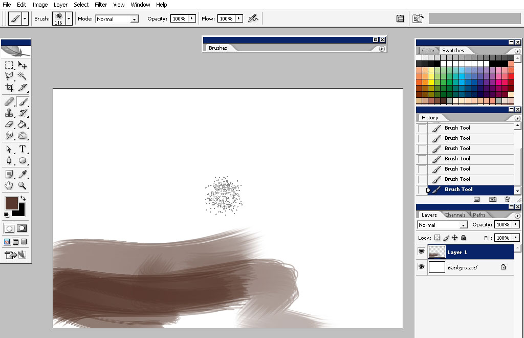
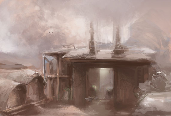
Very roughly – just to define the colors and maybe some shape areas:
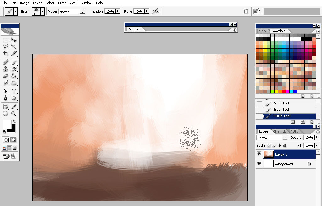
Colors bring life and mood to picture – so do try some to define the better color variation.
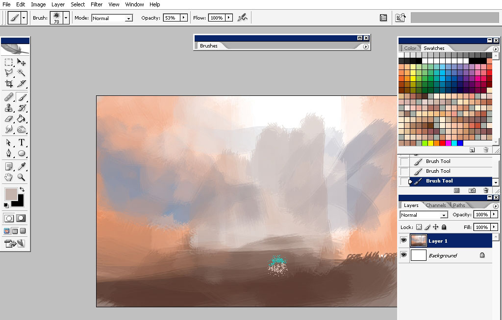
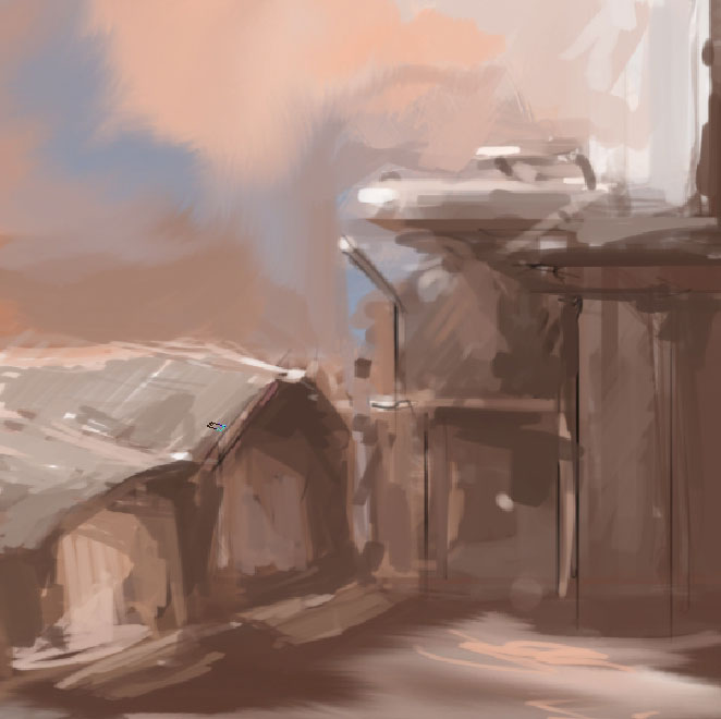
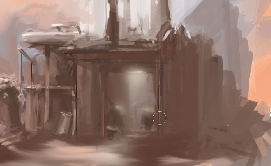
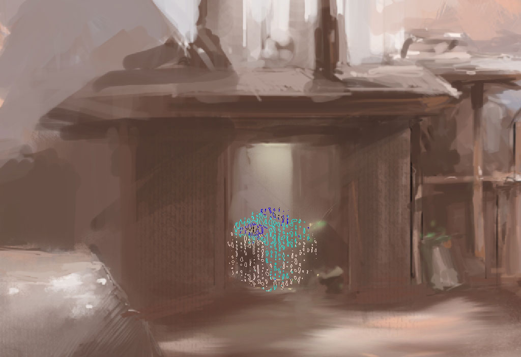
So the background tone is ready – I would like to paint over some foreground elements. Do it with a basic 1px – 3px brush!
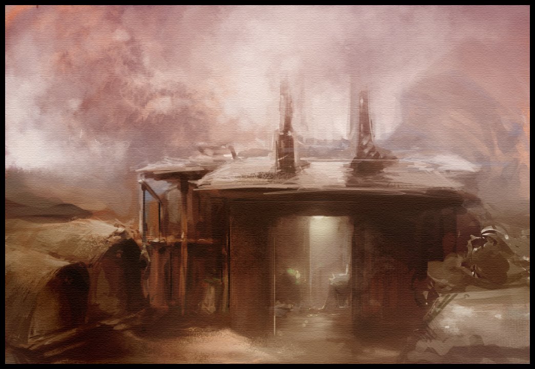
Os this is some king of a warehouse here.
To separate it from background (ground) use lighter colors to paint the ground with.
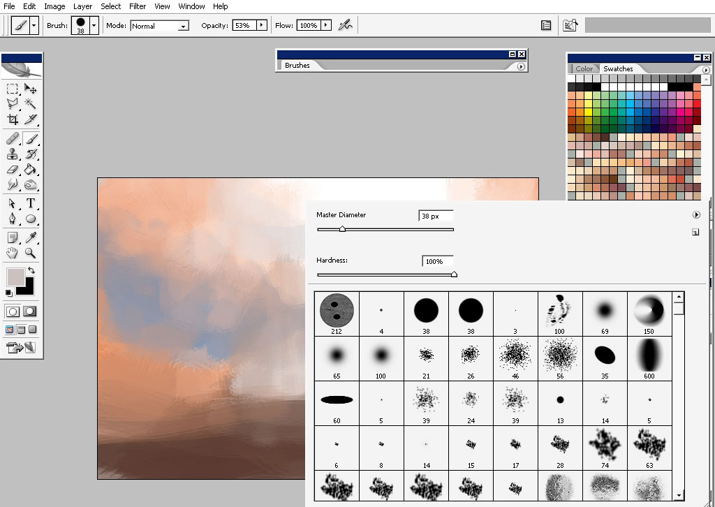
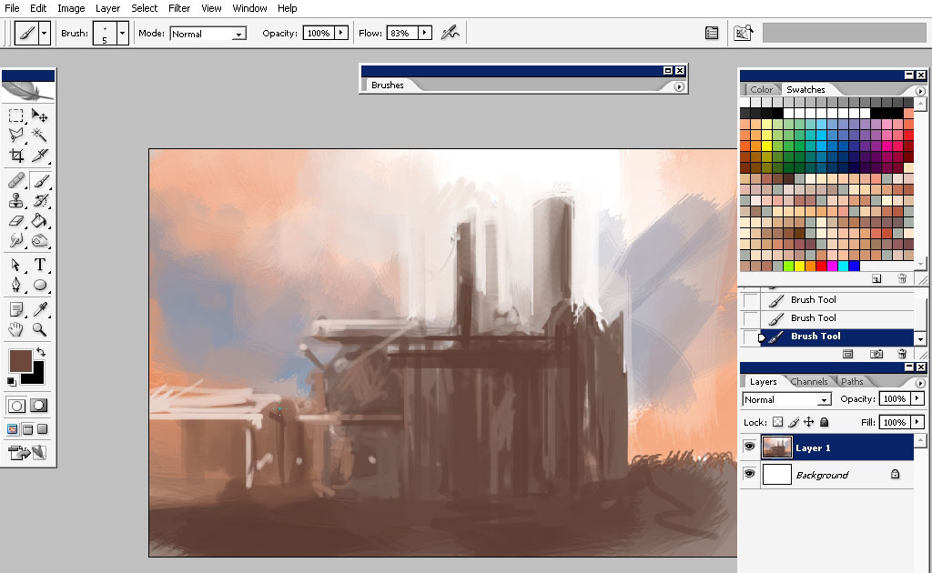
Begin to detail some elements:
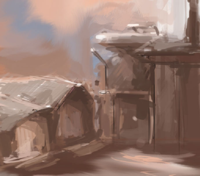
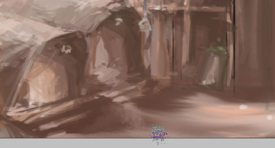
Try to use different colors for smallest details- the colors that have most contrast. Well actually this going intuitive.
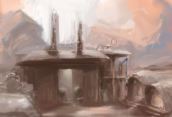
Soft brush is great for lighting.
Refining the picture (the brush gets smaller and smaller).
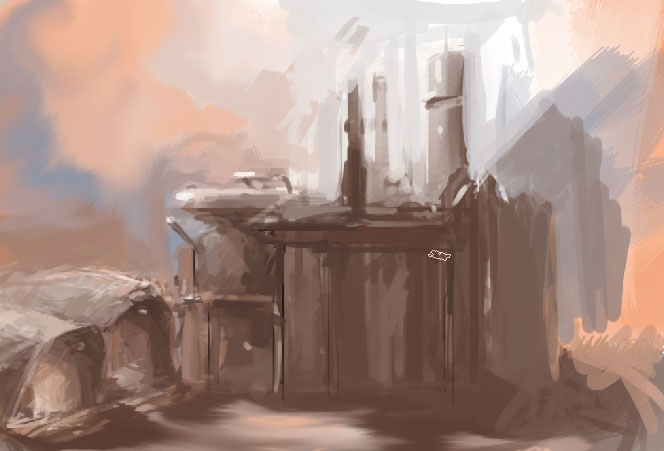
Flipping the image – specially when you’re dealing with environments, I a great thing to do during your process. The eye gets
used to what you’re [painting. Moreover you really get to see all the mistakes you did. So just flip it several times and
look at it for couple of seconds.
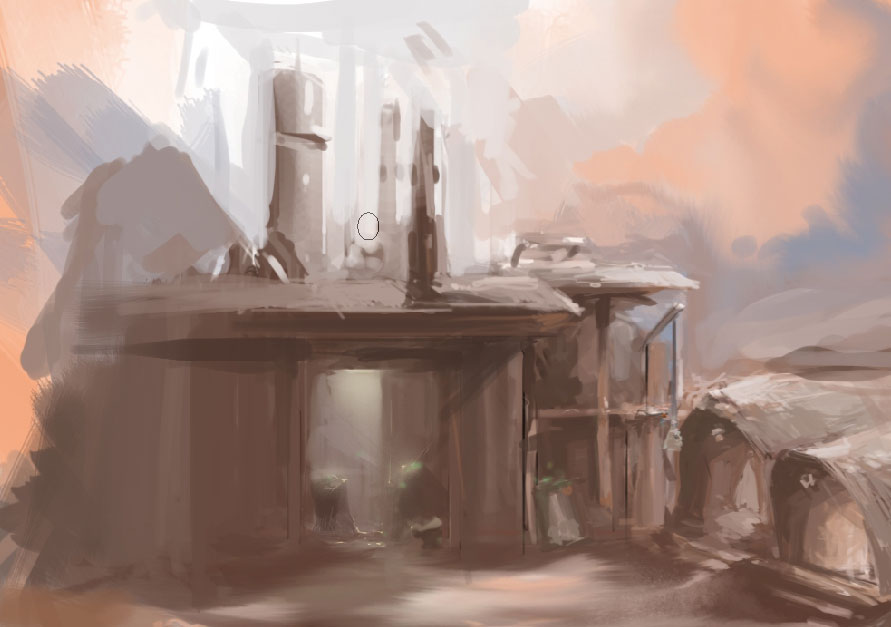
I’ve also did handle my background too, using only 2 tones basically – the blue and the pink.
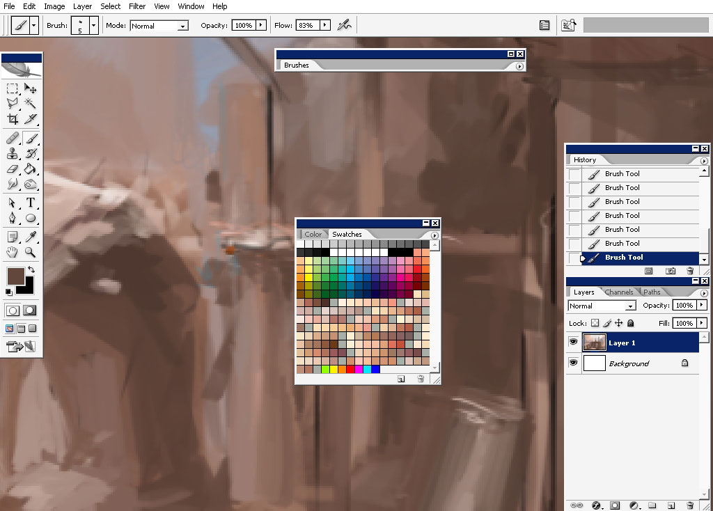
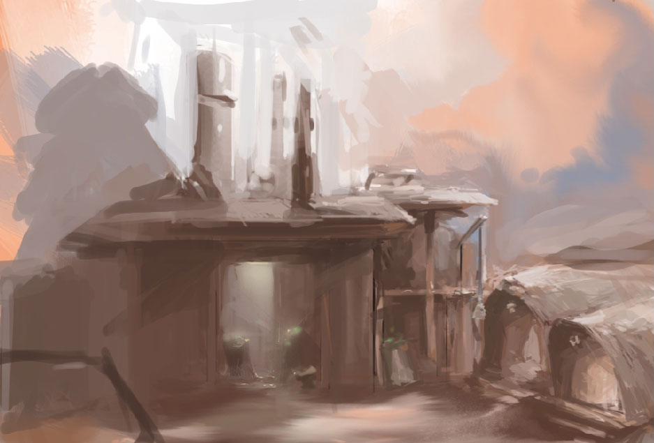
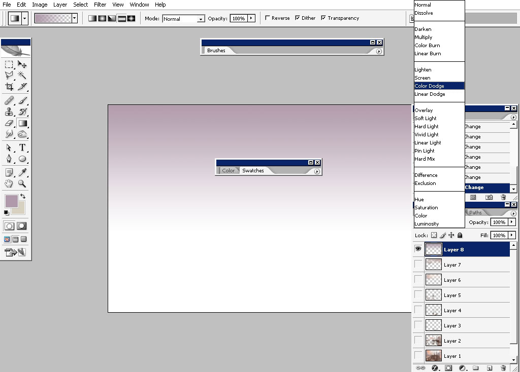
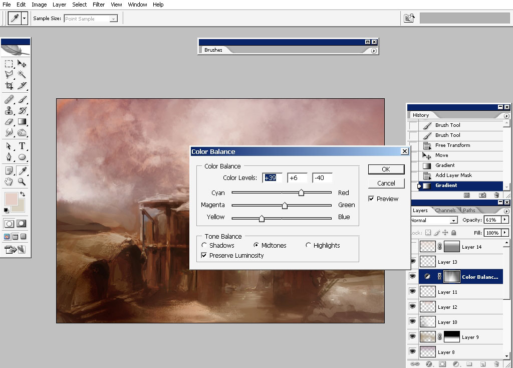
Now it is time to adjust the colors – I really can’t imagine working without color adjustments.
Create a new layer and drop a gradient on it. The gradient top color is something like image background. Click to find out the best layer blending mode
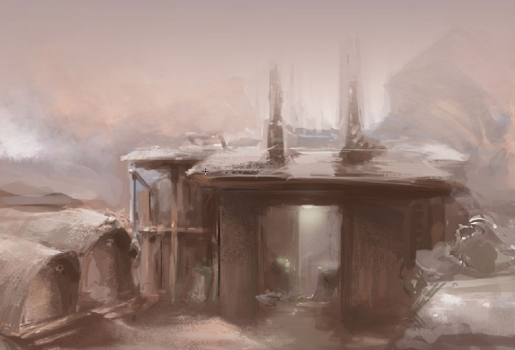
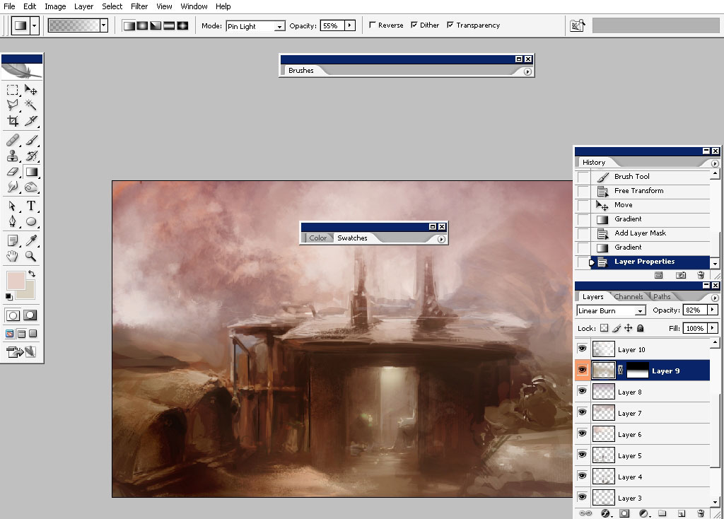
Create another gradient along with a new layer.
For this one: color burn I think is the best,
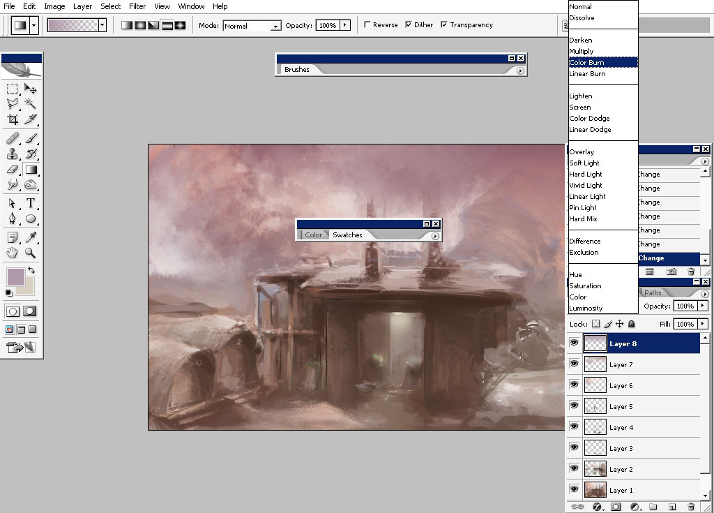
The same thing with the lower part – the same technique was used there.
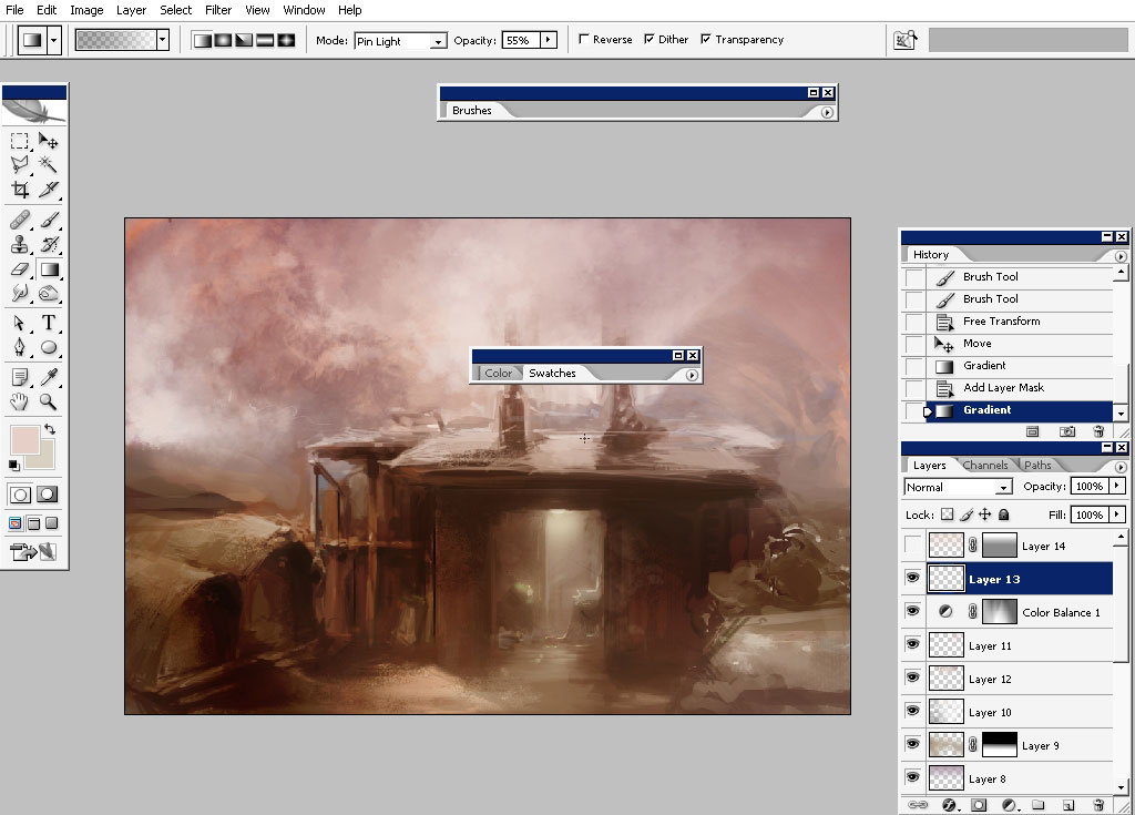
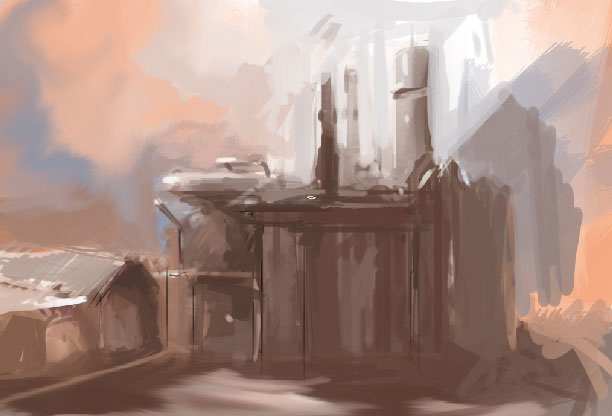
A little bit of color adjustments:
And this is basically it. This is hard to explain by words- you should always find the perfect value definition. Like in this
part of the image:
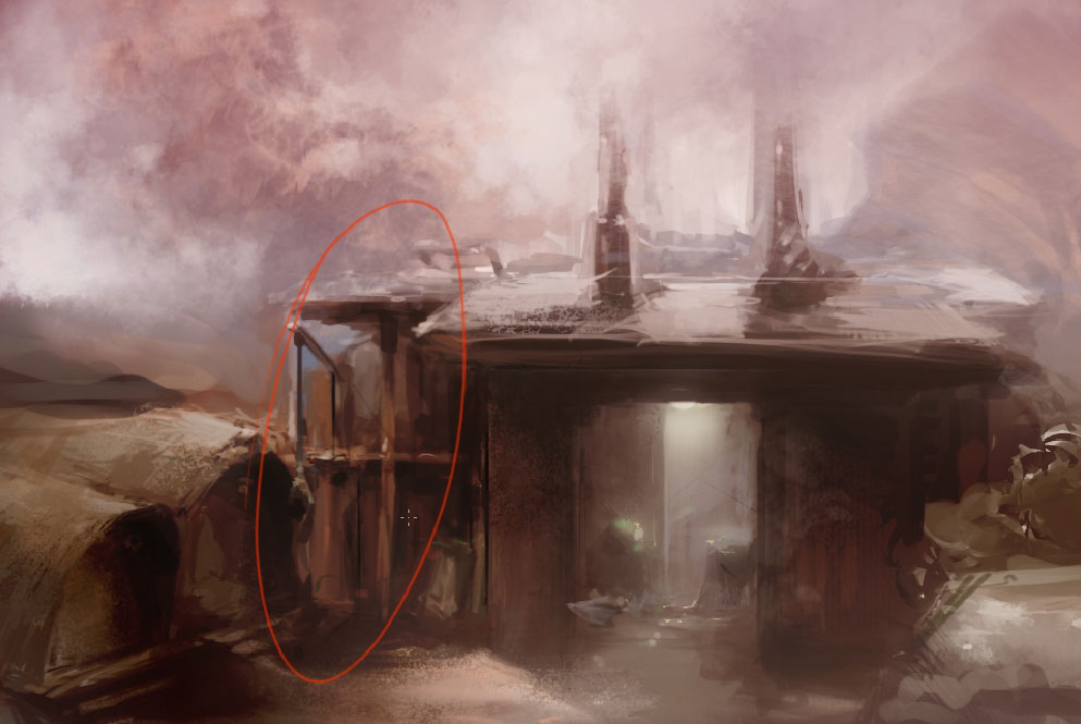
Try not to spoil such details. See you next time.
Comments