
Grudge illustration
Hello. Today we are going to make a Grudge illustration using Adobe Photoshop.
No tablet for today, just pure Photoshop with its amazing features.
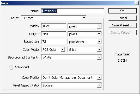
Do start with creating a document with these dimensions.
I usually start my drawings with background, but now I will make a foreground first.
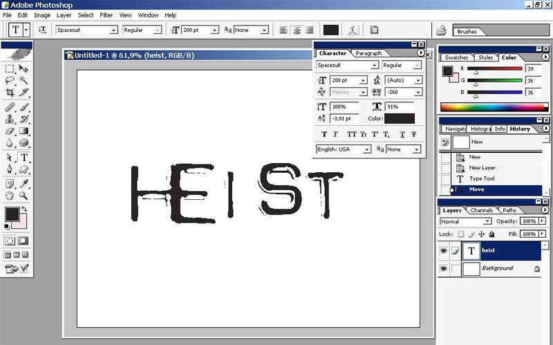
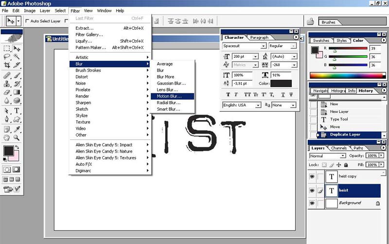
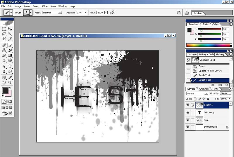
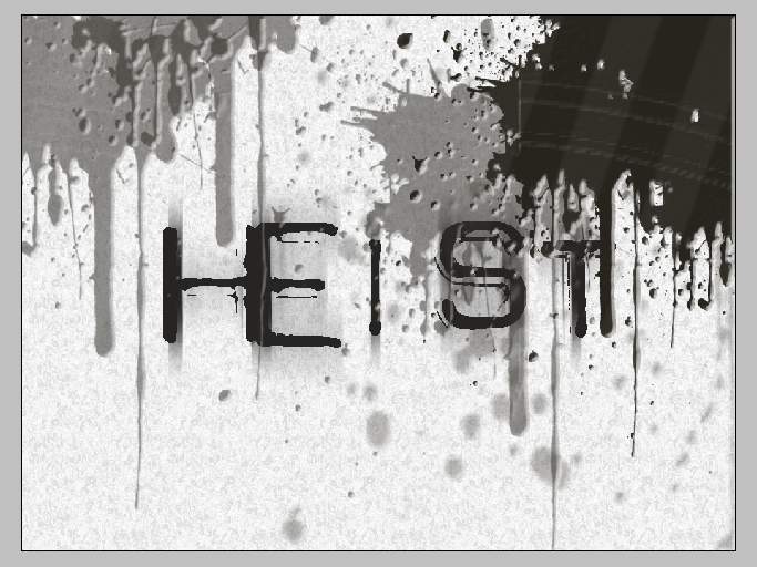
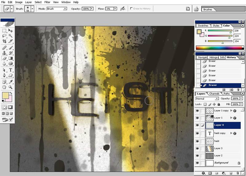
Out Foreground element will be a world – “HEIST”, the first word that came into my mind * (as usual).
The font is creepy too, just like I want.

You can see some text layout adjustments in the top right corner. They aren’t standard.
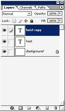
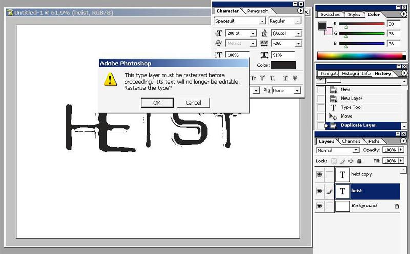
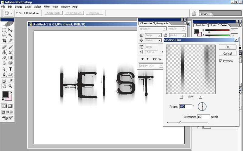
I will make a copy of my text layer and rasterize it and apply motion blur filter to it.
There we go.
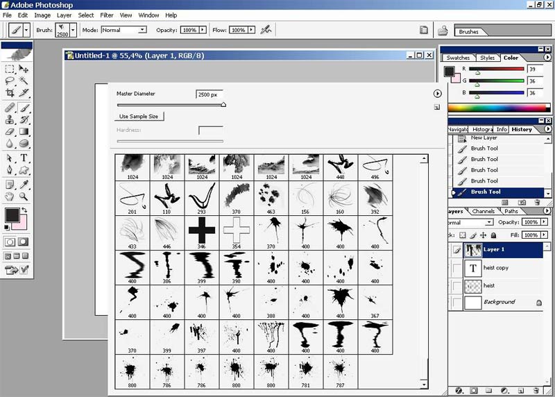
I will give one very good advice. When you are sketching (or making a colorful illustration) try to get rid of the white!!*(background) as quickly as possible.
So I will now. For this operation I will use brushes and mere mouse.
Our illustration supposed to be creepy so I will use Blood brushes.
Here is my newly downloaded set of blood brushes. I didn’t really mess with all the brush making thing when illustrating, but when painting digitally it has to be hone. Custom brushes will save you millions of hours of rendering and making effects.
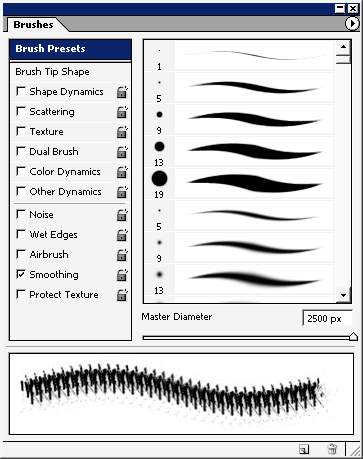
Choosing proper settings:
And here we go. Something likes this. These half tones were made just changing the opacity settings.
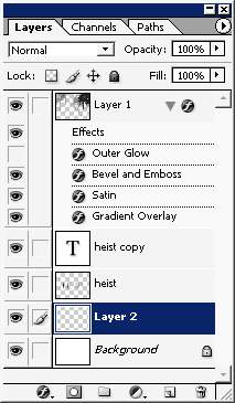
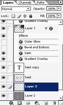
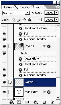
All these blood stains were made on the separate layer. Well you got to
know that all the major objects should stay on the separate layers.
Organize you paintings and illustrations.
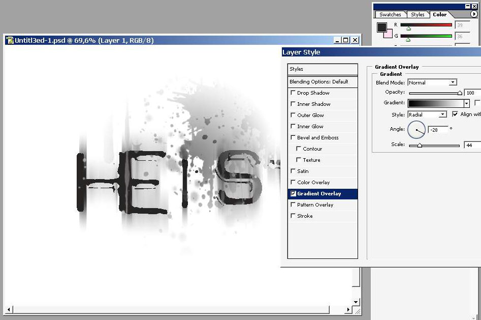
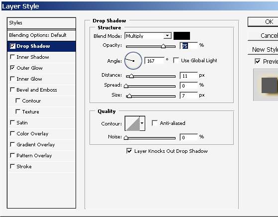
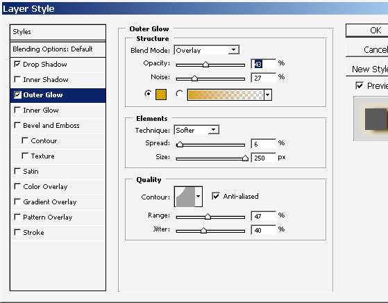
1st layer style: I would live it like this as a finished logo design bit we will continue.
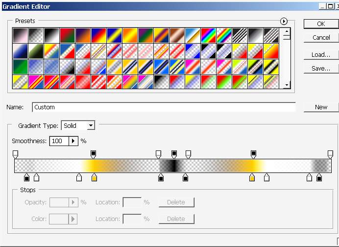
The Gradient is Radial.
Inner bevel with light source in the bottom corner:
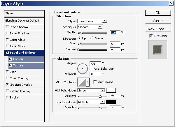
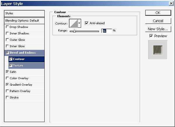
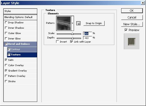
Contour is ranged 16%.
With unique texture scaled 358% (depends on the document resolution too).
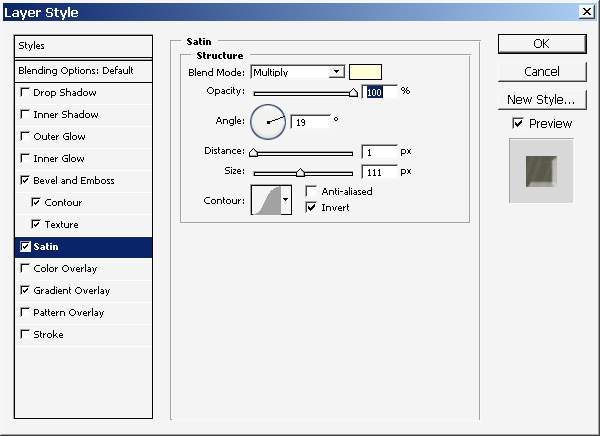
Light yellow satin put to multiply and angled 19 degrees.
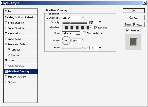
Such kind of gradient with screen mode and in reflected style.
Now make a layer just below the text layer (one that is motion blurred)
And overlay it with pattern.

Here what we got as a result of all layer styling and texturing.
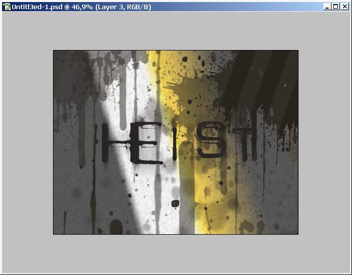
Now I will put some color to my image.
And another thing I’ve copied the Blood splatters layer flipped and here it is.
Here is my layer position.
See the difference.
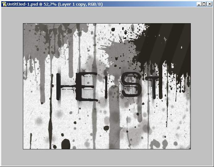
Now the blood lines come from the bottom too.
We will work now with color. Create a layer positioned right here.
And overlay it with gradient. This one:
And here we have it.
A little bit of layer styling to this layer.
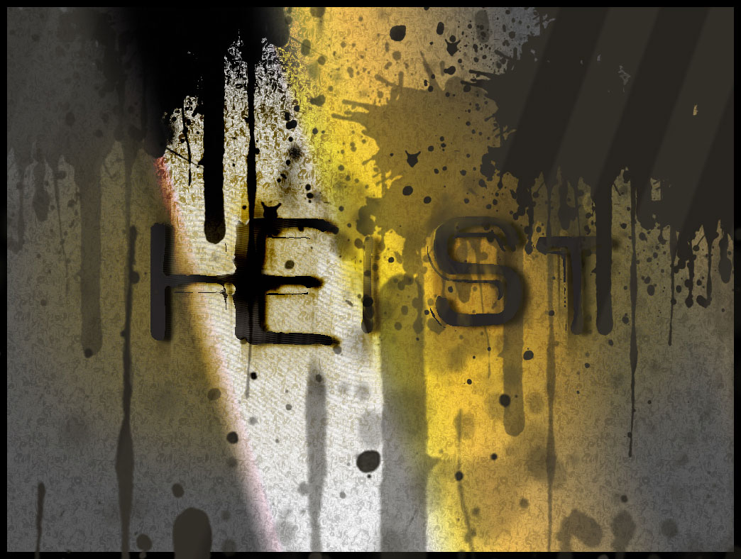
When I’m watching this picture I imagine that the white in the light ray.
And
the letters should be lighter there. So create another final layer
above the last gradient layers. A paint a little bit. Just make people
understand that this is a sun light ray.
And we are done here.
I did a little manipulation bit I think that the picture will be better without it.
Comments