
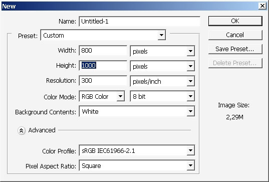
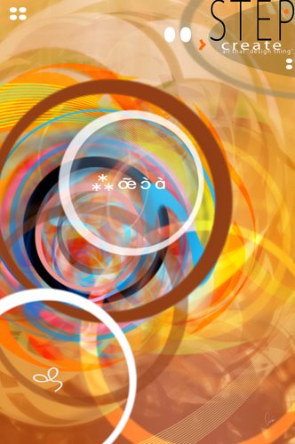
Graphic vector designs
Hello again and welcome in making real vector like wallpaper or design, call it as you like. So for this tutorial we need
some custom brushes that were created in my last tutorial and imagination. I think that is it. Moreover try this one because
it is definitely is very challenging to fit the color palette right.
So let’s start.
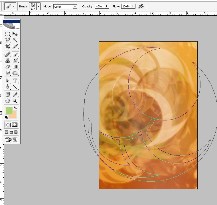
First thing I’m going to do is to paint a little bit over my background to form a pattern and maybe this will help me to go

further and faster.
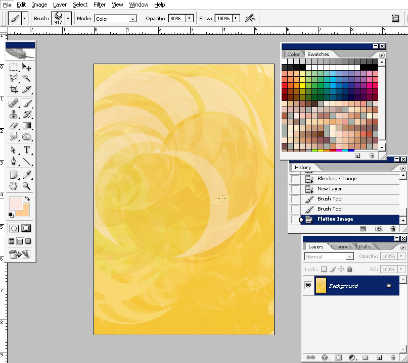
So here is my background and I really thing that it is supposed to be darker. It can be done by an adjustment layer but on
the other side you could get messy in the end while merging the layers.
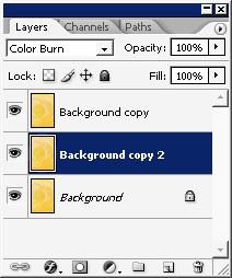
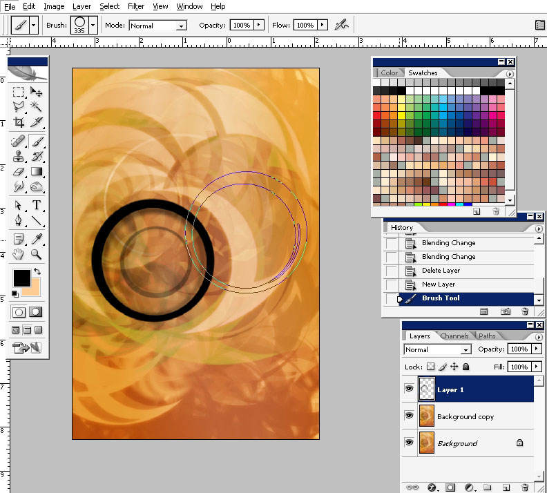
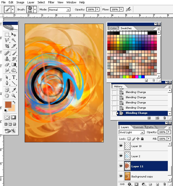
I did it my way. Flatten the image and create several copies of the layer. Play with blending modes. I found very attractive
if the top layer is set to multiply and the middle one is set to Color burn.
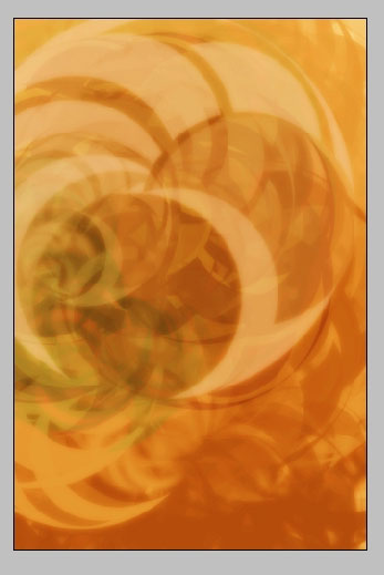
So I’m also adding some different from yellow and orange color using the brush set to COLOR blending mode.
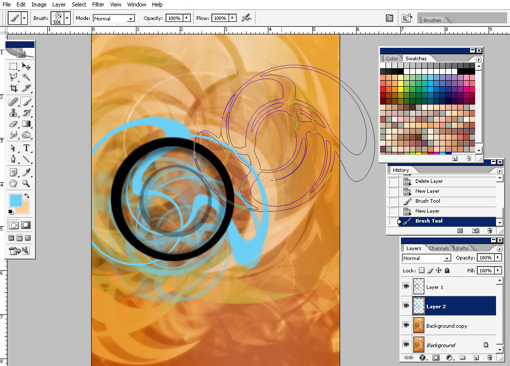
Next step will be the elements:
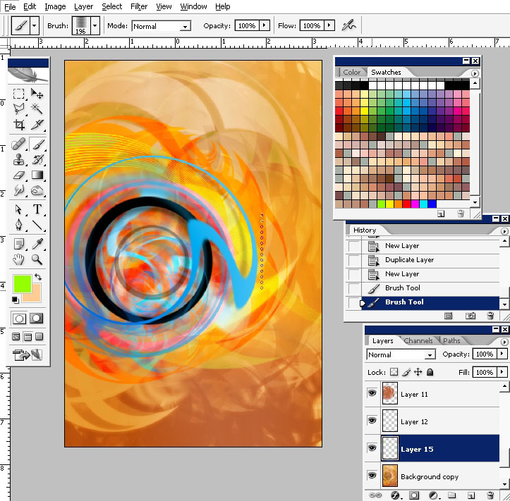
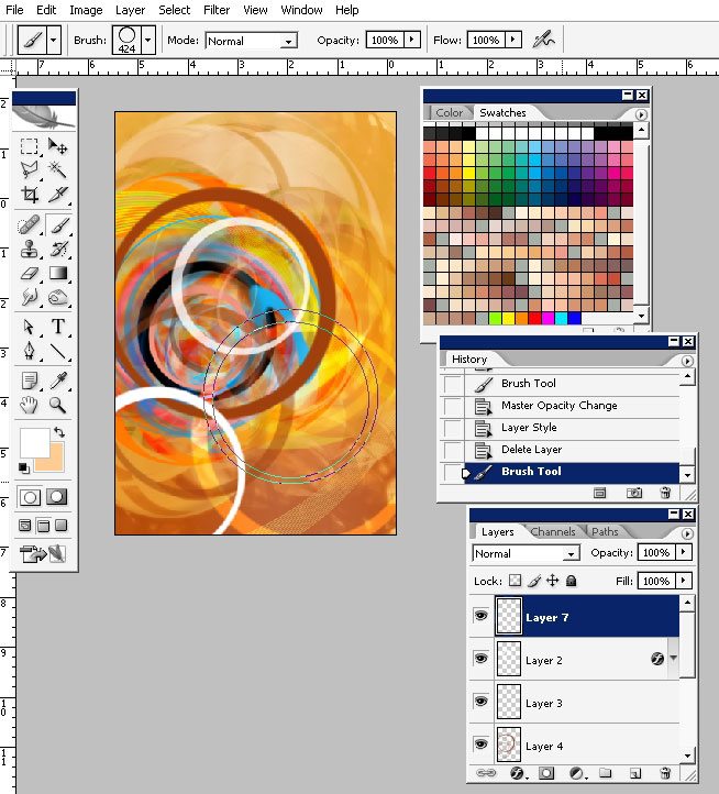
So let’s drop some elements on the foreground. As we are dealing only with y mini brush set we have not a lot of stuff to
choose from. Let’s experiment a little bit. I think that the black circle will be like a marking and will help us to go
further.
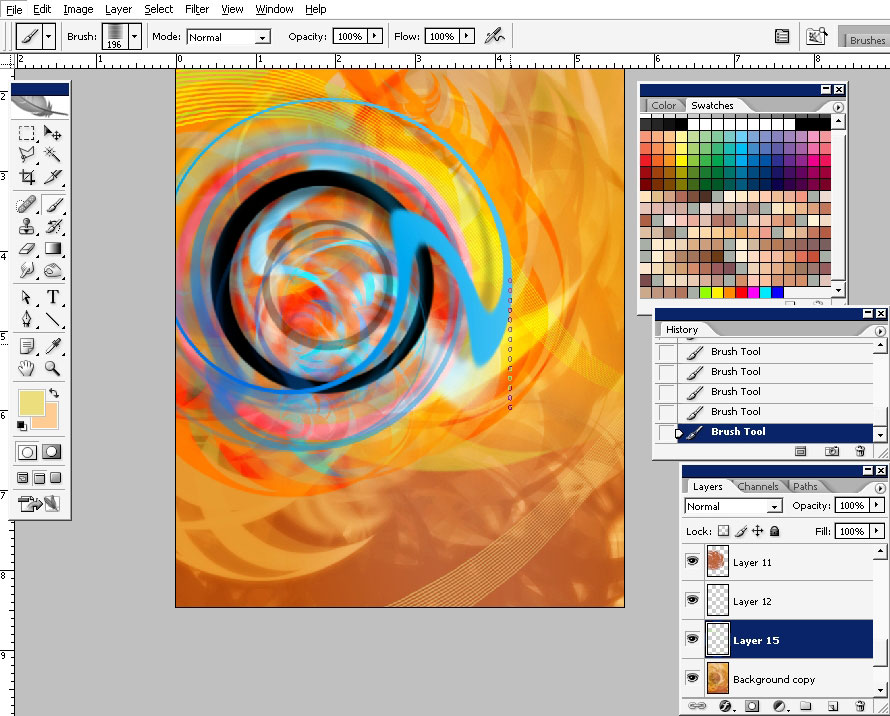
To add some contrast to the picture use highly saturated colors.
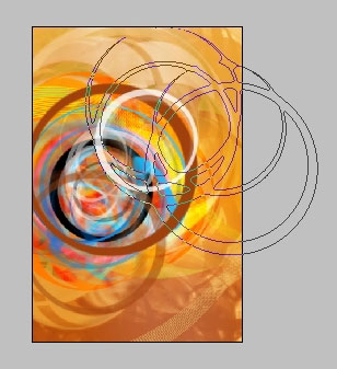
Try to add some other forms like the simple blurred lines. In such kind of designs, as I think, you must do some sort of
chaos.
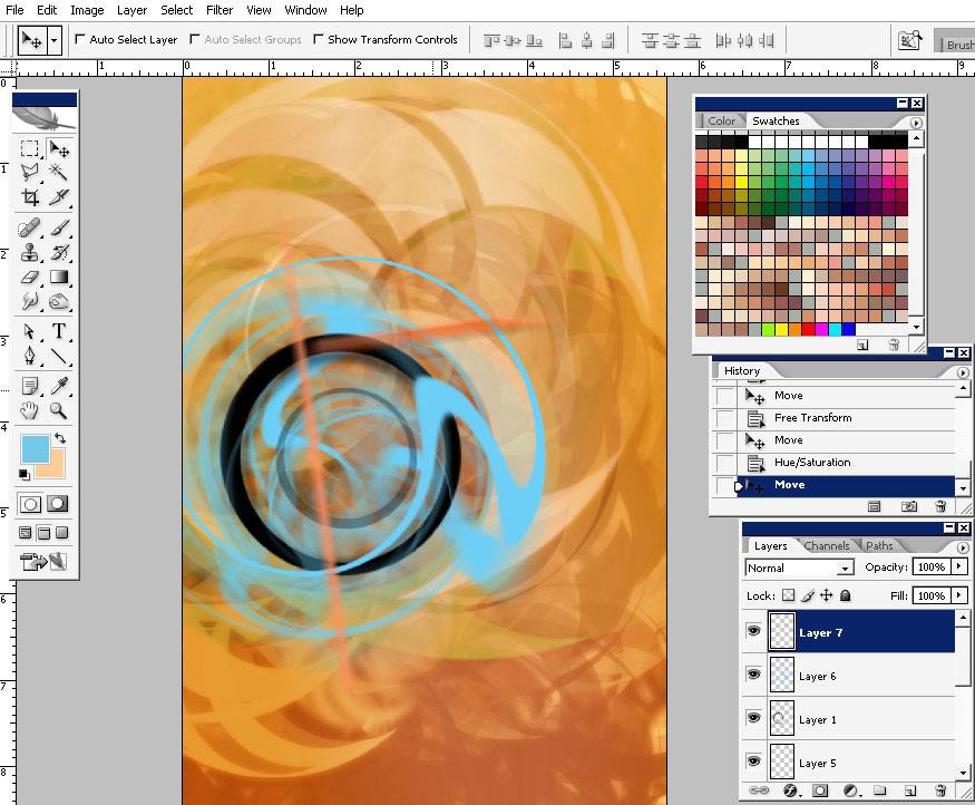
Adding even more contrast underneath the basic black shape.
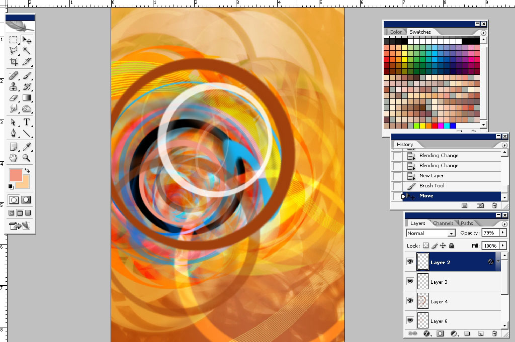
Try to work with some other brushes.
Add more elements which color you think contrasts with the rest. I think the white will be a nice decision. In fact this is a
just great decision.
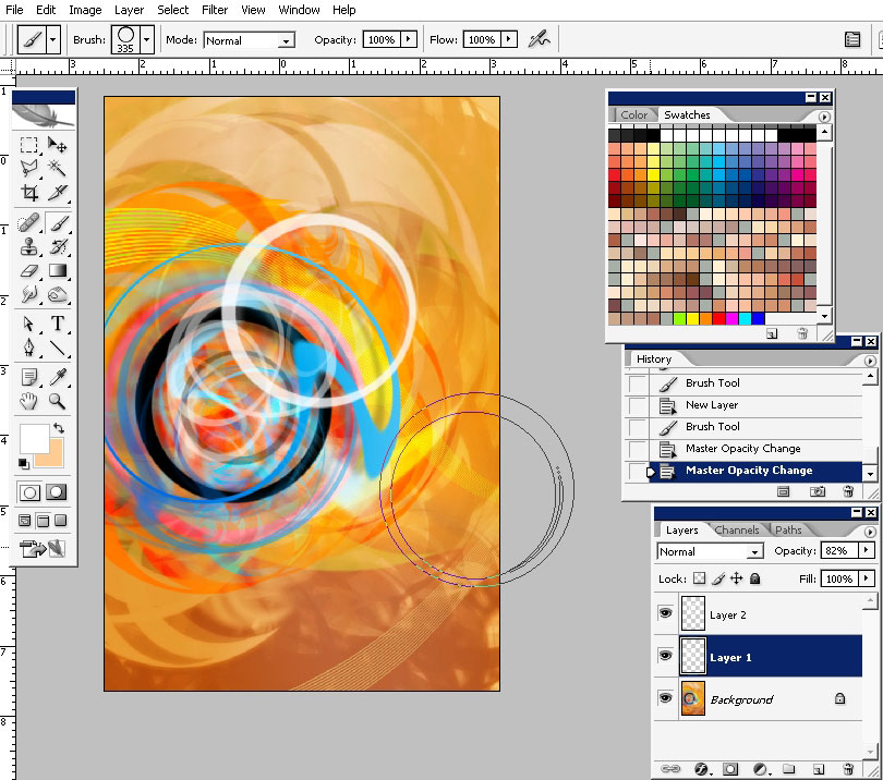
A little bit brown.
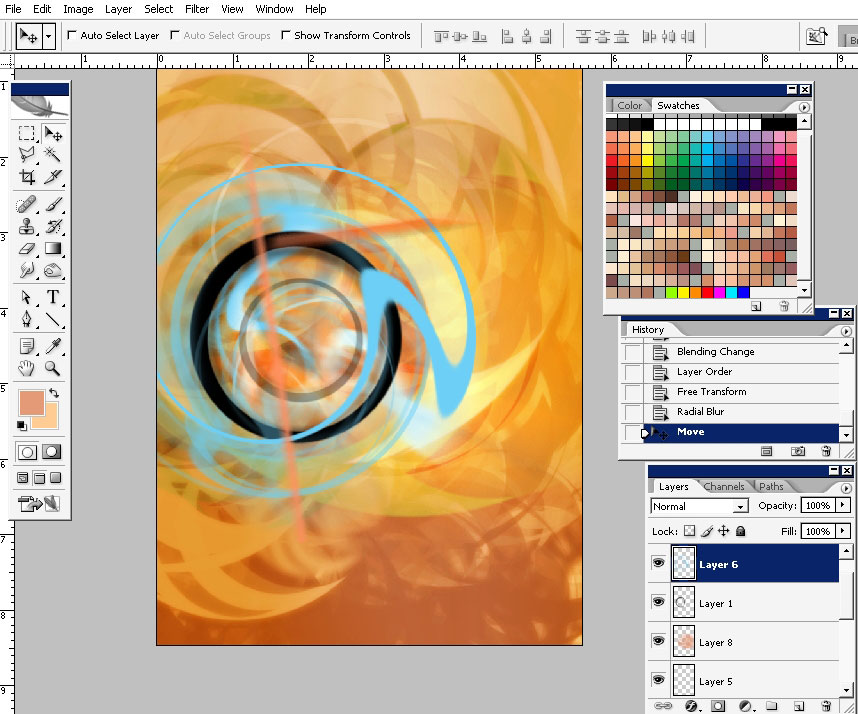
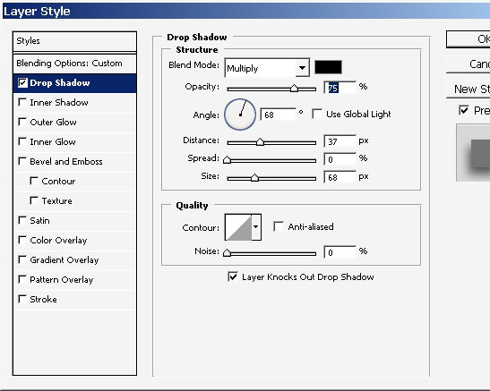
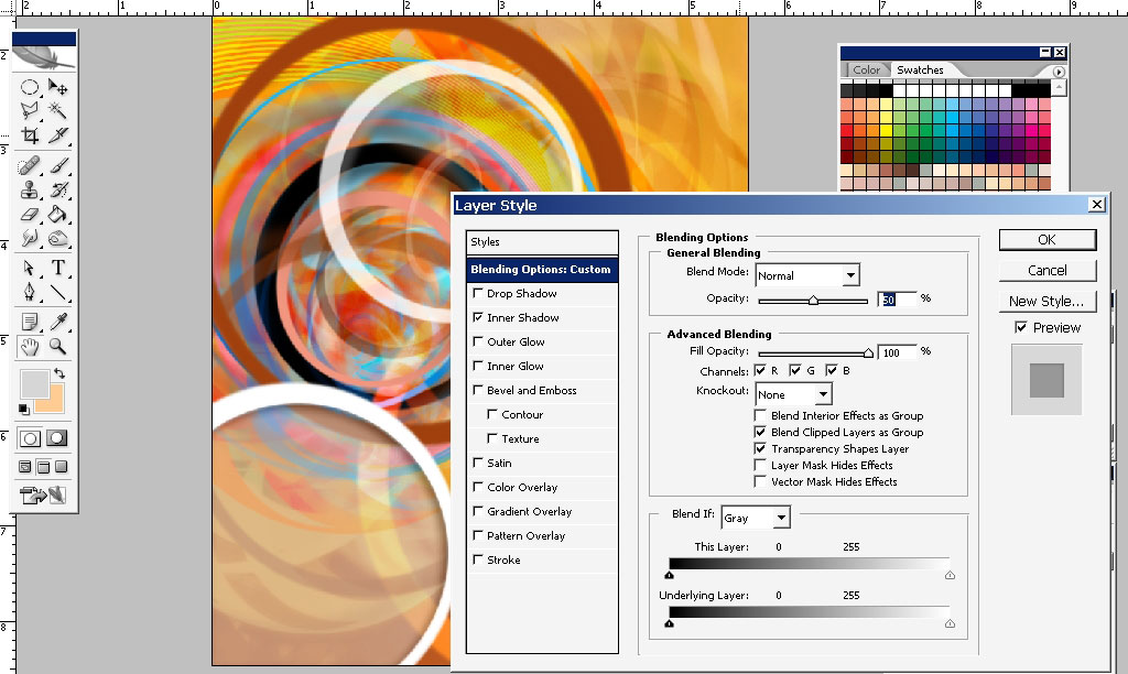
Now I think you made the white circle on a separate layer because we are going to apply some layer styles to it.
One more white. I really like the white color there.
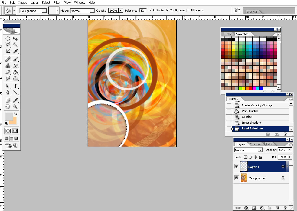
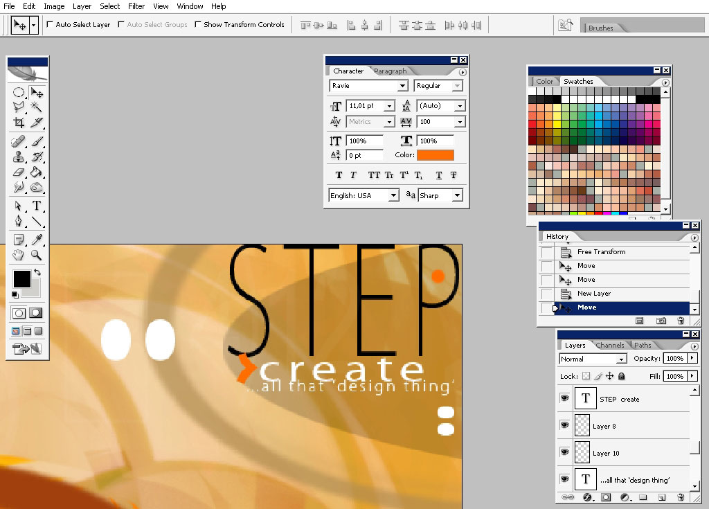
So our design here is done I think, but I think the text should be there too. Flatten the image (once again) .
Make a selection the matches the white circles. Create a new layer and lower the opacity down.
Drop an inner shadow and lower the opacity.
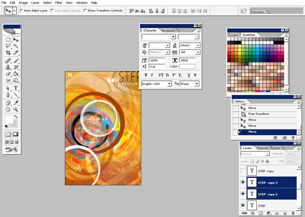
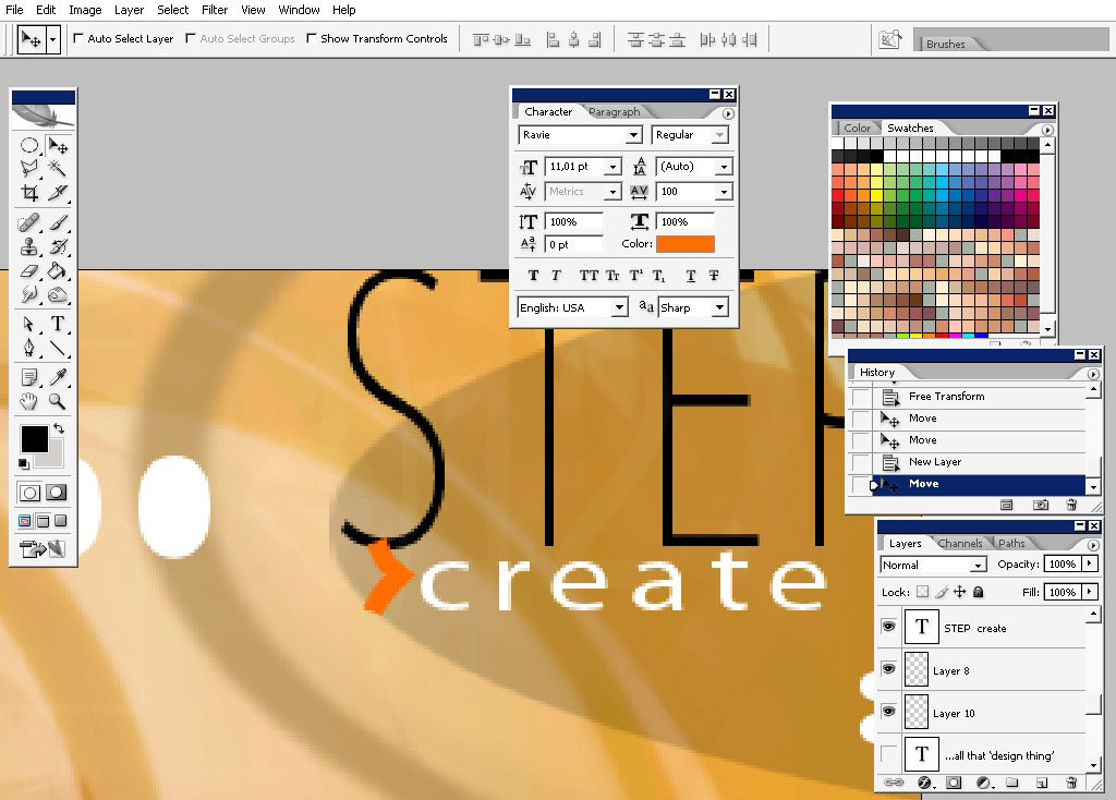
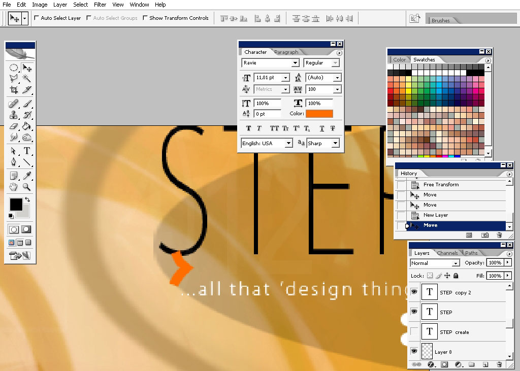
I’m beginning my text work here. As you can see I’m using simple fonts, maybe even standard and simple color variations.
So that is it: hope you learn something and remember to practice your skills in as much as possible design mediums as
possible.
Piece!
Comments