
From Tweening to Hand-tuning – Technique Matters
From Tweening to Hand-tuning—Technique Matters
Flash was originally created as a 2D (character) animation tool, at a time when computers were really slow compared to today’s standards—14.4K was the standard connection speed. Not surprisingly, this particular content category is also well-suited for mobile phones, which today, in many ways, resemble desktop computers from only 10 years ago in terms of bandwidth and memory limitations.
Slick motion graphics in Flash often require high frame rates to look smooth. You can see people using 30, 60, or even 100 frames per second (fps) to achieve the appearance of smooth motion with tweens. Try that on a mobile phone, and chances are you will only see something stuttering across the screen, which is anything but a pleasant experience.
Hand-tune It
The secret to successful animation with Flash Lite is what I call hand-tuning, the process of manually adjusting your animation keyframe by keyframe. A lot of motion in real life doesn’t happen in even increments, nor does it follow an easing curve. Even if it does, we often don’t perceive it that way. You need to trick the human eye, so the animation appears where the eye expects it to be, not where it should be placed according to some mathematically correct calculations. Believe it or not, we often don’t see what’s really there. Filmmakers, and in particular cartoon artists, have exploited this phenomenon for over a century. When an object doesn’t move fast enough to fool your sensory systems into believing that you are seeing a continuous motion, you need to exploit the phenomenon commonly known as persistence of vision and present your eyes with what they expect to be there.
In the case of motion graphics, this translates into the following: Start with tweens as you usually would, then hand-tune your animation, frame by frame, to get the result you want the user to experience. This is a lot of work, but it’s well worth it.
Likewise, you will have to adjust your thinking when creating animated transitions for mobile devices. For example, a cool transition that shows a transparent object speed onto the screen will work just fine on a desktop monitor, but on a mobile phone it will run in slow motion and ruin the effect of a smooth transition. In this case, you have to focus on what is the most important part of the effect that you really see. Most likely, you will not even notice something transparent is moving. You just assume it is transparent, because it is transparent at the end. However, while the object is moving, all you really see is a shape and a color.
The first step to making this transition effect smoother is to use a less intense effect during the motion—for example, tint the object or reduce its brightness, and only set its transparency one frame after the transition has completed. The object may still be graphically too complex for a smooth animation. So you may be able to use only a flat shape with a color for the actual transition. What you are starting to create here is called a blur in cartoon jargon (see Figure 1). Instead of moving something at 50 fps, you create what your eyes perceive during the motion. Don’t combine transitions with changes in transparency or other graphical effects; this will slow down your animation.

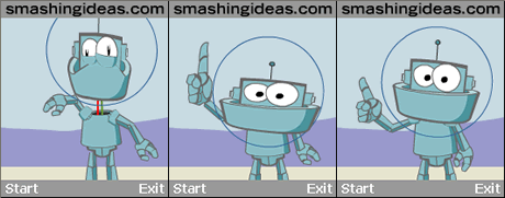
Figure 1: Head snaps off the body, everything is squished on its way down, then all parts snap into place.
Unless you have done this before, you may not believe me. You may think that users will notice that the object moving across the screen is not the real object. Get over it, they won’t (if you do it right)!
You need to realize that you’re creating motion here, not a series of static images.
Exaggerate
Another very useful technique that you can borrow from cartoon animation is called exaggeration. This technique enables you to create animations that feel more “natural.” Exaggeration can be part of a blur, or ease the transition from a blur to the real object. For example, try this exercise: Ask someone to point quickly with his or her hand at an object on the other side of the room. Pay very close attention to where you think the person’s hand is pointing. Repeat this a few times and you’ll notice two things: While the arm is moving, you don’t see the arm moving at a certain speed—it becomes a blur. When the arm is stretched out, the hand, for a brief moment, will appear as if it is a bit closer to the object than it actually is, and then it snaps back to its real position.
In the example of a moving object in your Flash animation above, you may want to move the object just a bit further than it should move. Then, in the next frame, put it in the proper position—think of its motion as resembling a rubber band that snaps back. Or when you create a zoom-in effect, make the object just a tad bigger at the end of the transition, and then set it to the intended size one frame later (see Figure 2).
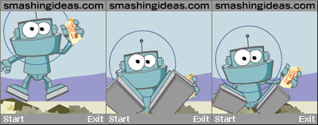
Figure 2: See how the feet turn larger than life then snap back.
You can take this one step further by adding a flash effect: Insert a frame where the object’s shape is completely white. Or even add just a white rectangle on top of it for one frame. This “blink” really draws the eye’s attention, yet you’ll only see what’s there now, not how it got there. In other words, it helps to complete the transition.
Don’t get discouraged when you try this for the first time, and it doesn’t come out right—it takes a little practice. Don’t forget to test your effect on the target device.
In the end, when you’ve done everything right, what you’ll get is smooth-looking animations at 10 to 15 fps on a mobile phone. You may even use these techniques on your desktop projects.
Comments