
Fine-Tuning
Fine-Tuning
Eventually, using all the tricks available – and compromises where necessary – a working layout is achieved. Now we can concentrate on fine-tuning and refining the design to make it more effective. In particular we want to add impact to both graphics and text to help them to catch the reader’s eye. The cover image of a building sloping at an incredible angle is already striking, but the effect can be highlighted further by angling the two items of cover text in the opposite direction. The only way to do this is to skew the text blocks using PageMaker’s control palette.
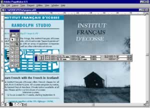
The same cover image is used again on the main spread’s centre panel, but simply repeating the photo would be a wasted opportunity. Instead new life can be breathed into the image by, for example, cropping in hard to the image’s centre of interest, the building. Instead I decided to literally give the image a different spin by rotating it which immediately grabs the eye by breaking out of the grid. Even better, by straightening the building and rotating the surrounding image, the photo is given a new internal tension and intriguing logic of its own.
Another eye-catching image effect is achieved with the Christian Dior fashion image. Originally this was a rectangular photo but the image’s centre of interest, the figure, is a much more interesting shape. If the shape was regular, such as triangle, we could isolate it by drawing a polygon and combining it with the image using PageMaker’s masking command (Ctrl + 6). In fact as the shape is very irregular, I have had to use Photoshop’s more advanced masking controls. To get the text to then flow around the figure, new points can be added and repositioned on the text-wrap boundary by clicking and then dragging with the select tool.
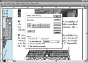
Looking at the text to see if we can add impact is less fruitful. Normally I would consider adding dropped capitals or emboldened introductory paragraphs to add interest and colour to the layout. Each of these “text breaker” features would usually act as entry points, enticing the reader to start reading. However, as our layout is already broken into sections and full of interest, they would be more likely to act as distractions and so give an excuse to stop reading. The one feature I have used is a couple of bullets to mark off small exhibitions. These have to be added with PageMaker’s Bullets and Numbering command – a dialog so clumsy and dated that it would embarrass a shareware word processor.

Comments