
Designing with CSS in Dreamweaver MX 2004 – Part 3: Setting Up the Content Div
Setting Up the Content Div
The next element to design in the XHTML document is the container for the main content, appropriately named content. You can let the div flow in the natural order of the XHTML page:
- Open basiclayout.css in Dreamweaver.
- Type #content p{
- Type
- Type margin: 20px;
- Type }
Your content selector should now look like the following:
#content p{
  margin: 20px;
}
Now switch basiclayout.html to the Code view, locate your closing nav div tag, and add the following code immediately below it:
<div id="content"></div>
Dreamweaver’s code hints will help you as you type the div. It really is necessary to switch to the Code view to complete this type of work because the placement of the div within the code is critical.
Add two p elements to the content div in the XHTML document. You can use the Lorem Ipsum extension to insert some filler text or you can use any other method to add text. Once you have added your two p elements and the filler text, your code should look like the example shown below. In your case add plenty of filler text into the two p elements—enough to make them both wrap over several lines:

<div id="content">
 <p>Some filler text in here</p>
 <p>Some filler text in here</p>
 </div>
Now that you have some real content in the page, you can remove the element you placed earlier in the wrapper div. The filler text will hold the page open (see Figure 14).
Figure 14. Margin settings around the p element
Every page needs a header or two. Create two headers: h1 for the top of the page and h2 to go above the second paragraph.
If you need help doing this, you can refresh your memory by reading the discussion in Part 1 (scroll down to the “Defining the h1 Type Selector” section). I suggest you give h1 a font size of 130% and h2 a font size of 110%. Don’t forget to enter zero for padding. Also, add a margin value of 20 pixels to all four sides to match the p element you defined earlier.
Once completed, your two selectors should look like those shown below:
#content h1{
  color: #003366;
 padding: 0;
 margin: 20px;
 }
#content h2{
  color: #003366;
 padding: 0;
 margin: 20px;
}
Insert an h1 above the first paragraph and an h2 above the second in basiclayout.html and preview it in your chosen browser (see Figure 15).
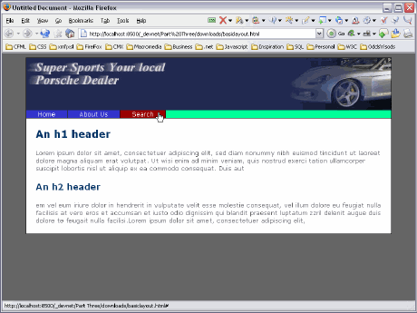
Figure 15. Headers added to the sample text
Adding Floating Images to the Design
To complete the layout of the content area, add a couple of images to accompany the information on the page. In Part 2 of this series I discussed how you can float an image within its containing element. In this instance, that containing element is the p element. Look at the amount of text in each p element in Figure 15. Make sure you have a similar amount of text (it doesn’t need to be absolutely the same, just close enough). You don’t want the text to wrap around the image, so keep it fairly short.
Use image1.png and image2.png from the downloaded sample files and create two float classes, one for a left float and another for a right float. If you need a recap on how to do this, review the section, “Working with Floats” from Part 2.
Once you have created your float classes, they should look like the code below:
.leftimage{
 float: left;
 margin-right: 10px;
 border: 1px solid #000000;
}  .rightimage{
 float: right;
 margin-left: 15px;
 border: 1px solid #000000;
 width: 150px;
 }
Preview the page in Firefox (see Figure 16). Internet Explorer gets this wrong, so be sure to preview it in Firefox.
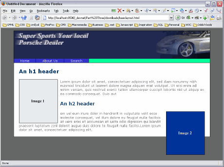
Figure 16. Float element problem rendered correctly in Firefox
When you float an element, it is removed from the document flow, as I discussed in Part 2. Because the two images are floated, the content around them has no bearing on where to be placed. Consequently, the h2 element moves up alongside Image 1 and Image 2 flows out of the bottom of the content div.
On first glance, this would seem to be a minor disaster, if not a major one. In this instance, you really want to keep each section of text and its accompanying image as a single entity. You don’t want the bottom text content flowing up to meet the first set of content, and you certainly don’t want the image from the second content section flowing off the page. Let’s see how to fix this.
On the next page you will learn how to clear elements to prevent this problem occurring.
Comments