Designing with CSS in Dreamweaver MX 2004 – Part 3: Defining the Link Style
Defining the Link Style
Once again you will use the descendant selector to pattern-match this XHTML document. You confine this link style to any links that reside within the li element within the nav div.
- Place the cursor below the
#nav ul liselector in your style sheet. - Use the code hints to add the
#nav ul li aselector. - Type #nav ul li a{
- Type
- Type color: #FFFFFF;
- Type background-color: #3333CC
- Type text-decoration: none;
- Type padding: 0 25px 0 25px;
- Type border-right: 1px solid #000000;
- Type text-align: center;
- Type width: 9em;
- Type }
Step 4 scales the font size on the body selector to 80%. I find this is a good default size for body text. I would set this for font-size on the p element as well, which you will see shortly. Step 5 removes the underline from links and Step 6 applies padding to either side to give the links a button appearance and make them clickable along their width. Step 7 adds a border to the right of each link, which provides an end to each button and a start to the next one.
IE 5.x for Windows has a problem with the padding when it is set on the link. To combat this, I center the text alignment so the link text is in the center of the button. I also provide a width so that IE 5.x for Windows gives a button-like appearance for each link. If IE 5.x for Windows applied the padding on the link, then the width would not be necessary.
Your completed selector should now look like the following:
#nav ul li a{
  color: #FFFFFF;
 background-color: #3333CC;
 text-decoration: none;
 padding: 0 25px 0 25px;
 border-right: 1px solid #000000;
 text-align: center;
width: 9em;
 }
You’re almost done. The final selector in the navigation system allows a change of background color when the user hovers the mouse over the buttons:
#nav ul li a:hover, #nav ul li a:focus{
 background-color: #990000;
 }
Earlier in the series I described grouping selectors and separating each one with a comma. This is exactly what you are practicing here. You set a selector that changes the background color of the buttons on hover, or on focus if a user uses Tab to move around the page with a keyboard or some other pointing device.

Note: Internet Explorer does not support the focus section of this selector. To see it in action, you need to preview it in Firefox or one of the other browsers that provide true standards support.
Add the navigation div into the XHTML code. I’ve added three list elements and made each of them a link: Home, About Us, and Search:
<body>
 <div id="wrapper">
 <div id="banner"></div>
 <div id="nav">
<ul>
 <li><a href="#">Home</a></li
 ><li><a href="#">About Us</a></li
 ><li><a href="#">Search</a></li
 ></ul>
 </div>
   </div>
 </body>
Lists can be rendered oddly in browsers. Therefore, it is necessary to make them “ugly” to prevent erroneous spaces from being added, which can throw your navigation out of line. Notice the non-breaking space in the wrapper div to prevent it from collapsing when you preview your work. You will remove this as soon as you enter the content div into the page:
<div id="nav">
 <ul>
 <li><a href="#">Home</a></li
 ><li><a href="#">About Us</a></li
><li><a href="#">Search</a></li
></ul>
</div>
See how I placed the closing > for each li item on the next line of code? Make sure you do the same because this negates the erroneous spaces that can appear in list menus. Once you have added the code above to the basiclayout.html document, preview it in your browser of choice (see Figure 13).
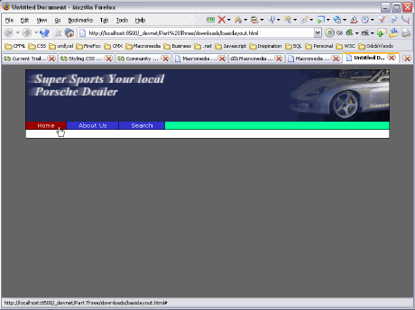
Figure 13. The completed list navigation
In Figure 13 you can see the green background of your ul element. It spans the width of its containing element—the wrapper—without having a width of its own declared. This is the default behavior and is worth bearing in mind when laying out your pages in the future.
On the next page you define the content div.
Comments