
Designing with CSS in Dreamweaver MX 2004 – Part 1: Margins, Padding, and Doc Types
Margins, Padding, and Doc Types
Starting with version MX 2004, Dreamweaver adds a complete doc type to all pages you create. This was another big step in the right direction from Macromedia because an incomplete doc type can cause many problems with your CSS.
A complete doc type is shown below. In this case, the doc type is a Transitional XHTML doc type:
<!DOCTYPE html PUBLIC "-//W3C//DTD XHTML 1.0 Transitional//EN"
 "http://www.w3.org/TR/xhtml1/DTD/xhtml1-transitional.dtd">
 <html xmlns="http://www.w3.org/1999/xhtml">
An incomplete doc type will cause your browser to drop into what I call “quirks mode.” This will very quickly cause you to lose your hair and any sanity you may have if you are aiming for a pixel-perfect design. Ensure that your doc type is a complete doc type at all times. If you are using a version of Dreamweaver prior to MX 2004, you may want to view the available doc types you can use at the World Wide Web Consortium (W3C).
You should also be aware that if you have anything above the doc type in Internet Explorer—even a comment—the browser will revert to quirks mode. This, of course, does not include the use of any server-side code you may have above the opening XHTML tag. Server-side code is, of course, processed on the server and not returned to the browser in the manner I am talking about here.
What Are Margins and Padding?
Margins and padding exist within many of the XHTML elements you will use within your design work. Figure 2 represents a <p> element. The text is clearly visible and the red area surrounding it indicates the presence of a padding value. The black border around the red area indicates the boundary of the <p> element. Increasing or decreasing the padding value causes the red area to expand or contract to suit the value you provide in your CSS rule for the <p> element.
The blue area represents the margin value. The margin value pushes away other elements surrounding the <p> element as long as they are in the document flow. (I will talk more about the document flow later in this series.) Increasing and decreasing the margin value determines how closely the elements surrounding the <p> element are allowed to encroach upon it.

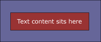
Figure 2. Margin and padding example
So to recap: Padding resides within an element and margins reside outside the element.
The Syntax of CSS
CSS is a simple language. It is easy to read and takes very little time to grab the basics and start building your own style sheets. After you complete this section of the tutorial, you will have a good understanding of the syntax and various elements that exist within CSS rules. I begin by creating a simple rule that clearly lays out the structure for you to see:
selector{
 property: value;
 }
Selector
The first part of the rule is called a selector. The selector represents a structure that can be used as a condition to define how an element looks in the browser.
Property
The property section of the CSS rule defines a specific area of the structure, such as padding or margin properties.
Value
The value section of the CSS rule defines a measurement—in general terms. If you are defining how a <p> element may look, the property might be a reference to the <p> element’s padding and the value might be 10 pixels:
p {
 padding: 10px;
 }
A CSS rule may, of course, contain many property and value pairs. Each would perform a specific task within the structure to provide you with the look and feel you want for the rule.
Property and value pairs are separated by a colon (:). The space after the colon is optional. Immediately following the value, you have a semicolon (;). The semicolon is said to be optional after the last property/value pair in your CSS rule. However, I prefer to leave it in place.
That is really all there is to CSS syntax; it is as simple as that. While it is always good to know your code, it is also good to know that Dreamweaver writes the CSS rules for you, as you shall see shortly.
Longhand or Shorthand?
When you write your CSS rules, you have an option of two different writing styles: longhand and shorthand. Dreamweaver allows you to set your own preference for the writing style. Here are the steps to access the Dreamweaver’s CSS preferences:
Select Edit > Preferences, or use the Control+U shortcut. In the Preferences dialog box, select the CSS Styles option in the Category list (see Figure 3).
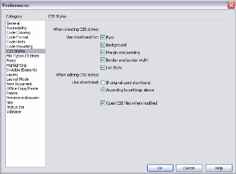
Figure 3. Setting your CSS writing preferences
By selecting all the Use Shorthand For options, as well as the According to Settings Above option, you tell Dreamweaver to write your CSS rules in shorthand. That’s fine, but what is the difference between longhand and shorthand writing styles?
The obvious answer is that shorthand creates a smaller file. Shorthand allows you to condense your rules in such a way that you can assign multiple properties and values in a single line. More importantly, you can write your rules and modify them faster—less work all around.
To show you how this is achieved, I will write the same CSS rule in longhand and then again in shorthand. The difference will be obvious. Once you are familiar with shorthand, I will show you how it can be condensed further to reduce the amount of required information.
Let’s begin by creating a CSS rule that redefines the margins of the body element, first in longhand and then in shorthand. Go to your external.css file and type the following longhand code to set the body margins:
body{
 margin-top: 0;
 margin-right: 10px;
 margin-bottom: 0;
 margin-left: 10px;
 }
Right under that code, type the following shorthand version of the same code:
body{
 margin: 0 10px 0 10px;
 }
There’s quite a bit of difference here. Using the shorthand method, you do away with the need to describe each side of the body you want to affect in the property side of the rule. By simply declaring “margin,” you avoid having to declare each margin property within your CSS rule. You also are able to apply the values in a single line of code. This reduces the CSS property from a four-line affair to a single line.
Delete both the longhand and shorthand code you just wrote.
How does the browser know which value is for which side of the body element? Simple. The browser takes the order of the values into consideration and then applies them accordingly. Reading from left to right, the values are applied to the top, right, bottom, and left margins. In this scenario you would have a 0 margin to the top and bottom of your page, while the left and right margins would have a value of 10 pixels.
You can further reduce the shorthand rule as follows:
body{
 margin: 0 10px;
 }
When the browser comes across a rule like this one, it knows that the values are pairs of values. The first value is taken and applied to the top and bottom margins while the second value—10px in this instance—is applied to the left and right margins.
If all the margins of the body are the same value, you set the value only once:
body{
 margin: 0;
 }
In the rule shown above, a value of 0 is applied to all four sides of the body element. Zeroing the margins on the body element is a good practice, at least initially. Browsers tend to apply default margins on the body (and other elements) if they are not explicitly stated. Explicitly zeroing the defaults and setting the margins you require is the best way to guarantee that browsers apply the margins you want. Leaving the defaults can result in unexpected displacements within your page because default margins vary greatly from browser to browser.
The Opera browser is a special case because it also applies a default padding setting on the body element. This means you need to zero off the padding on the body as well as the margins to get a consistent cross-browser starting point. To achieve this, your final body rule would look like the one below:
body{
 margin: 0;
 padding: 0;
 }
The above rule provides you with a cross-browser zeroed body element—a good base from which to start when laying out pages.
Now that you understand about zeroing your page margins and the importance of a full doc type, return to your external.css file and add the body rule to your style sheet using the Dreamweaver user interface. The demo below walks you through the process.
Here are the steps reviewed in the demo:
- Click the New CSS Style button in the CSS Styles panel. The New CSS Style dialog box opens.
- Select the Tag Selector Type option.
- Select Body from the Tag pop-up menu.
- Select the
bodyelement. - Ensure that Dreamweaver has selected the correct style sheet in the Define In pop-up menu.
- Click OK to open the CSS Style Definition dialog box.
- Select the Box category option.
- Ensure that the Same for All options are selected for both Padding and Margin.
- Enter 0 in the Padding field.
- Enter 0 to the Margin field.
- Click the OK button.
- Look at the code that Dreamweaver enters in the external.css file. Although Dreamweaver has added a value for the measurement (px), this is not necessary for a zero value.
- Select the
bodyrule and delete it. You will next use the Dreamweaver code hints to write your CSSbodyrule. - Type body { . As you begin typing, the code hints appear.
- Select Margin from the code hint list.
- Enter a value of 0 after the
margin property: margin:value. - Press Enter to go to the next line of code and type p.
- Select Padding from the code hint list.
- Enter a value of 0 after the
padding property: padding:value. - Select File > Save to save the file.
It is possible to reduce the amount of characters in a color value within your style sheet rules. If a color is defined in three pairs (for instance, red is #FF0000), that could be written as #F00, where each character represents a matching pair. The F represents FF and the single zero in the second and third positions of the value indicate 00 and 00. This technique can only be applied if the color value contains three pairs. Other examples of this would be #FFFFFF (white) written as #FFF and #000000 (black) written as #000.
Alternatively, each color value could be set using the color’s name:
color: red;color: black;color: white;
The syntax of CSS is a flexible one. In many cases, it allows you to use different syntax to achieve the same results.
In the next section, we will look at how you can lay out your web pages correctly by using semantic markup.
Comments