
Dark wallpaper
In this tutorial we are going to do some design (things). We will create wallpaper quite dark as it is now. We will also do some text work to fill our design so this mean we’ll go through illustrator as well.
So let’s begin this one.
Fill the background with almost black tone.
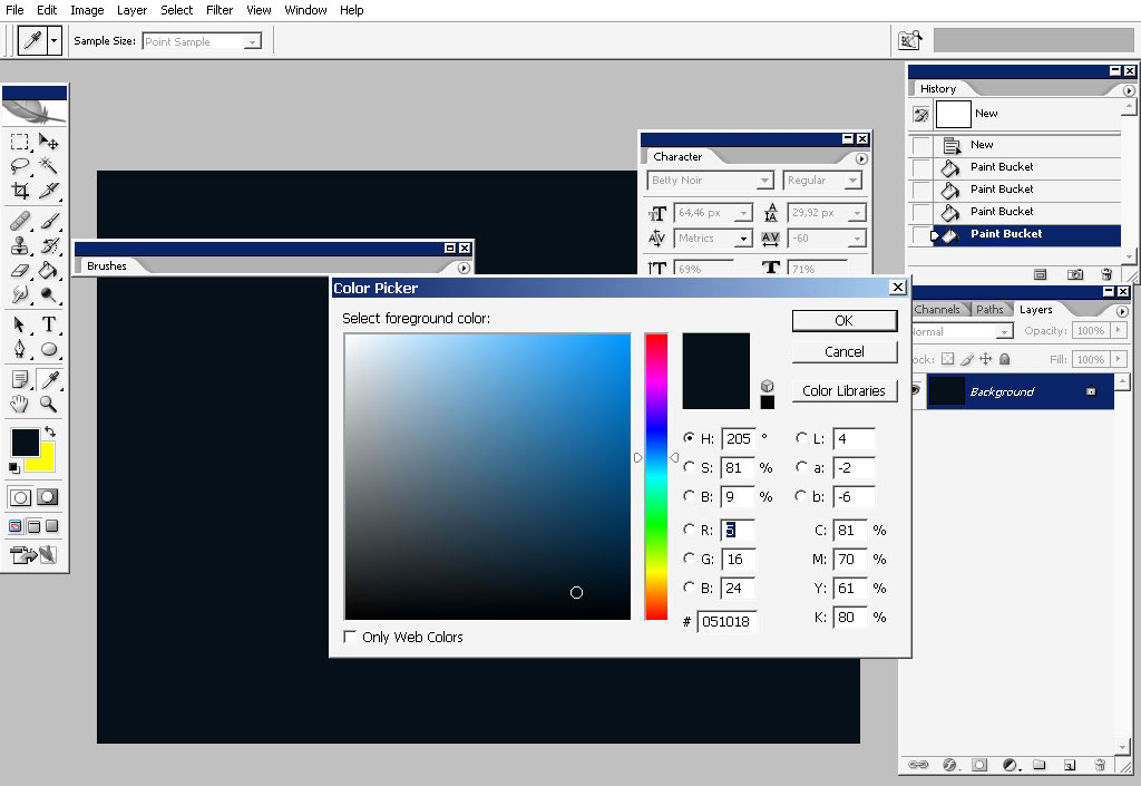

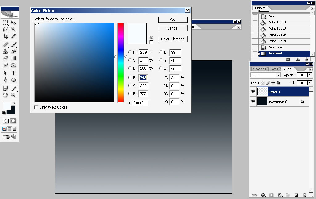
Create a layer and select Tone to transparency gradient. The color in this gradient will be:
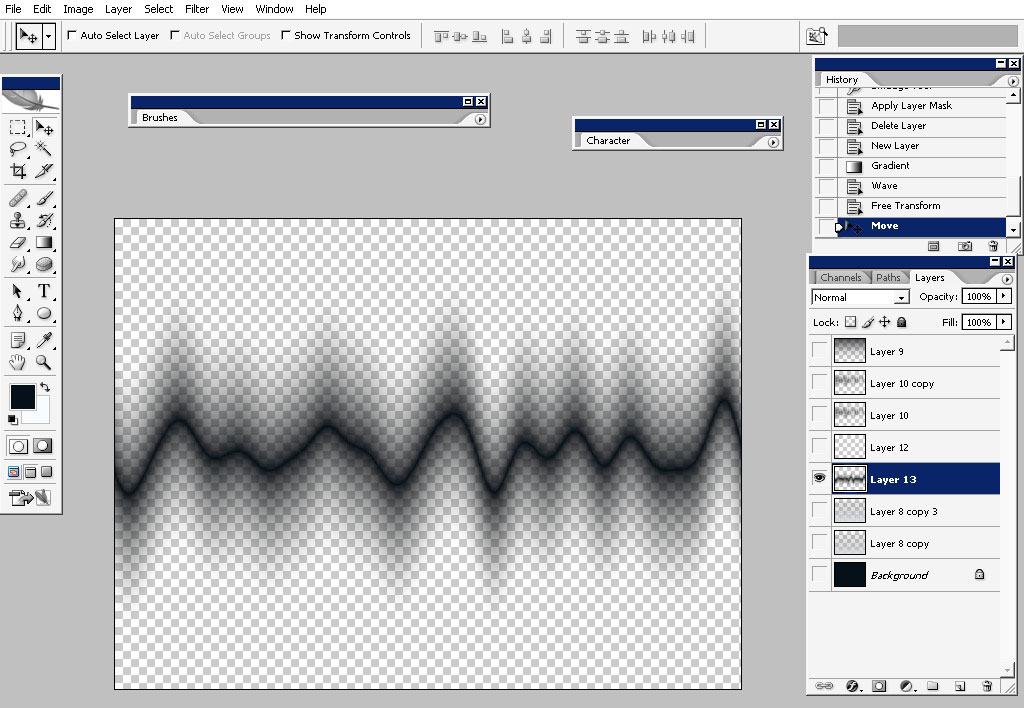
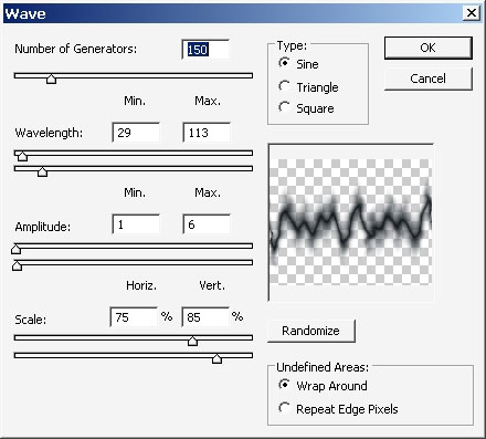
Apply some waves to it, just a little bit. This filter can be found in Filters > Distort > Waves.
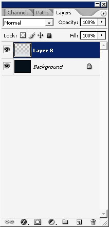
Now create a new layer and fill it with light tonal fill. We only need this, to create a dark shape then.
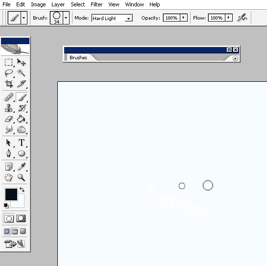
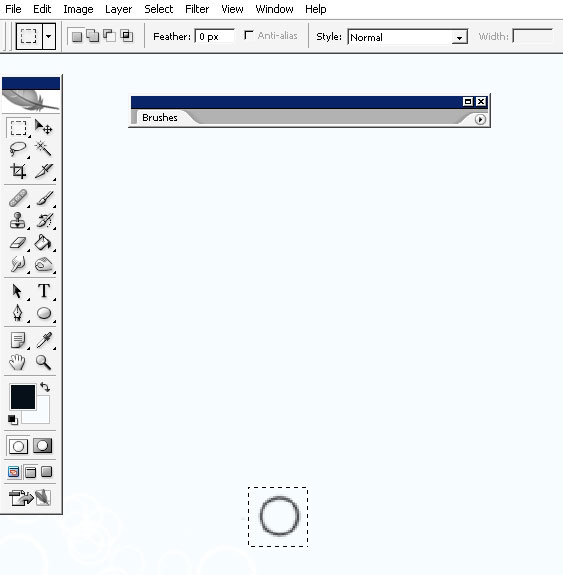
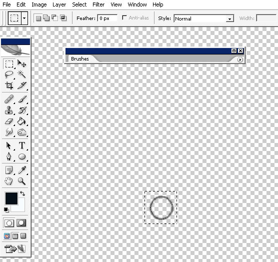
Create a shape – a circle shape. Select an area around the shape.
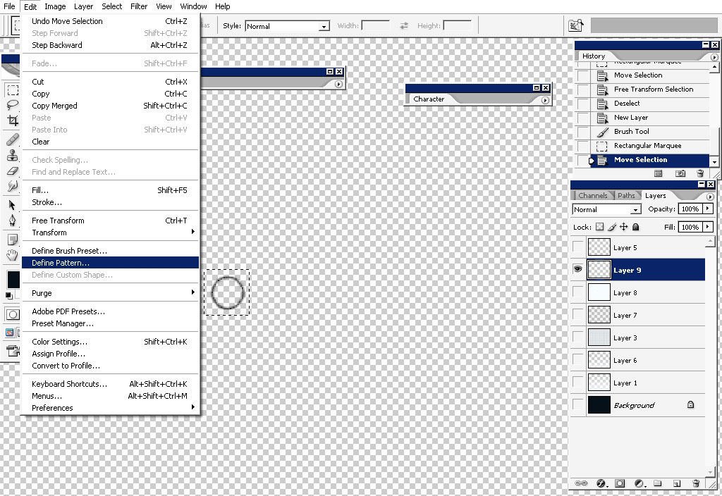
Turn off all the layers leaving only the layer you have shape on.
Define this shape as a pattern.
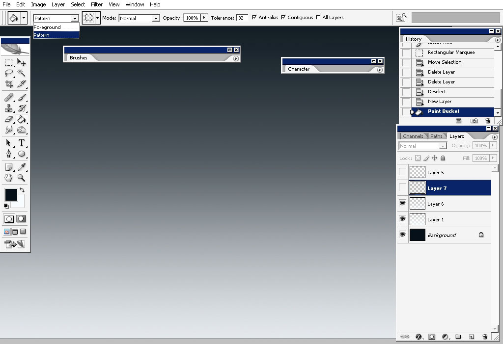
Now turn on all the layers now and create a new black layer. Fill this black layer with pattern fill – you can see where it’s hidden (upper left corner)
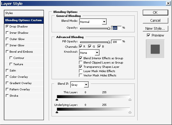
Now I did this entire define pattern thing to apply some layer styles directly on my shapes.
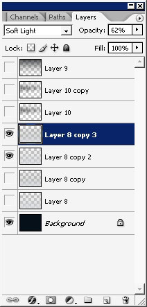
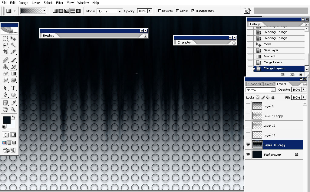
Merge all the layers together. Leave only the dark background and the pattern layer.
You can create even more with the help of some filters along with playing with layer blending modes.
But it isn’t the idea I had in mind.
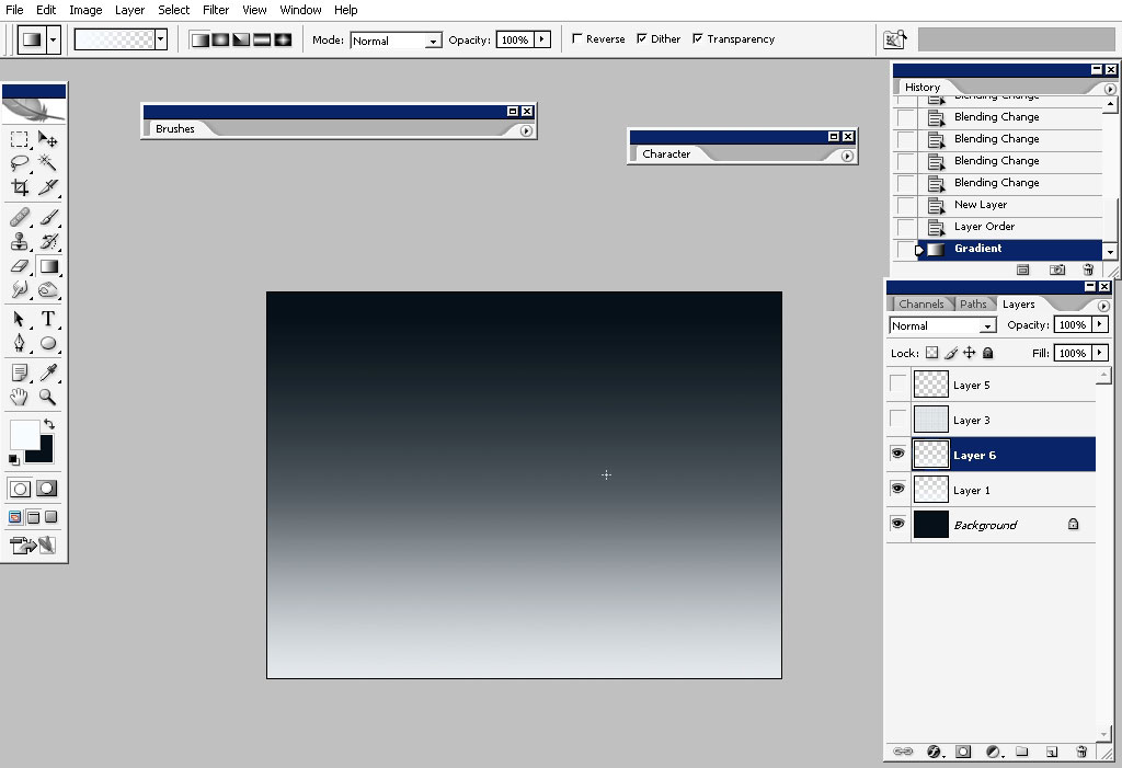
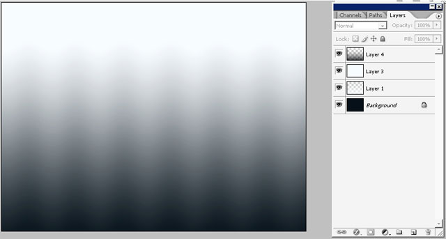
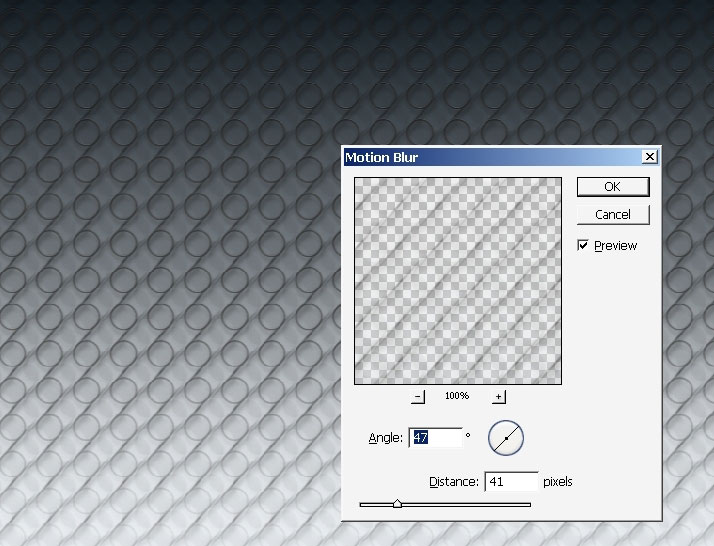
So just create a new layer and apply reflected horizontal, black to transparency gradient.
Then apply wave filter to this gradient.
Then look what happened
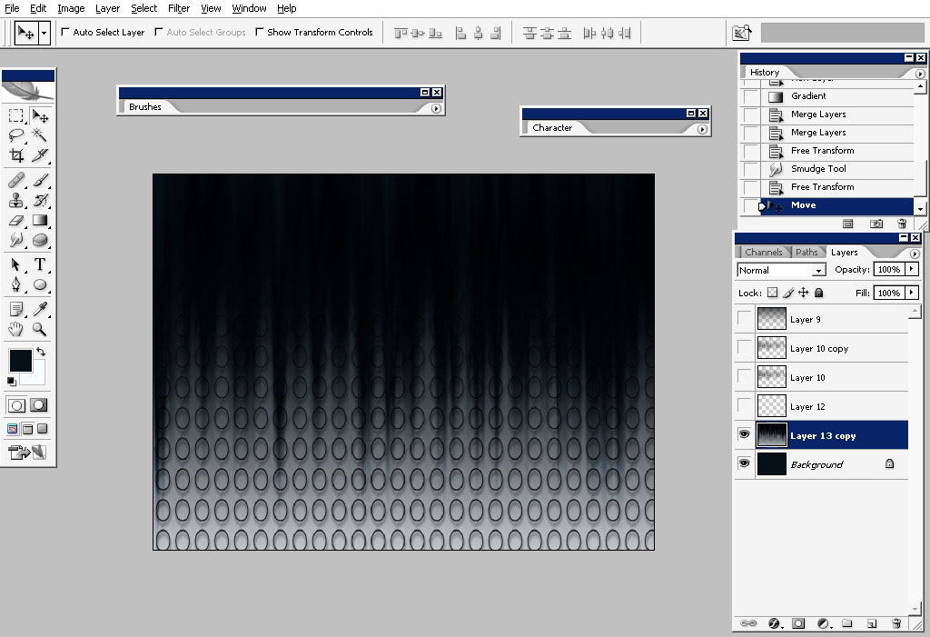
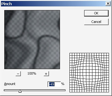
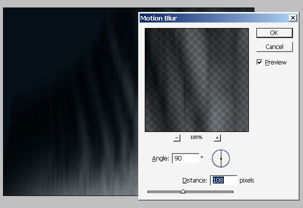
Now, really did a lot of perspective transformations to this layer. I’ve also applied some filters to it, for example this one too.
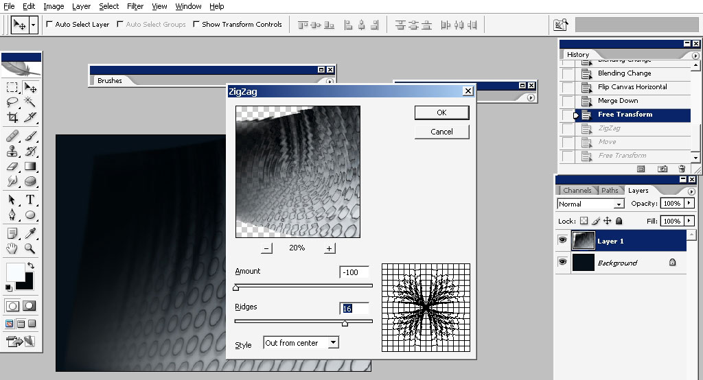
And then this one:
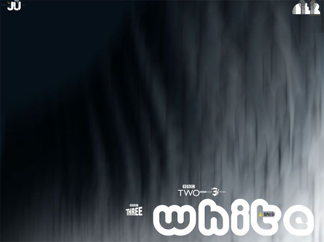
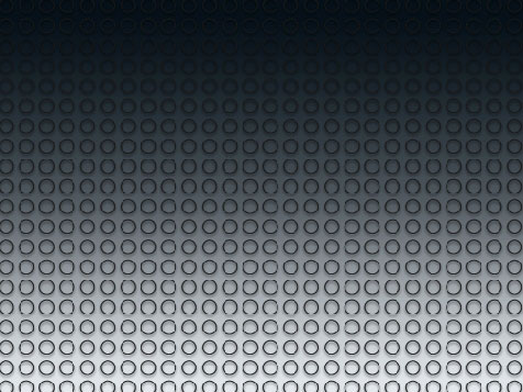
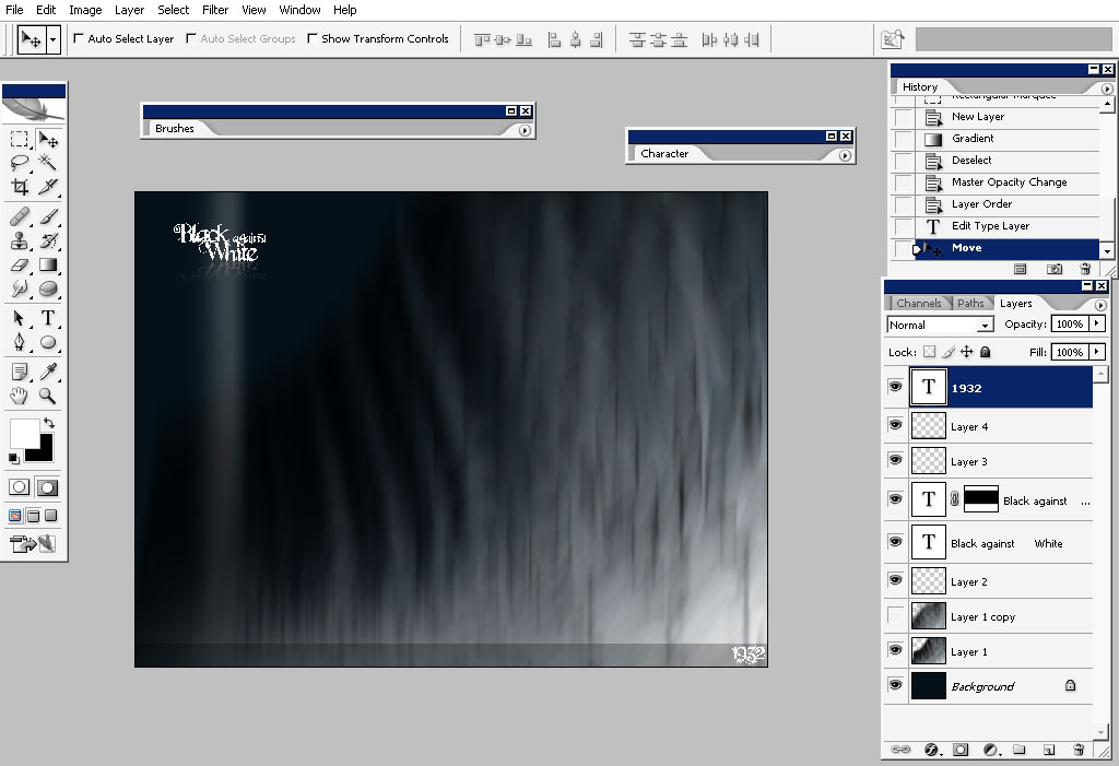
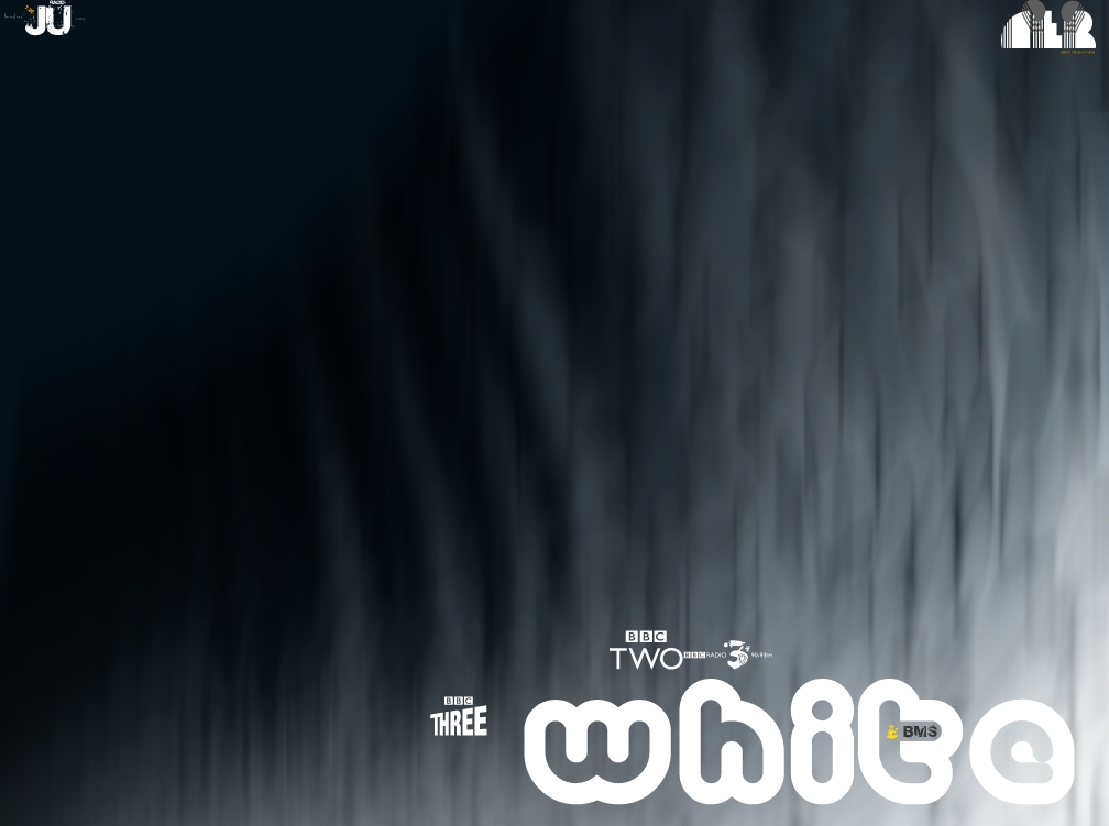
And finally I’ve reached the background that somehow was on my mind all the time.
I’ve did a quick text preview to define where I really like the text to be. And that is probably it for PS part. Let’s take this background in Adobe illustrator or Corel Draw.
So here I am in illustrator already doing one of the text styles to my design.
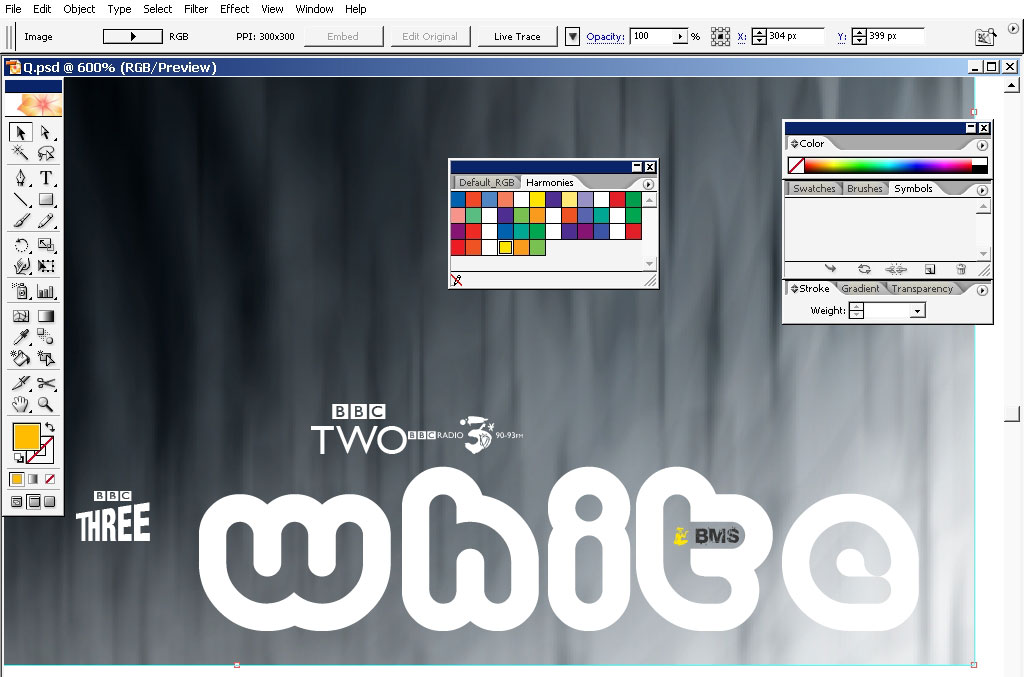
I’ve combined the several fonts here – the one with the BBC is one of the Figure fonts or something – meaning that instead letters you type with logos or something like that. I’ll use it for my own purposes.
The word – white is done with a retro like font with small logo in the T. I used 3rd different font for that.
The next text work is one as a little logo in the upper left corner – so really like to do as radio station logo or something like that but I’m still going to use only the white – black or grey and yellow colors in it.
And here it is:
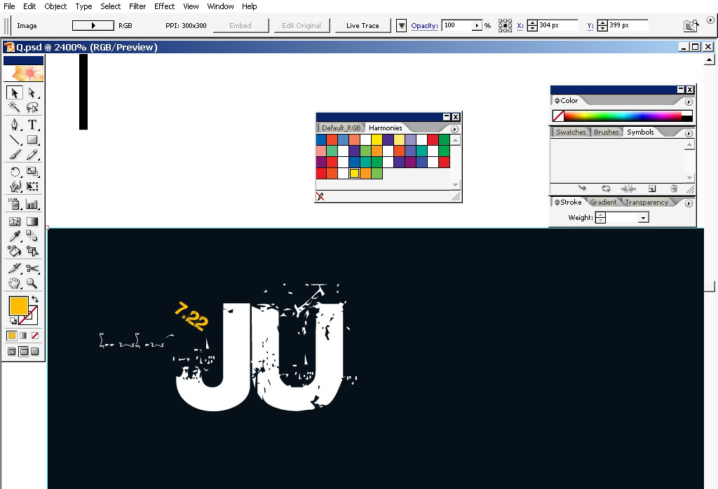
And the third stile it completely retro like.
So in the end I really like to say that the more you practice the more ideas you may get during the process, so do this and you will come with something even better.
See you next time.
Comments