Creating Experiences for the Small Screen
Creating Experiences for the Small Screen
Before you get started, you have to realize how small the screen you’re targeting really is, not just in terms of resolution, but also in terms of physical size. Take a business card, and cut it in half—that’s about the size you are designing for.
In technical terms, the display on a Symbian Series 60 phone is 176 x 208 pixels, which is only slightly bigger than the screen size of other Flash Lite–enabled phones. Of course, if your application is not running in full-screen mode, you have even less room to work with.
Note also that mobile phones use a vertical aspect ratio. Desktop content is often created with a TV-like 4:3 or a cinematic 16:9 aspect ratio. On a small device screen, you don’t want to waste a pixel, so you really have to think through the design of your animation to make the most of the limited space.
Don’t let the resolution of the device fool you; it is actually pretty decent. However, each pixel is smaller than on your desktop monitor, because the dots-per-inch (DPI) ratio is higher. You can easily verify that by holding the phone next to a Flash movie of the same size on your desktop monitor. Depending on your monitor, the phone display will have only some 70% of the screen real estate.
Be Bold and Simple
The problems you face are further complicated by varying lighting conditions. Mobile phones are used everywhere—indoors, outdoors, at night, and in bright sunlight. For mobile Flash content in general and animation in particular, this means you have to be bold—don’t focus on small details. Users most likely will not even notice subtle smooth color transitions, unless they just can’t tell anymore what they are looking at. Pump up the contrast. Even if that bothers your color-sensitive eyes, your users will thank you for it.
For animations, focus on close-ups, while avoiding panoramic views and pans (see Figure 3). A lot of detail will be lost on the small screen, and as great as your animation may look on your desktop computer, if it can’t be seen on the mobile phone the user will not appreciate it.
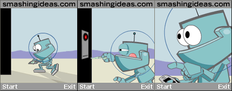
Figure 3: Close-ups immerse you in the content.
The same principle holds true for the artwork itself—the simpler the better. Stylized cartoonish characters will come across much better than realistic looking ones; the details will be lost in translation. The more you’ll try to squeeze onto the small screen, the more you’ll lose. Instead, focus on what is really important and leave out space fillers.
Test and Test Often
Before I continue, a word on testing. Nothing can replace frequent testing on actual devices. Ideally test your animation on different devices, because devices differ in performance, color depth, and sound. You won’t encounter memory problems on your desktop, or even get a glimpse of actual device performance using the emulators that you can use in Flash. Be warned that testing can be quite painful, because you can’t see how much memory is actually being used. Unfortunately, this means a lot of trial and error. You should never assume that your content will work on a device until you actually have tested it on the target device. Developing for a device means at times rather tedious work. However, if you think about what you can actually put on these tiny devices today, you know there is a reward for your effort.
So take testing your animation (or application) on your target devices seriously. Don’t wait until the very end only to be in for a big surprise.
Comments