
Colouring Your Abstracts
In this tutorial, you’ll learn how to get some really deep colours applied to your images, and their far more effective than the Hue colouring that most people new to photoshop use.
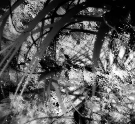
1. Do whatever image you will be applying colour to. I took an old image, cropped it for size conveniance, and took off the colour balance layer. Generally, if you were doing an image, you would want to apply the colour to the render/base of the image pretty much as soon as you pasted it/finished creating it into the document. It helps the brushwork a ton
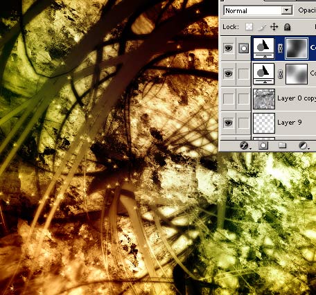
2. Now go to Layer > New adjustment Layer > Color Balance, and click OK. Now you will have this:
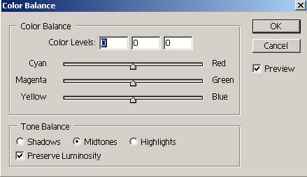
3. The midtones are the base of the colours, and the highlights/shadows are the modifyers. So do the midtones first, then fiddle with the rest.
To get the firey styled colour, I used the following:
Midtones – +54, 0, -64
Shadows – +41, 0, -44
Highlights – +47, 0, -31
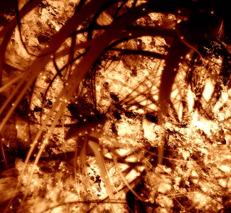

Fiddle with the settings, make your own colours
-EXTRA-
Want to blend two colours together?
1. Make one colour. Hide that layer, and make another colour layer on top of that. Then, unhide the second layer. You’ll now have a jumble of ugly colours, right? Well now, if you want a line defining the two colours, take the gradient tool, and select one of the layers colour masks. Then just gradient it where you want the line to be/how large you want the fades to be.
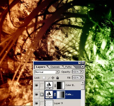
2.If you want to have it more blotched/your own design, take a brush, foreground colour as black, and brush on the masks.
Comments