
Color Replacement in Photoshop CS part 2
Creating the effect
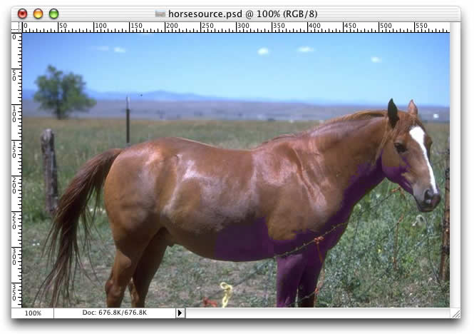
For our image, we’re going to be using the “Hue” Mode because it’s the most subtle. It doesn’t produce the most vibrant results usually, but it does allow you to match the subject to the overall lighting of your composition. In other words, it looks the most natural. We’re going to set the Sampling to “Continuous” because, typically, it’s the easiest to work with. We’ll set the Limits to “Contiguous” so that we don’t accidentally affect our background. My brush size will be set to 150.
For the first step, I’m going to turn off the Antialiasing option and set my tolerance to a low value–5 percent–to allow me to go in and take care of a few details. I want to go after the broadside of the horse first, but I also need to eliminate a couple of problem areas first. In my image, specifically, this is the barbed wire and colored strands that cross the horse’s front legs and chest and interfere a bit with the head. So I’ll just go over these areas with about three strokes to block them off from the rest of the image. That way, if I’m careless later on, they shouldn’t pose a problem. This process, shown below, took me three quick strokes.
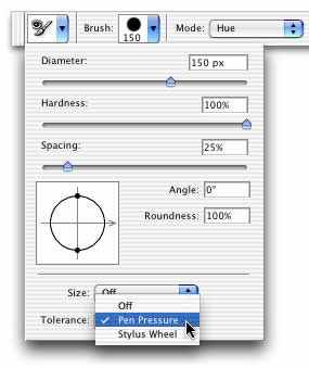
Now I can go after the bulk of the horse. I’ll crank up the Tolerance value to 20 percent. But I’m also going to want to vary the Tolerance in certain areas. And how can I do this without having to go back to the Tool Options bar every three seconds? Well, if I expand the Brush parameters, I get a whole list of options, including the ability to modulate Tolerance on the fly using pen pressure.
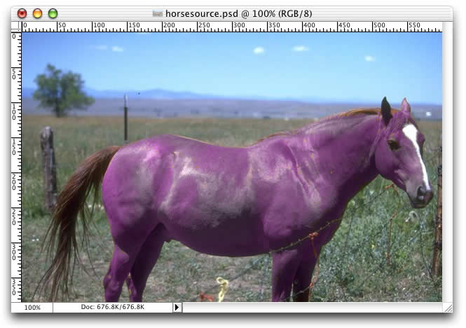
So now, with my Tolerance varied, I can apply fairly broad, careless strokes, easing up a bit on the pressure around the edges to avoid bleeding into the background.

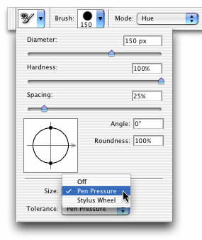
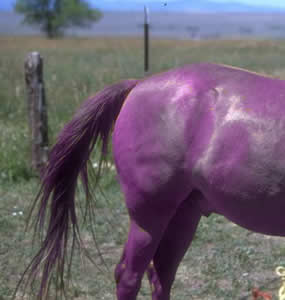
And now it’s time for the tricky part. This horse, being a fur-bearing critter, gives us some scraggly edges to deal with, specifically in the tail and mane areas. So now we’ll go in and add pressure sensitivity to our brush Size as well as our Tolerance.
Going over the tail lightly and trying to follow its general contours, I wind up with something like this after six strokes. If I study it later, I’m sure I’ll find a few areas that I’ll need to clean up a bit, but, on the whole, I’m pretty satisfied.
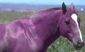
So that leaves just the mane. This is another trouble spot because it’s slightly blurry around the fringes and also blends pretty well with the dry brush background of the image. I gave it a once over with the same settings I used for the tail but was unhappy with the results. The effect was a bit too subtle. So, instead, I’m changing the Mode back to “Color” and hitting it again. Otherwise, I’m using all the same settings as in the previous step. And the result is much better, even if it does look a bit painted.
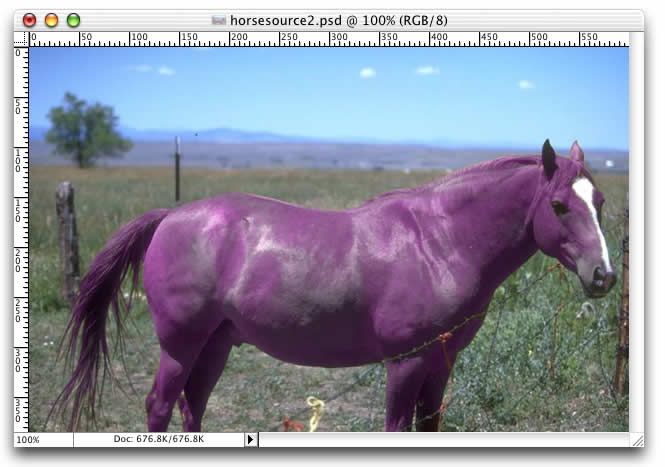
So all that’s left now is a slight amount of touchup. This whole exercise has been fairly sloppy. In other words, there hasn’t been much of a need to take care around the more complex areas because the tool itself handles most of the problems for us. Nevertheless, I will go back and fill in some details that I think were missing. For example, some of the edges on the animal were a bit sloppy. Some of the detail was lost in the tail area. Etc. So for my final few strokes, I’ll leave the tool in “Color” mode and add in a little extra color where I think it’s needed. Nothing major, but just paying a little more attention to the individual strands, but also careful not to overdo things. Even with a purple horse, there are limits to what a viewer will accept. And what I mean by that is that you want to be careful not to add in too much saturation where it’s not called for or too much luminance where there wouldn’t be any, such as in the shaded areas of the horse. If you don’t have the kind of vibrancy you were expecting, it’s not that big a deal. The effect is still there. But, if you want more, you should adjust the image overall when you’re finished, or just make a few touches here and there to bring out details where you want them. And hopefully, when you’re done, you’ll wind up with something like this, something that carries out the effect but that nevertheless maintains the qualities of the composition as a whole, particularly contrast and lighting conditions.
So that’s it for the Replace Color tool.
Comments