
Aqua Text
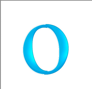
In this tutorial I will show you how to make that cool aqua text that is on my header. In the end you text will look like the O below.

The fist step is to make your text. I chose the font : Times New Roman, with a size 450, and a light blue color.

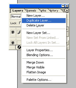
With your text tool selected. right click on your picture and choose “rasterize layer” Now duplicate your layer, by pressing the arrow on the layers panel and selecting “duplicate layer”

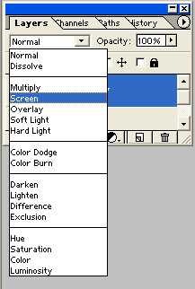
Set your new layer mode to screen.
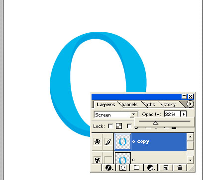
Position your new layer so that the light colord O is like the one below

Now set the opasity of this layer to around 30%
Now, select the outline of the original O. To do this, hold the control button, and click on your original text’s layer. Now go to select, invers to inverse your selection. Now go to your top layer, and press delete. What we just did was deleted the part of your duplicated that was sticking outside your original text’s boundires. Now go to your top layer, and press control + e to merge your two text layers together. To make sure you did this part right, hold control and click on your merged layer. If you did it correctly you should have a perfect outline of your O.

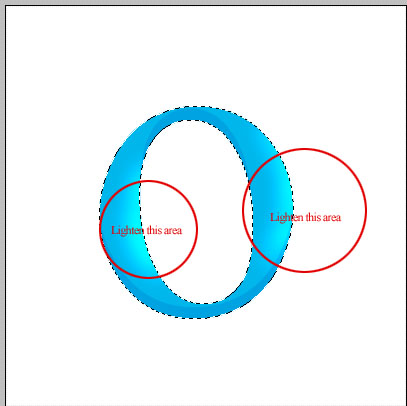
Now, take out your doudge tool. We are going to lighten some of your text to give it that aqua feel. So, lighten the areas that are marked below. If you are having trouble making it look right, then lower the exposer of your douge tool to around 50%
You should now have an image like this, with a total of 2 layers in your picture.

Now again, hold control and click on your top layer, this should give you an outline of your text again. Now that we have things situated, we are going to save this selection for later use. So, while you have your text selected. go to select> save selection and save it as whatever you want. Now, load your selection. If you did it correctly, you should still have an outline of your big O text.
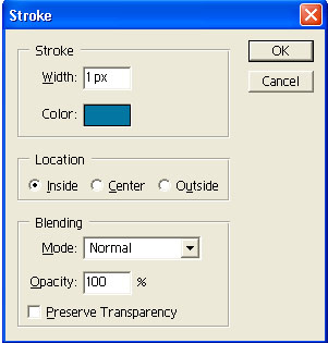
Now that we have that taken care of, while you have your text selected make a new layer. On your new layer, go to edit> stroke. We are goin to outline our O with a nice dark blue. Use the settings below, with a color close to mine.
You should now have an image like the one below:

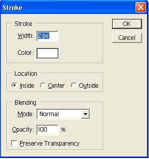
Now, make another layer. Again, go to edit> stroke, but this time choose a width of 2 px, and the color white. Use the settings below:
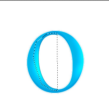
Now that we have our white outline, we are going to erase the white outline from the parts that the light would not be hitting your text. Sapose to the light is comming from the top left, in that case we are going to delete the white outline in left center of the O and the right outside.
To do this, take your polygon selection tool, and make a selection like the one below. And press delete.
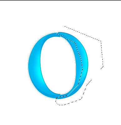
Now make a selection like the one below, and again press delete.
Now you should have an image like the one below.
Now, we are going to move the white outline. Move your outline, just slightly to the right, so it looks like mine below:

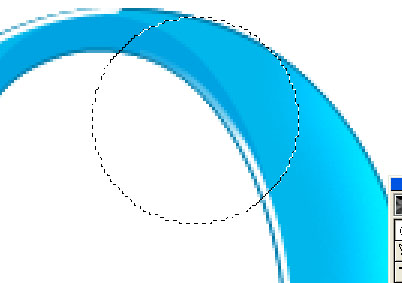
Now we got it position right, but it still looks a little chpy doesnt it? So, we are going to smooth out the edges. Zoom in by press control & +
Use your eraser tool to blend in the white outline like I have done in my selection below.
Do this to all end of the line.
Now are text is starting to look good. You should have something very similar to the text below:

Now I went back down to the original text layer, and darken a few spots to add a little contrast. You can do this as you see fit, I just added some darkness were the light wouldnot be hitting the image. Most likely around the areas were we have deleted the white outlie.

Now, do give it just a little more life I have added a little reflection of white. Just to make it a little more glossy. It is barely noticible now, but it does make a difference. To do this, make a new layer above all your previous ones. Load you saved selection and fill it with white. Lower the opasit of your layer to 15% and moove it a ittle to the right.

Now, make a new layer under your first layer. Load your saved selection once again and fill it with a dark blue. Now position to like the picture below:

Now go to filter> blur> gausian blur and set it to 4
You should now have an image like the one below.

Now I just added a little to the background to make it moreinteresting and we are all done!
Comments