Animated gradient bar button with transparency, shadow and gradient effects
Making great-looking multicolored bar buttons with transparency, shadow and gradient effects in Flash 8
Before starting, please note that this is a tutorial made for Flash 8 Professional. Some effects, like drop shadow and other blending fx, are not available in other versions of Flash.
While making this button, you will learn to:
- Make a nice colored gradient effect,
- Create a button label with some modifications,
- Apply a drop shadow effect to the label to give it more depth,
- Create masks so that the button looks more compact,
- Make a rollover state with animation inside it,
- tips and tricks related to Flash design and much, much more.
You can see the final result that you’re going to achieve at the end of this tutorial below. Roll your mouse over the buttons and click on them to see how nice they behave.
Creating the colored gradient body of the button
Before starting to draw, you are just going to increase the speed of your movie, so that the animation that you are going to make later moves more smoothly.
1. Open a new Flash document.
2. Select Modify > Document and in the Frame rate field, enter 30 (see 1 in the figure below). Click OK.

3. Select the Rectangle tool (R). Since you’ll be drawing a borderless rectangle, you need to block out the stroke color. To do this, click the pencil icon in the Colors portion of the Tools panel (see 1 below) and then click the block color icon (2). Choose any fill color you like.

4. Draw a rectangle of any size on the stage. Select it with the Selection tool (V).
5. You need to make precise adjustements to the dimensions and position of your rectangle. The best way to do this is in the Properties panel, just below the stage. Go to its bottom left part.
You will see the W, H, X and Y input fields there. The W and H fields serve to change the width and height of your shape. The X and Y define the horizontal and vertical position of the rectangle. All four are pixel values.
Make the rectangle’s width 450 pixels and the height 30 pixels. Your rectangle will become a nice elongated bar.
Now, make sure that the X and Y fields (the coordinates of the rectangle on stage) are set to round numbers. This means that the number after the dot must be set to zero. You cannot have, for example, 35.4, but 35.0.
You absolutely must do this if you want your objects (buttons, shapes, movie clips) to be displayed sharply in your final SWF movie. If you don’t pay attention to this and leave the coordinates at non-round numbers, your objects will look blurry. This is true for all designs that look nice and sleek like the button you’re working on right now.
6. Click anywhere on stage to unselect the rectangle.
7. Open the Color Mixer panel (Window > Color Mixer). Click on the little paint bucket icon (see 1 below) to select the fill color. Next, in the Type menu, select linear (2).

8. You will see the basic black and white linear gradient color strip appear in the lower part of the Color Mixer panel. Move your mouse between the two small black and white square beneath th gradient strip and a plus sign will appear next to your arrow cursor.
9. Click and a third color square will appear. Click 5 more times to add five little squares. Now click on each square (once), starting from the left and enter the hexadecimal color code for it in the field above the gradient stripe.
10. The squares should have the following color codes:

11. Also, move the squares so that they are positioned like in the image above. Do this by clicking and dragging a square to the left or to the right. Just don’t drag your mouse down, this will eliminate the square you selected from the gradient strip.
12. Select the Paint Bucket tool (K). Move the cursor over the very top of the rectangle, click and start dragging downwards. You should make a perfectly vertical gradient fill. To do this, you hold Shift while dragging.
Stop when you are just over the lowest point point of the rectangle (its bottom side). Release the mouse and there you have it – a beautiful orange-red gradient fill.
Making a button symbol
13. Choose the Selection tool (V). Click on the gradient rectangle to select it.
14. Press F8 (or select Modify > Convert to Symbol). The Convert to Symbol window will appear.
Select Button as type (see 1 in the image below).
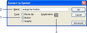
Call it orange bar button (2). Now, you can call it whatever you want, but I suggest that you follow the names I used in this tutorial. This will make your life easier, because there will be many more elements that are going to be a part of this button. And if all of them have meaningful names, you will instantly know which element does what, especially if you are going to duplicate this button, arrange them in the Library etc.
In the Registration point area, click on the middle left little square (3). This will place the ragistration point of the button in the middle of its left side. This isn’t exactly that important now, but if you choose to use any ActionScript for controlling the placement or movement of this button in any future project, doing so will make some operations easier later.
Click OK. You have just created a button.
The functionality of a button symbol explained
15. Double-click your button on the stage (with the Selection tool – V) to enter inside it. Take a look above the timeline – there you have the information that nicely tells you that you are inside your button now and not on the main scene anymore.
16. Also, you certainly noticed that the look of the timeline has been altered. Button symbols in Flash have their special kind of timeline.
The Up frame (or state of the button) is present when there isn’t any interaction with the button going on. This means that the user’s mouse is outside the area of the button. The button just sits there calmly.
The Over state becomes active when a user rolls her mouse over the button. The button can stay the same or it can change its color, shape or even move – all depending how you set it up. In this lesson, you will do exactly that – create an animation that will start to play once a user moves the mouse over the button.
The Down state shows when the user clicks the button. Again, this state can differ from the two previous ones, if you wish to make it so. You will make a change to this state also, later on in the tutorial.
The Hit state is different from all the previous ones: it isn’t visible at all. This state, or better, the contents of this frame define the clickable area of the button.
This means if the contents of this area are smaller than the visible button parts displayed in the previous frames, only the area defined in the Hit frame will be clickable. Of yourse, this area can also be bigger than the visible parts. Look at the following Flash example:
The gray area shows the hit area of each button. Try rolling your mouse over the blue button. You’ll see that the hand cursor appears only when you reached the zone defined in the hit area. Also, if you move your mouse close to the green button, the hand cursor will appear before you reached the visible area of the button. That’s because the green button’s hit area is bigger than its visible parts.
Making the first label for the bar button
17. Call the first layer inside your button gradient background.
18. Right-click on this layer’s Hit frame and select Insert Frame from the menu that shows up.

You will notice that the first keyframe (the Up keyframe) has just had its duration prolonged until the end:

This is fine, because the background won’t be changed – it will stay the same no matter how the user interacts with the button. Also, this layer will define the clickable area of the button – the gradient rectangle that is visible at all times. There are no hidden parts, this will be a standard, “normal” button which the user can click anywhere on.
19. Lock this layer. Create a new layer above it and call it label 1.

20. Click on the Up frame of this new layer to select it for working.
21. Select the Text tool (T). In the Properties panel, make the following choices (see the corresponding numbers on the image below):
- Select Static as type of text field. The other options serve only for text fields that are going to be manipulated with ActionScript. Since this text won’t change, this is the best option.
- Choose a cool font that will fit in nicely with the button’s overall design. Arial or some other sans-serif font is quite ok. If you’re working on a Mac, you can choose Helvetica.
- Make the font’s size 22. This will look good on this long button.
- Choose white as color. This way, the label will clearly be visible against the gradient background of the button. You can also bold the text – click the “B” button next to the color option.
- In the appropriate menu, select Anti-alias for readability. The button’s label has to be clearly readable.
- Set the letter spacing to -2. This will make the label look really slick. 😉
- Finally, make sure that the Selectable option is turned off. If this option is turned on, the button’s label will be selectable, which looks really ugly when a user passes his mouse over the button. Also, the user might think that this isn’t a button at all and the button itself might not work. So it has to stay turned off.

22. Click somewhere over the gradient rectangle area and type Photography. Hit Esc on your keyboard to exit the text editing mode.
You may type anything you want, if you have already decided that this button is going to be a part of a website menu interface and you know all the links/labels. I suggest that you follow the labels I proposed throughout this tutorial – you can change them easily later.
23. You will now position the text field to make it fit nicely with the button background and also to make sure that it renders sharply in your SWF file.
With the text field still selected, go to the Properties panel once more, and enter 23.0 as the value of the X coordinate and -14.0 for Y coordinate.
If you didn’t select the same registration point for your button symbol as I when you created it, your label may not be positioned over the button’s background. It doesn’t matter. Just move the label text over the gradient background.
What is important is that the label should be placed on round coordinates. As I said for the button before, so I say for the button’s label now: make sure that it is placed on round coordinates or the text will look blurry and messy. Just punch in the zeros at the end of each coordinate in the Properties panel and everything will be fine.
Adding effects to the button’s label
24. Your text field should still be selected. Now comes a nice feature of Flash 8 Professional: the blending effects. Go to the Properties panel and click on the Filters tab (see 1 below).

Next, click on the little blue plus icon (2). A menu will open. Select Drop Shadow from it.
25. Insert the following values for the effect (the numbers on the list are the ones shown in the image below):
- The X and Y blur values should be set to 5.
- Set the Strength to 120%.
- Select Medium for the Quality of the shadow. This is looks just fine, you don’t need to set it to high.
- Leave black as color.
- Set the Angle to 60 degrees.
- The Distance should be 4 pixels.

The label looks really cool with the added shadow! The text is nicely outlined and even more readable. Plus, the button has a 3-D feel to it.
But if you look close, the shadow is spilling over into the white area outside the button. And this doesn’t look very well. You will correct this with a mask in a moment, so please go to the next page.
Comments