
An illustration of a weird clock
Hi. Today we are going to make an illustration of a weird clock. I will use a lot of layer styling for this. Moreover we will practice some texturing techniques.
So let’s begin, shall we?
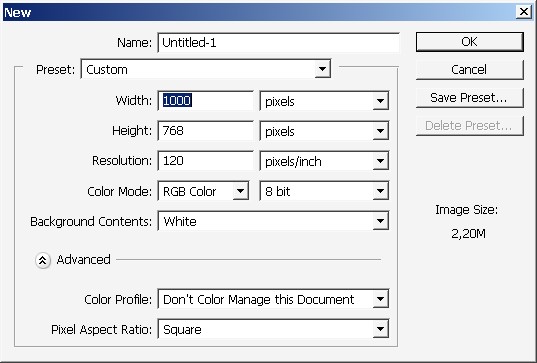
Create a new doc. Here we have it with 120 dpi pixel resolution.
Immediately create a new layer and overlay it with gradient. I’m often using this technique in my illustration. This is a good way to set basic lighting.
Note that this is done on a separate layer.

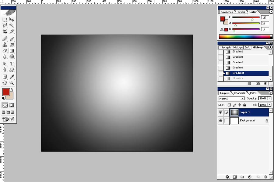

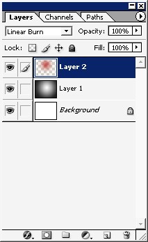
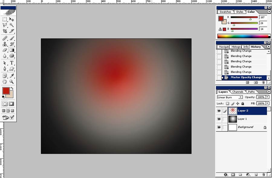
Then create a new layer and overlay it with another gradient. This time we will define light color. The layer mode is Liner burn.

And there we go.
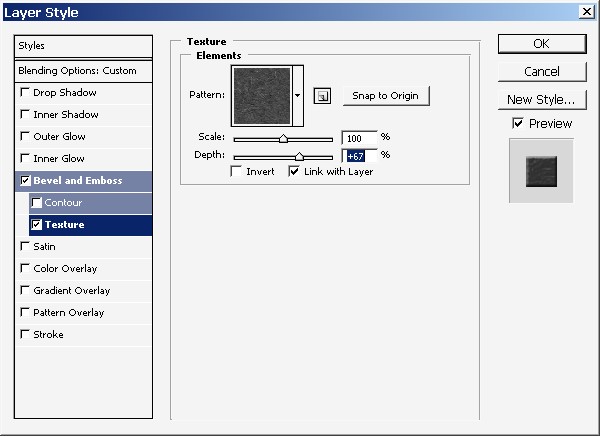
When illustrating a complex textured object I’m trying to set as many layer styles as possible, especially when it comes to texture.
So here are some layers styles that I think will be ok here.
I’ve used yellow color overlay.
Half opaque and set to linear burn mode.
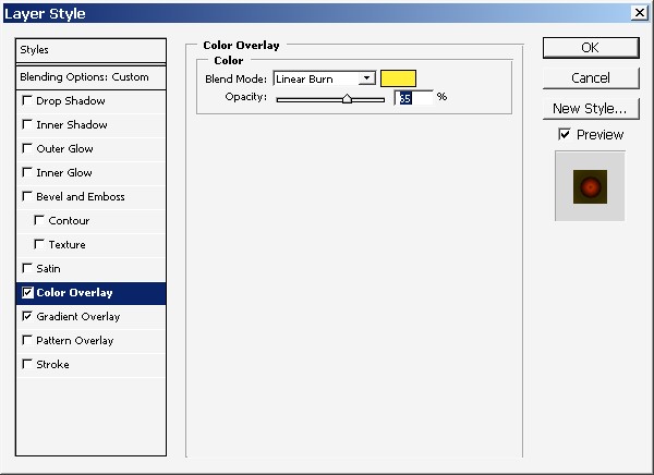
And special gradient overlay (radial style).
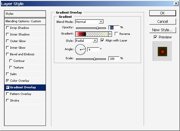
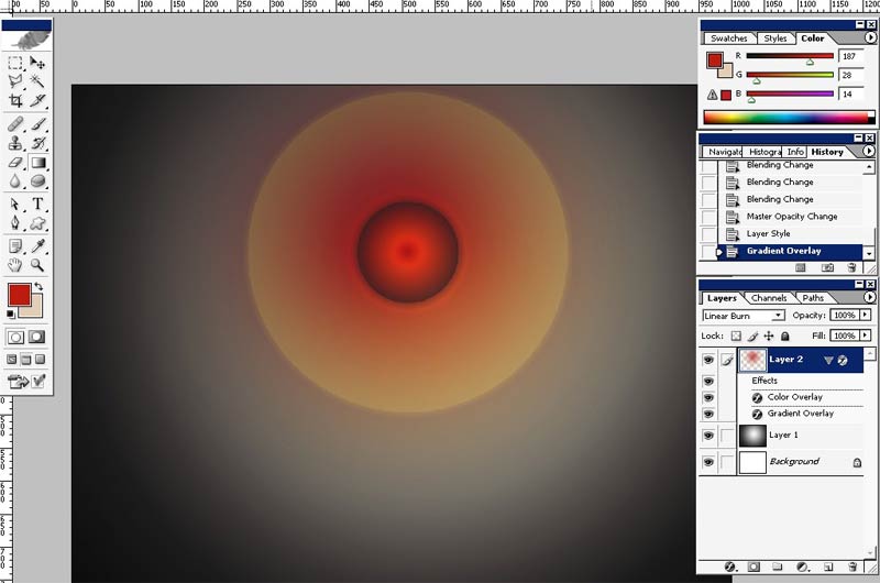
Result.
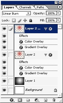
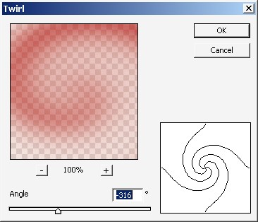
As next step I will copy my red gradient layer with all its layer styles and apply twirl filter to it.
Filters>Distort>Twirl.
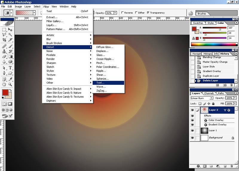
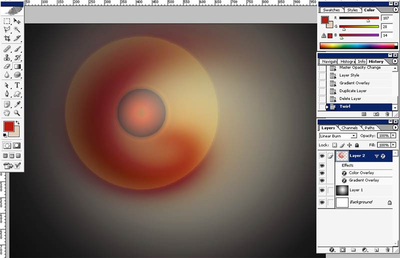
And there we go.
I will now switch off all the layer styles that have been made to my previous layer.
They are turned off.
And I will apply new filter to my top copy.
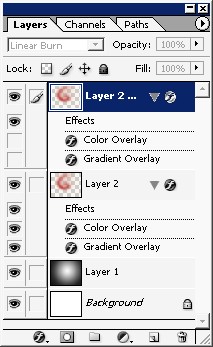
I did it to form some kind of texture.
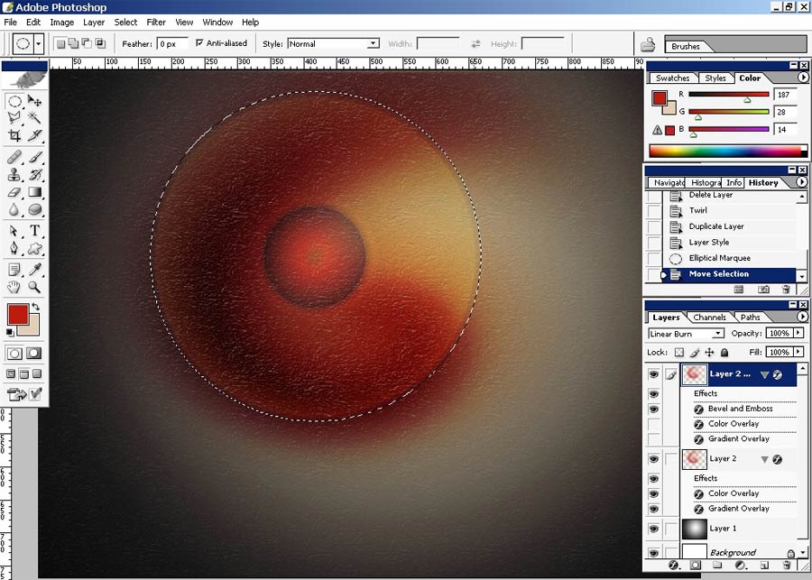
Here
we go. As you can, and if you don’t believe me that our texture spread
through all the working area, and we don’t need it. I need the texture
to fill only my round object.
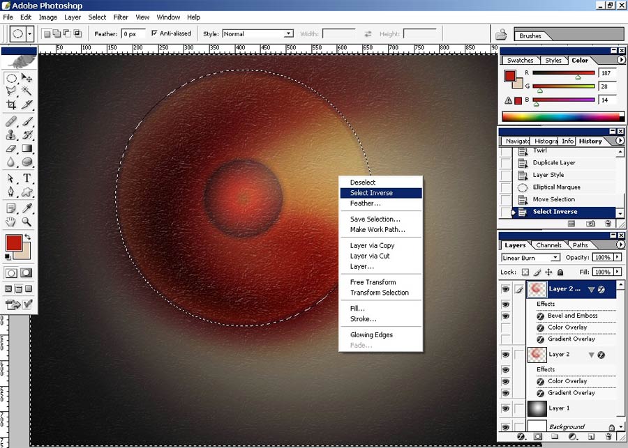
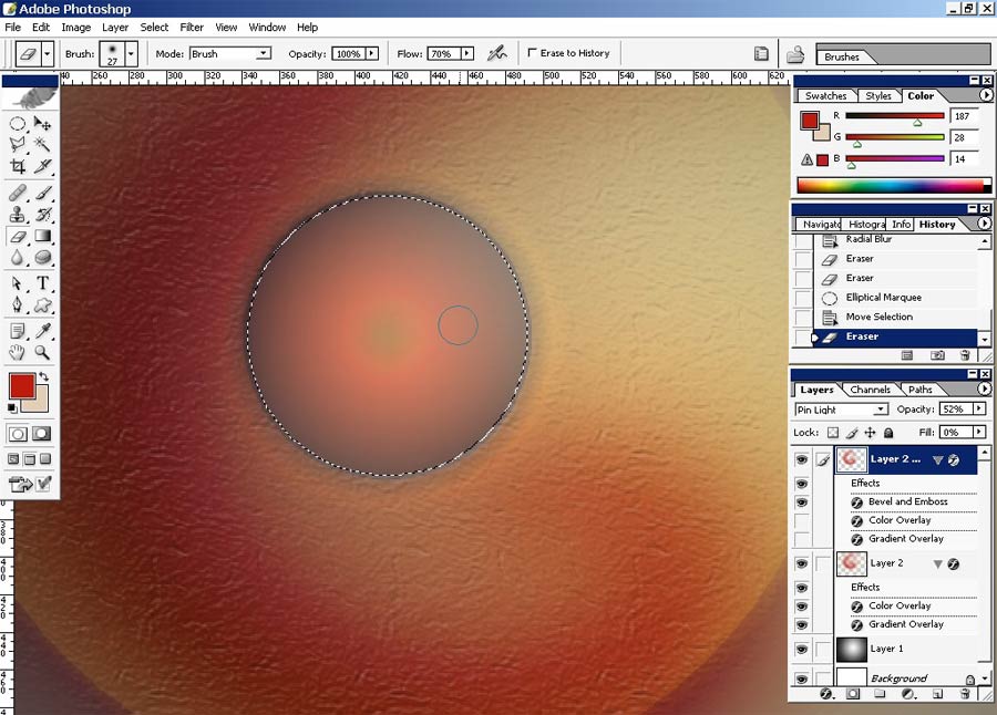
To do it I will use Round Selection Tool.
Just select the object, than select inverse and erase.
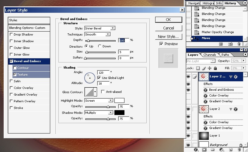
+ To that I will change my bevel light source and the layer itself layer mode.
Now I will use a filter, Radial blur to my top layer.
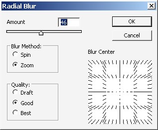
Than
I will select the middle part of the layer and do the same thing. I
will get rid of the texture in the middle of the object. Just use an
eraser for that.
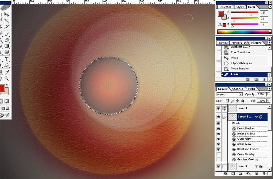
And another selection, this time it will be mush smaller and I will copy it to separate layer as well.
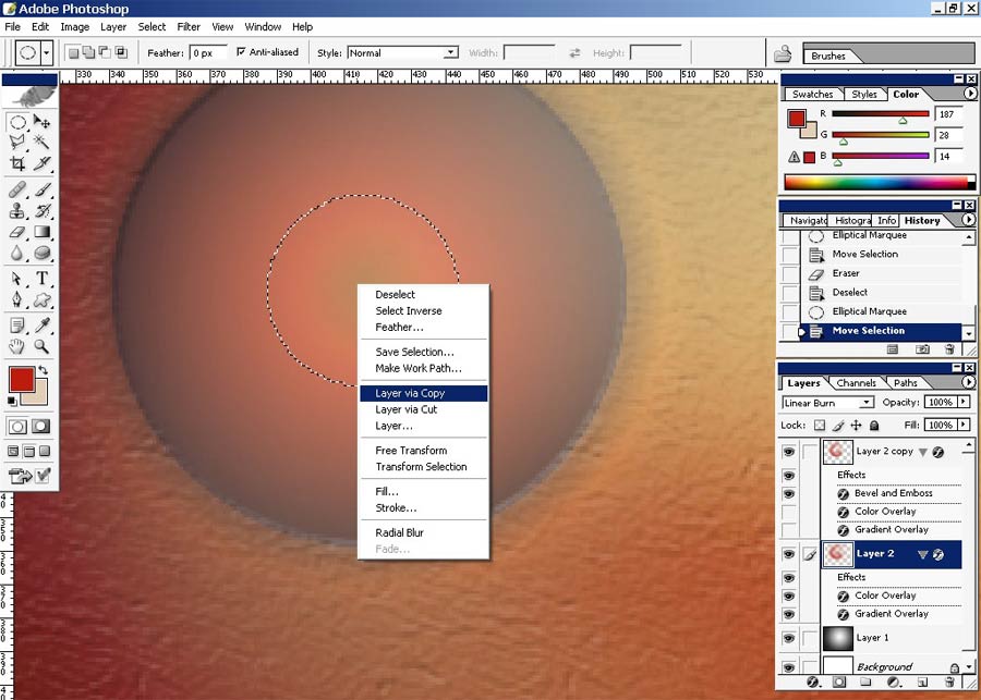
Just resize the layer. Overall opacity is set to 20%.
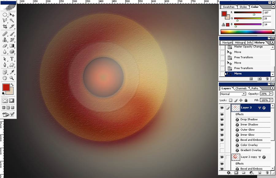
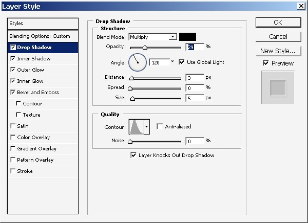
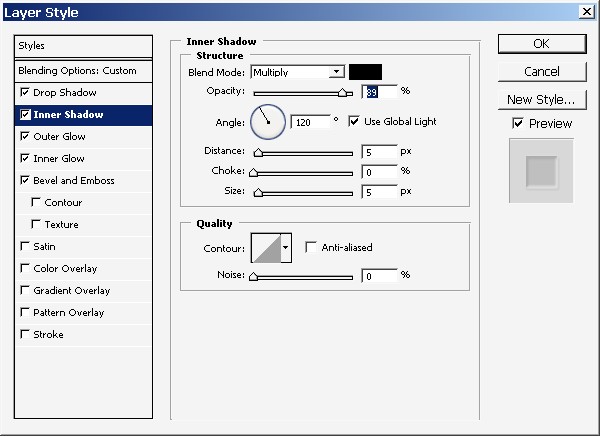
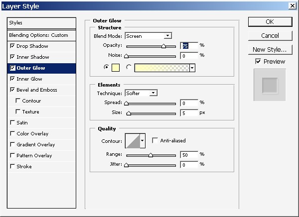
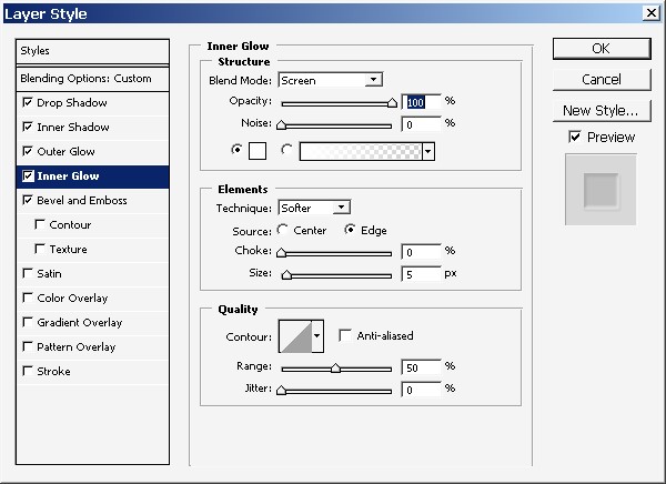
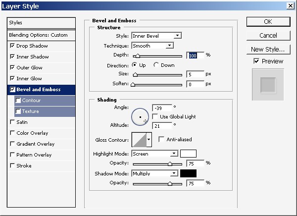
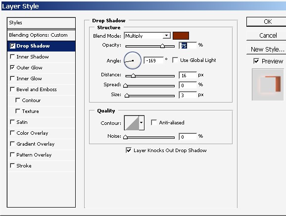
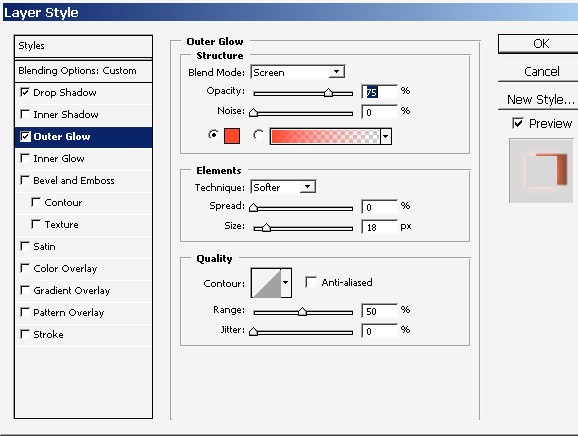
And here are some layer styles that I have applied to my newly created layer.
Some o them a quite standard so just watch the pictures carefully.
As for light and shadow I’m just using grayscale gamma – black and white.
What I did is I’ve dragged the circle (layer) a little bit to the side and copied the layer.
I’ve also transformed it making it a little bit bigger.
+to that, see this selection? I’ve got rid of all the texture inside the selection (just erase).
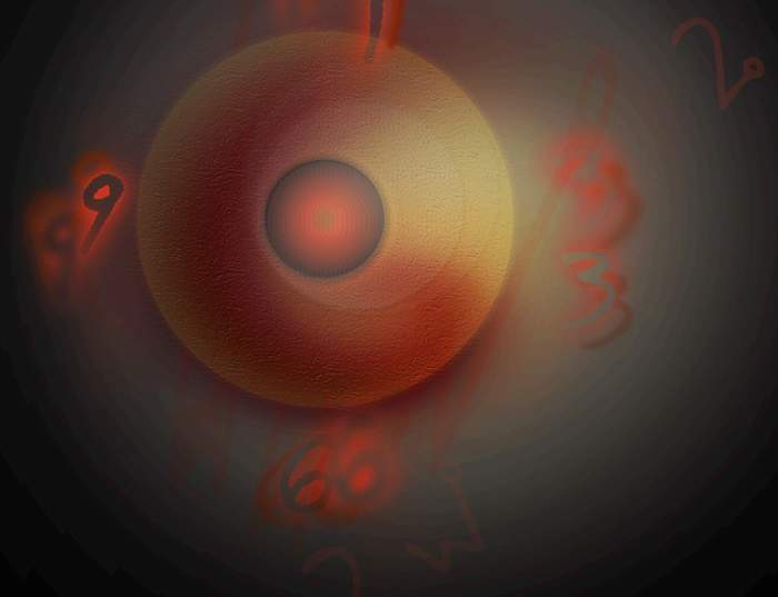
Now I will fill the image with digits.
Here are my layer styles that I will apply to my numbers. Note that the Overall FILL of my digits is set to 0%.
And here we go.
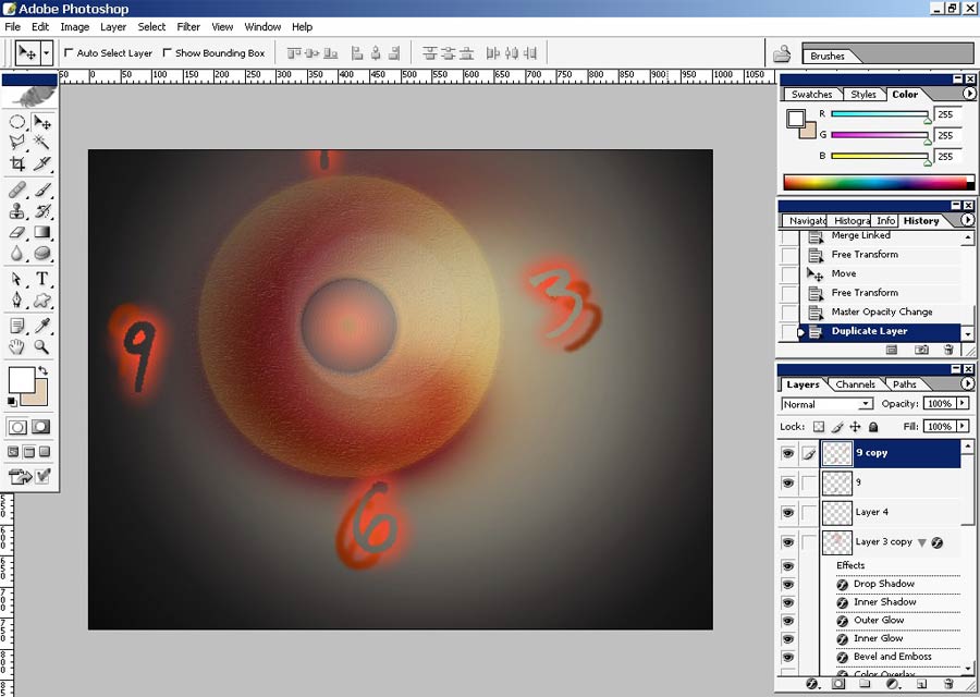
I’ve did each number on the separate layer and merged them down then.
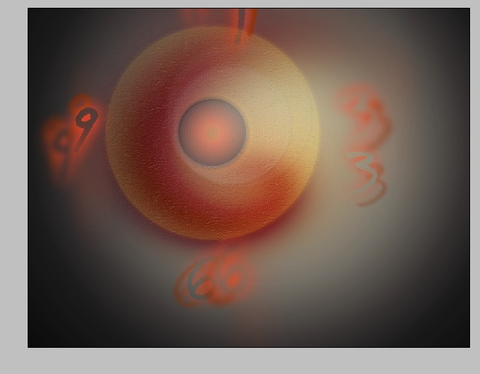
Now create a copy of the digits layer and make it a little bit blurry.
And there we go.
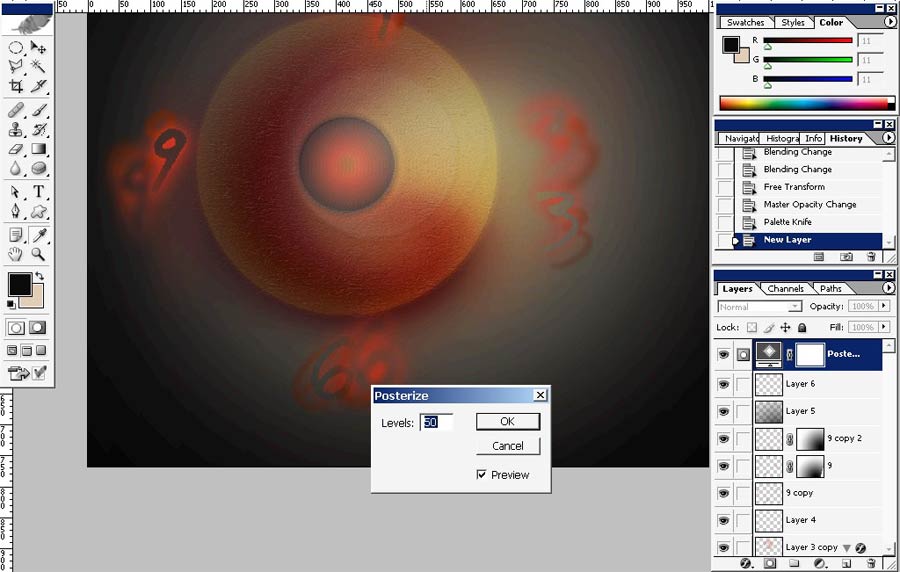
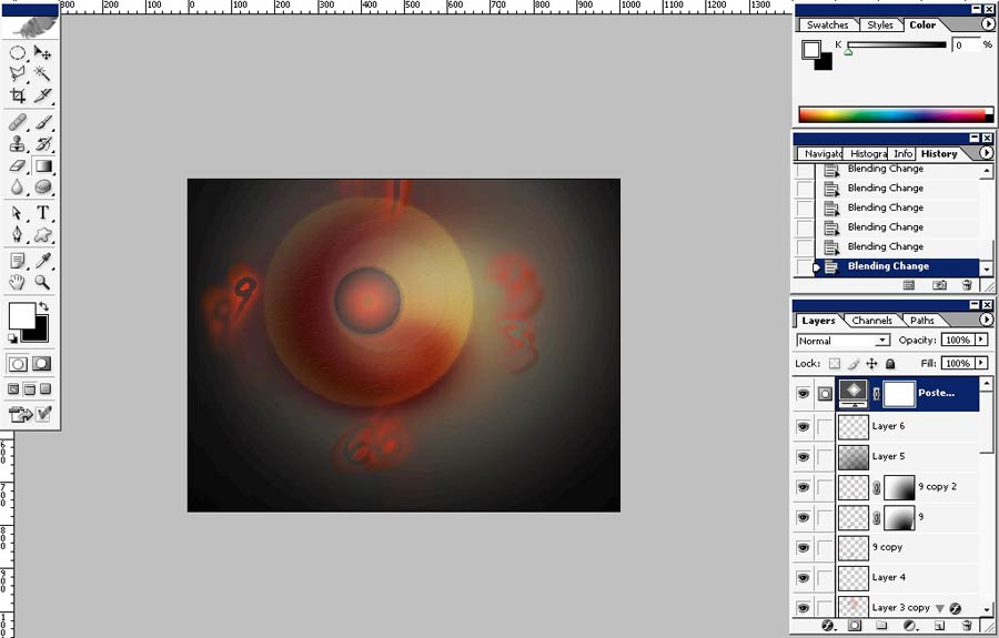
Posterize it as final step.
Enjoy.
Comments