
3D Effects in Adobe Photoshop
Hello. Today we are going to practice some effects in Photoshop. And also a little bit of color practice. Remember that the color of the picture plays major role in whole the illustration.
So let’s begin.
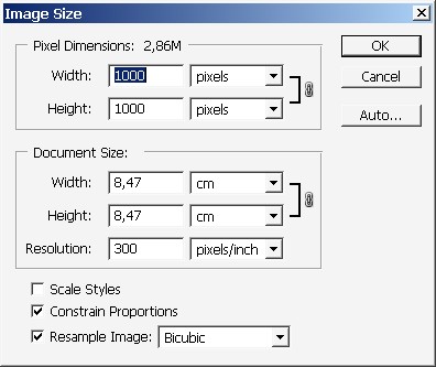
Create a square document. I rally like square documents you know.
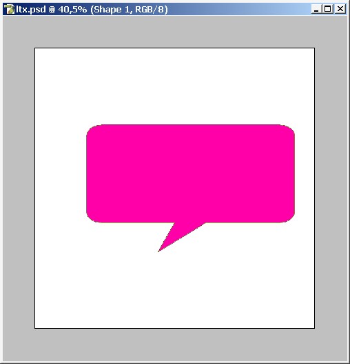
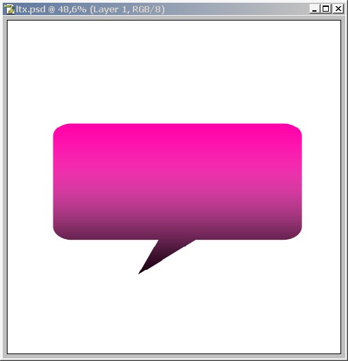
Create a shape using Custom Shape Tool. I will use this one. For my fill color I will use this high contrast Pink.

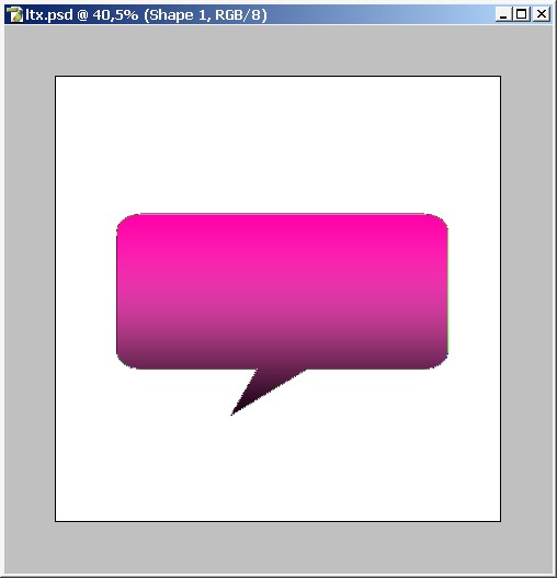
Now I will make in more like 3D. Tthe easiest way to do this is to paint basic shadows and highlights. The pink in the mid tone.
Shadow.
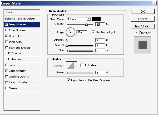
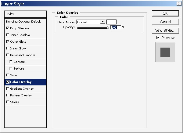
For creating the shadow I will use layer styles only one this time.
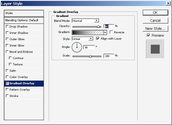
Note that the opacity is set to 90%. And the gradient goes from black to transparent and not to white. 90% opacity setting will give us dark pink color and not black.
Now for the highlights.
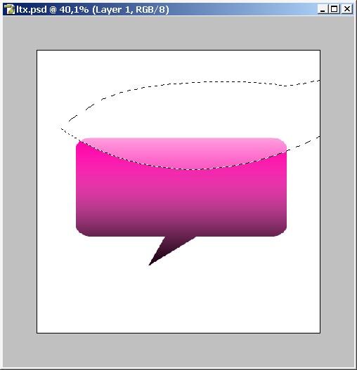
Make a selection sing Pen Tool. The key moment here is to create a smooth curve in the bottom of the selection. Other areas are not so important.
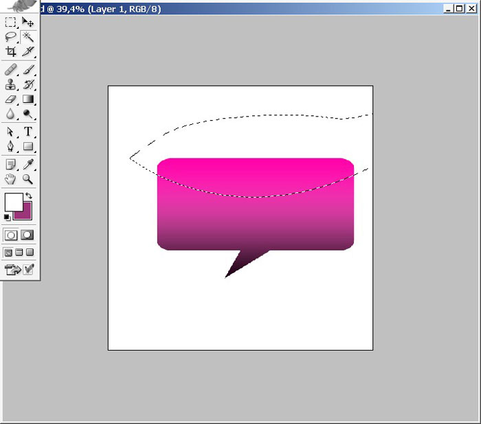
When you are done with the selection Create a new layer. And overlay this layer with white to transparency gradient.
Here we have it.
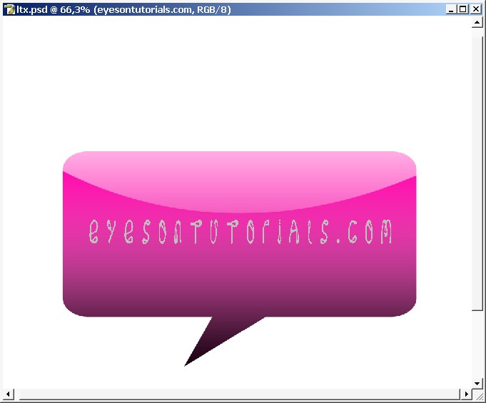
Good thing that we have this white highlight on the separate layer. So just move it a little bit to position it right in the center.
A little pro secret. Jelly web2.0 styles don’t looks well without foreground object or text on it. In other words it just has to be a foreground element.
I will choose text.
Now I will style my text with layer styles.
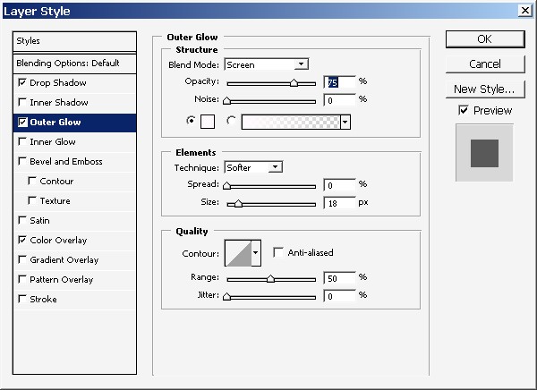
Layer styles are quite standard. But note that inner glow in colored white.
Change that font.
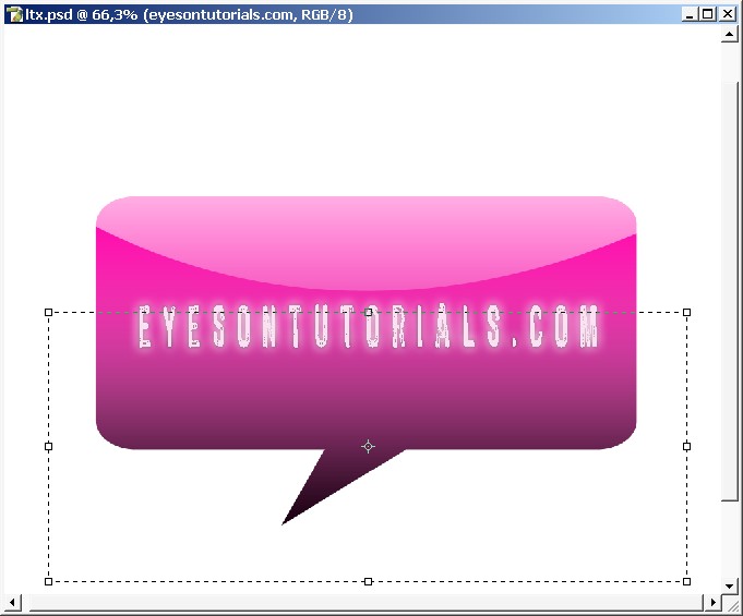
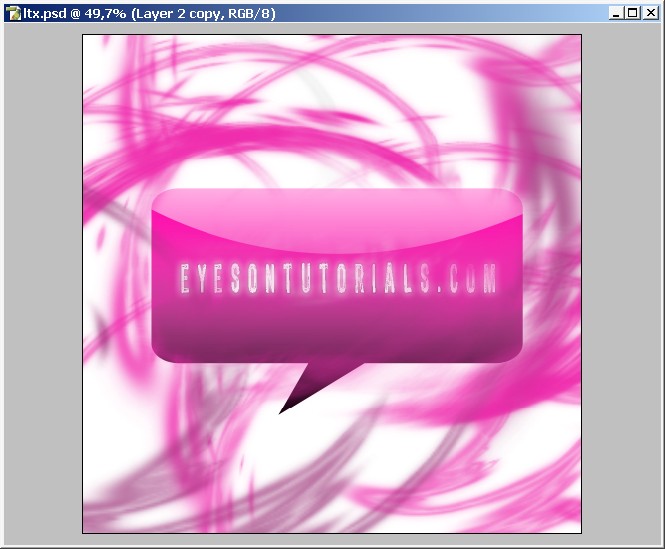
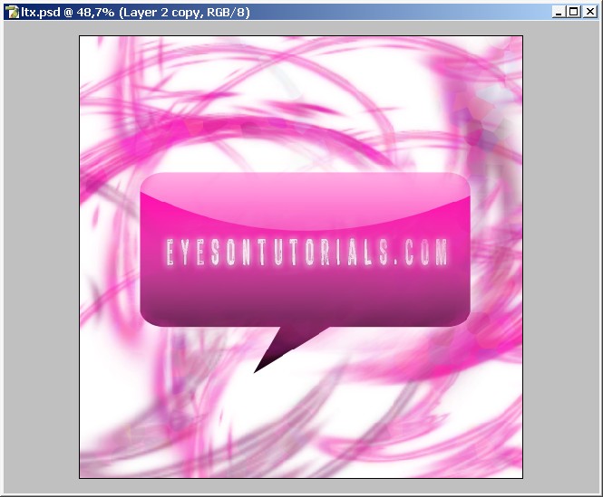
Our illustration foreground is ready.
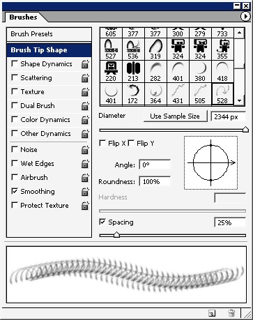
And now for our background. You can create cool background using abstract brushes with big diameter.
Brush without color or shape dynamics.
And there we go.
Choose big diameter.
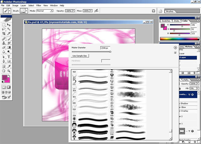
Several clicks and we have cool abstract background.
Even think how many abstract wallpapers you can create this way.
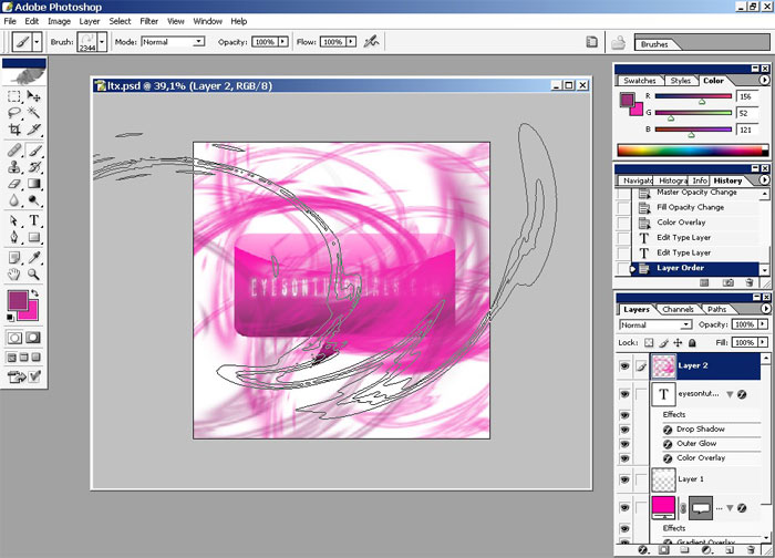
Erase a little bit to be able to see our foreground element.
Erase settings. Use low flow ratio.

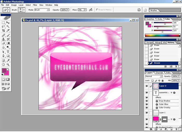
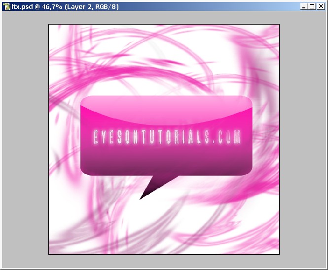
Here we go.
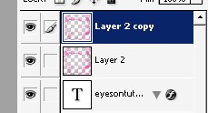
Now create a copy on our abstract layer and blur the top copy and set the opacity from 60% to 70%. It gives an amazing effect. Maybe it is not seen here so good but believe me it is a very and useful technique.
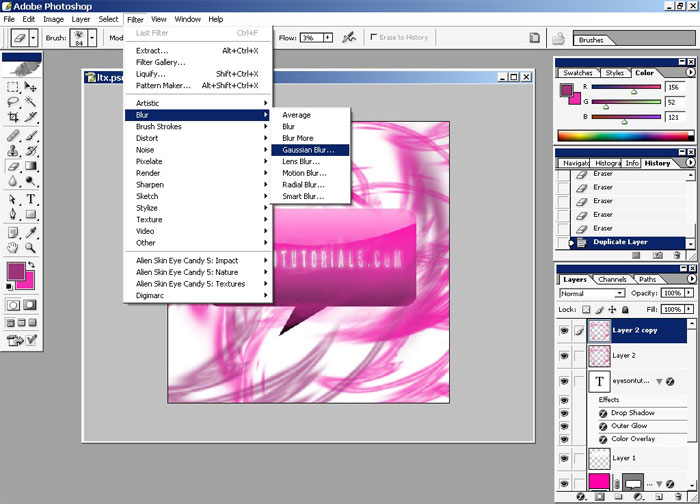
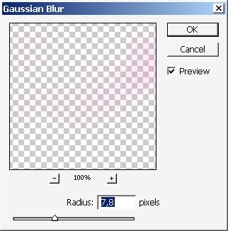
In plus to that, use a filter that I never use) on this layer (the one with the blur).
Here are the settings. Maybe should have set little bit smaller Cell Size.
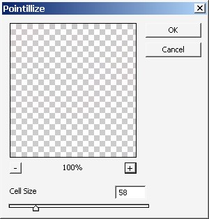
The only reason I’m using this filter is I want to see some color variety.
Change that font again. Actually I have a complete “DaFont” font collection but only about 70 loaded to Photoshop).
Remember
that the font plays vary big role on design. If you are making the
design with text in it chose the font properly. Font is the part of the
image.
Here we have it. Done!

Now create a copy on our abstract layer and blur the top copy and set the opacity from 60% to 70%. It gives an amazing effect. Maybe it is not seen here so good but believe me it is a very and useful technique.
In plus to that, use a filter that I never use) on this layer (the one with the blur).
Here are the settings. Maybe should have set little bit smaller Cell Size.
The only reason I’m using this filter is I want to see some color variety.
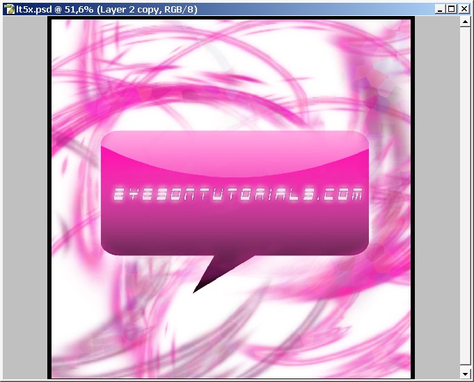
Change that font again. Actually I have a complete “DaFont” font collection but only about 70 loaded to Photoshop).
Remember
that the font plays vary big role on design. If you are making the
design with text in it chose the font properly. Font is the part of the
image.
Here we have it. Done!
Comments