Designing with CSS – Part 5: Adding Hover and Focus Styling
Adding Hover and Focus Styling
With the hover and focus styles you are going to use a little border trickery to make the links act more like buttons. You can change the border color on hover and focus to make the links appear as if they really are buttons being depressed (see Listing 5).
#leftcol #nav a:hover, #leftcol #nav a:focus {
 background-color: #003366;
border-right: 1px solid #ffffff;
border-bottom: 1px solid #ffffff;
 color: #ffffff;
 }
Listing 5. Using hover and focus styles
Before you implement the changes shown above, take a quick look at the selector, which is set for both the hover and focus states. Each selector has been stated immediately before the opening { and each selector is separated by a comma. You saw this earlier when I discussed grouping selectors; that is all that’s going on here. You are likely familiar with the hover state; this is the state the link changes to when the mouse or pointing device is positioned over the link. The focus state occurs when an alternative to a pointing device is used to navigate your pages, such as a keyboard.
First complete the selector; then you can see how the focus state works:
- Locate the selector and change the
background-colorvalue to #003366;. - Add a property and value for the right border by typing border-right: 1px solid #ffffff;
- Add a property and value for the bottom border by typing border-bottom: 1px solid #ffffff;
- Make the
colorvalue #ffffff; - Save your work.
Preview the page in your browser of choice (see Figure 4).
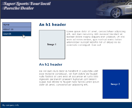
Figure 4. Hover section of the selector in action
Below, Figure 5 shows how the light-colored—in this case, white—borders to the right and bottom enhance the depressed effect of the button when it is in the hover state.
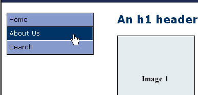
Figure 5. Hover effect in detail
To see the focus side of the selector in action, press the Tab key on your keyboard to hop from link to link. You can determine the order of the links visited by using tabindex in each link. This provides an ordered navigation sequence.
Note: You know, this might make a good tutorial in the future. If this is something you would like to learn more about, click the Send Feedback link on this page and let Macromedia know so they can pass it on to me.
Now that you have the basis of your navigation system in place, you can use a background image to make the two columns look the same length at all times. This will help make the page look more structured.
Comments