
Color Variations
In this tutorial we will practice some of PS‘s layer styles and color variations. I was asked to do something
shinny and colorful, so this is it. We will just make a design using basic line elements with combination with
layer stiles.
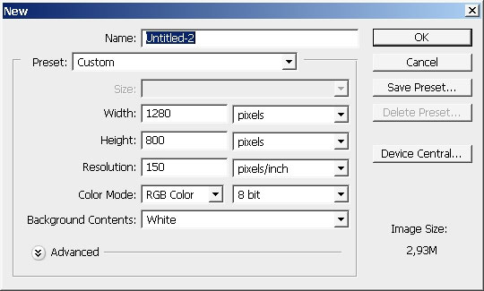
Choose a document size first.
Create first layer and fill it with pure black color. This is going to be our background layer. Leave only the

lower border a little bit lighter: Do it with low opacity or flow white to transparency gradient.
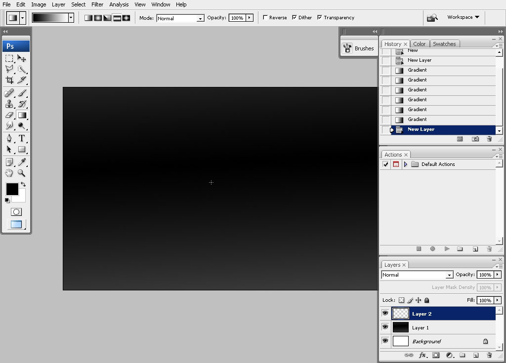
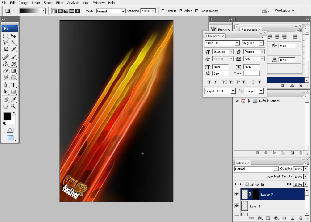
Next: create our major design element which we will use in this tutorial. Use Lasso Tool to do it.

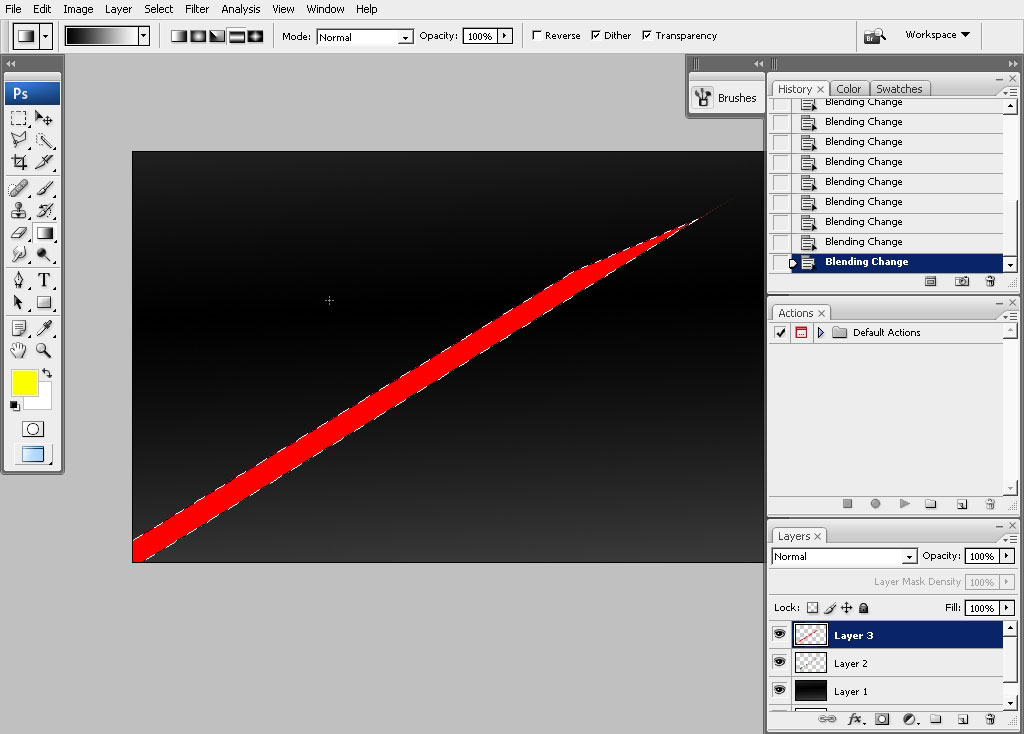
Create a new layer at once and fill the selection with red. Leave the selection on.
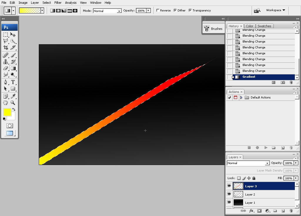
Choose yellow to transparency gradient and overlay the selection with it. It will give some color variation.
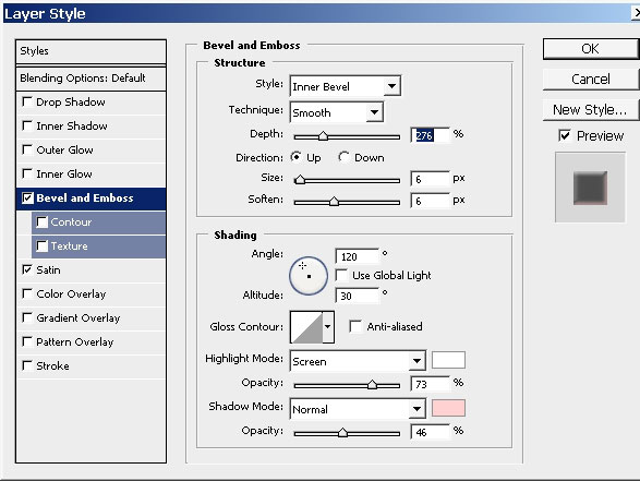
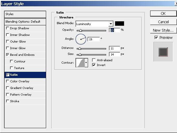
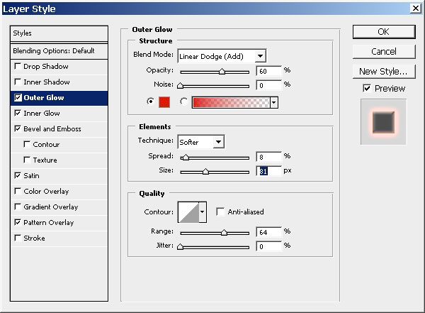
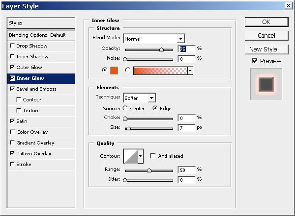
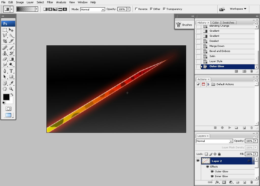
Now let’s give the shape some value, reflection and drop shadow using layer styles. Here are my layer styles.
I’ve also painted some dots using my dot brush. Select the layer, create new one and do the painting within the
selection.
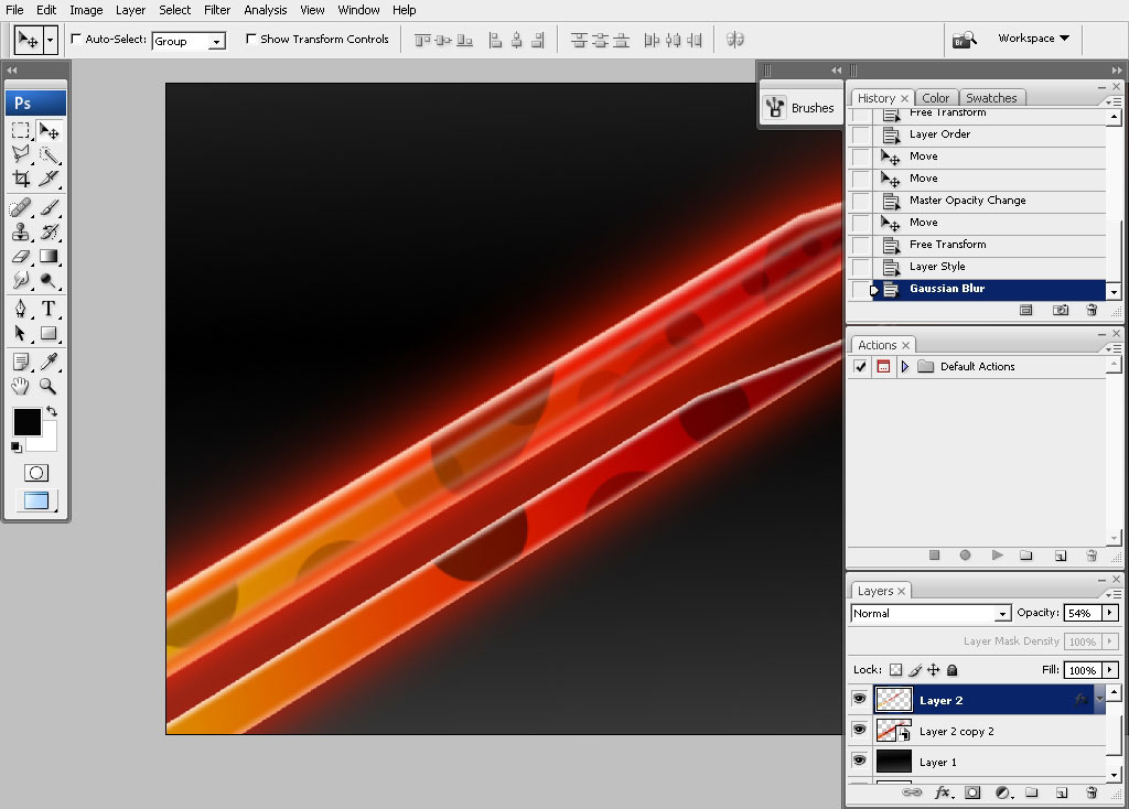
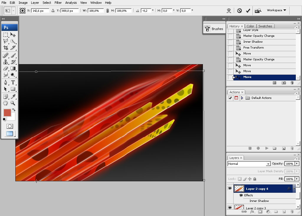
Now as I say, this will be our basic element of this tutorial. It means that you can just make copies of the
layer to create some kind of composition.
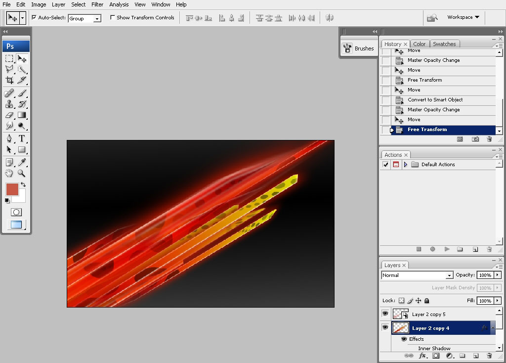
As you can see I’ve converted some of my layers into smart object meaning that all my effect with stick to my
layer. Moreover I can even make new 2nd time. Generally speaking I can make a drop shadow, convert my layer into
a smart object with shadow and drop another drop shadow to it.
Creating more and more of these shapes:
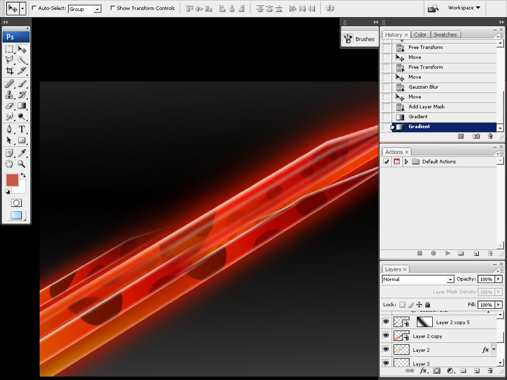
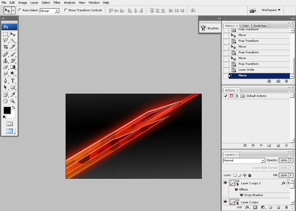
We have this bigger shape made from these small ones. Lock them up and make a copy of it. Moreover you have to
transform the shape group to make it like it is reflected. Now we have some color contrast.
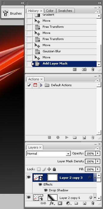
When you think you are satisfied with your lines merge them together (convert them into smart objects first not
to get messy with all those layer styles).
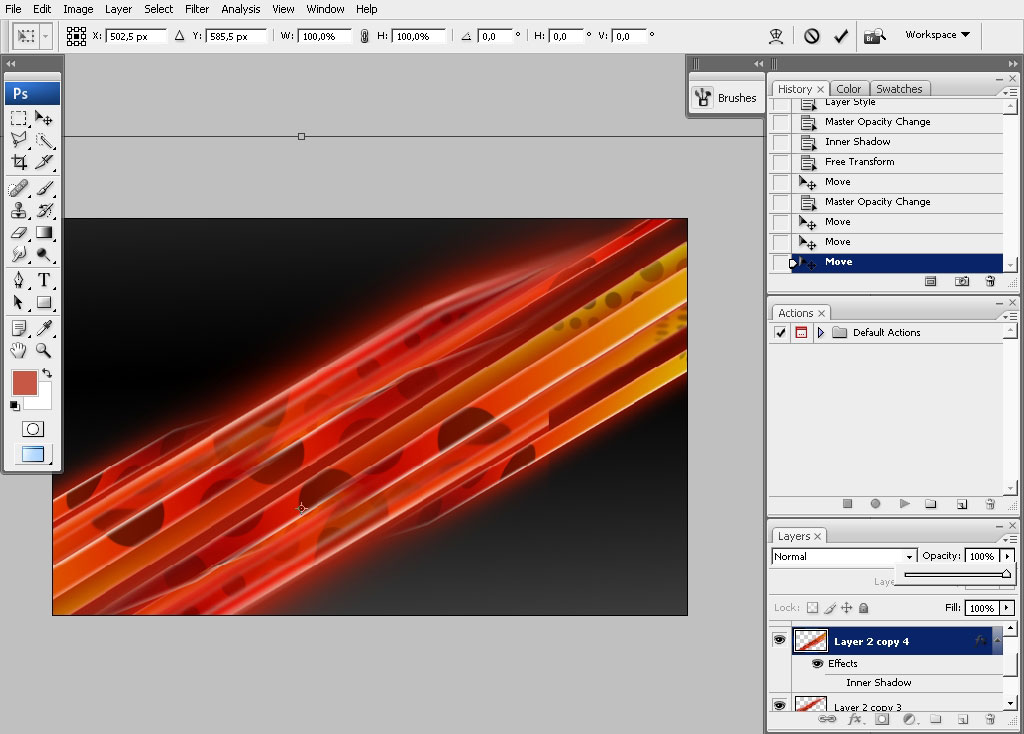
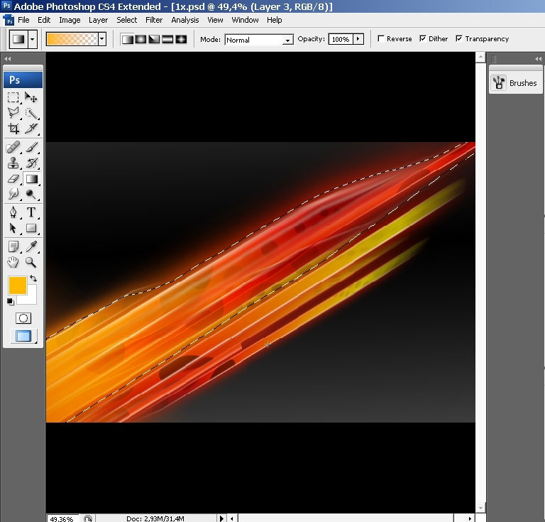
I think we should drop a little bit of yellow. There is just too much red there. Select the part you like. And
use yellow to transparency gradient to drop some yellow.
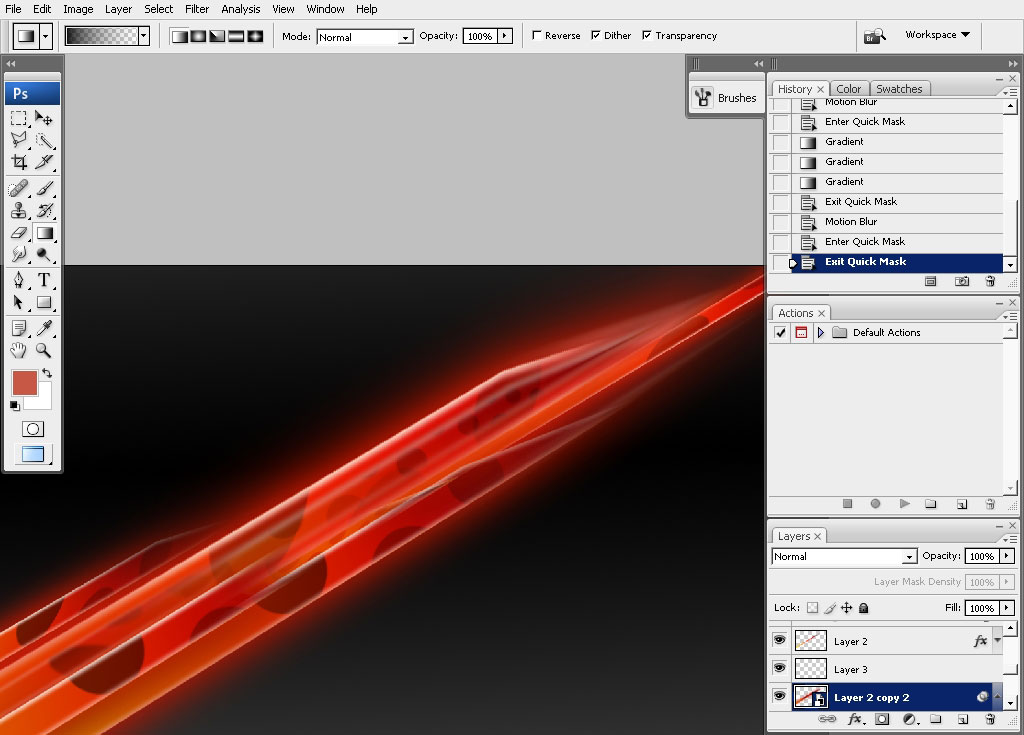
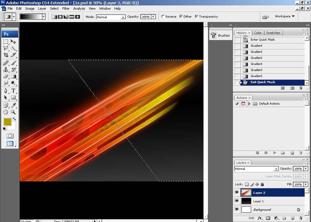
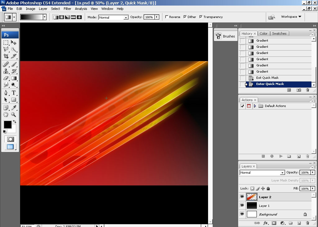
Next: press Q to switch to quick mask mode. Use black to white gradient to define the area exposed to the effect.
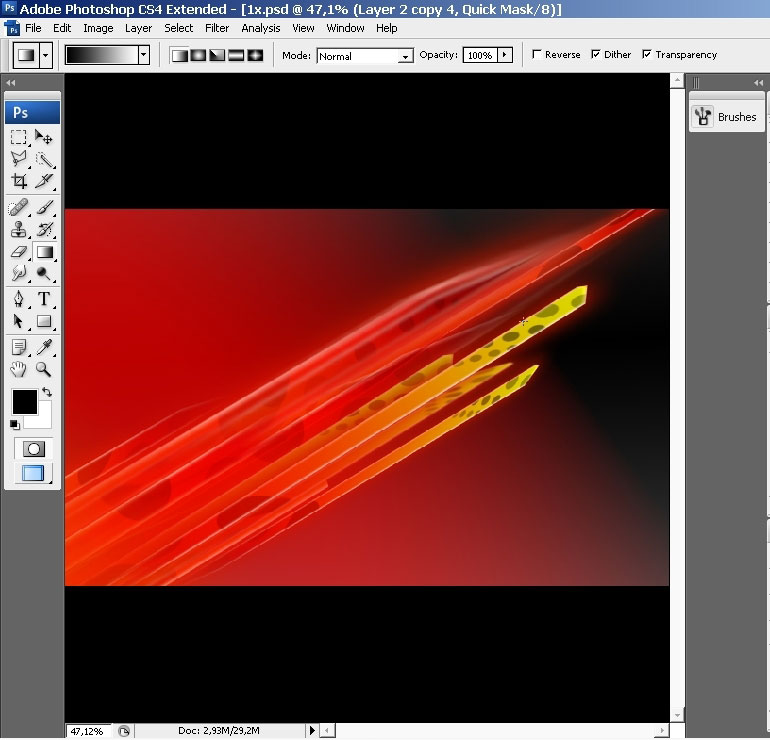
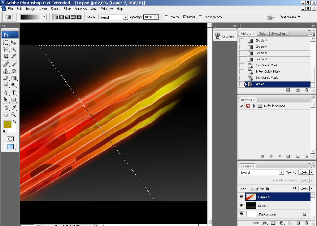
Tap Q once again to exit the mask. Here we have the area as a selection. Use motion and a little bit of Gaussian
Blur to soften up the edges.
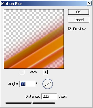
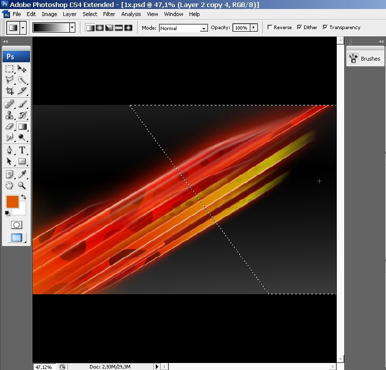
And the final effect I really want to apply is radial blur. The same technique: use quick mask – and then apply
the effect on the area that is unmasked.
Some text and we are ready here.
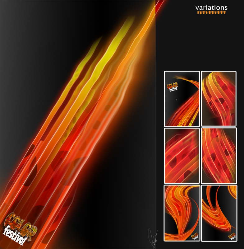
As I think, you found out something useful for you in this quick tutorial. The best thing to get things right is
to practice and focus on it completely. If you have this basic design you can make any king of variations.
Comments