
How to design Business Card
This tutorial will cover something different: I really want to make a part of corporate style meaning the visiting card: let
the size and the purpose not fool you – it is a still a very big part of Graphic design and corporate style making.

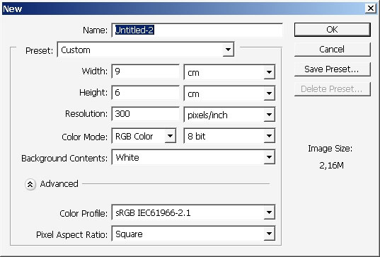
So let’s pick standard business card size: it is 90mm X 50mm (and not 9×6 how you can see on the picture – I really missed
that). So here we go:

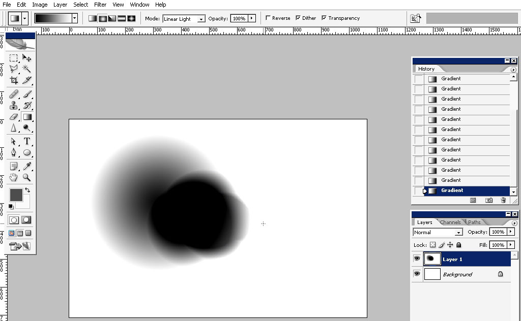
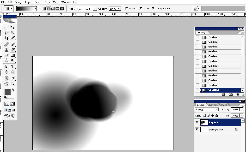
Now tap (G) to switch to gradient tool. Select blending modes too – Linear light and rounded (form)

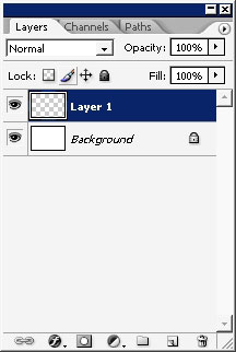
Create a new layer:
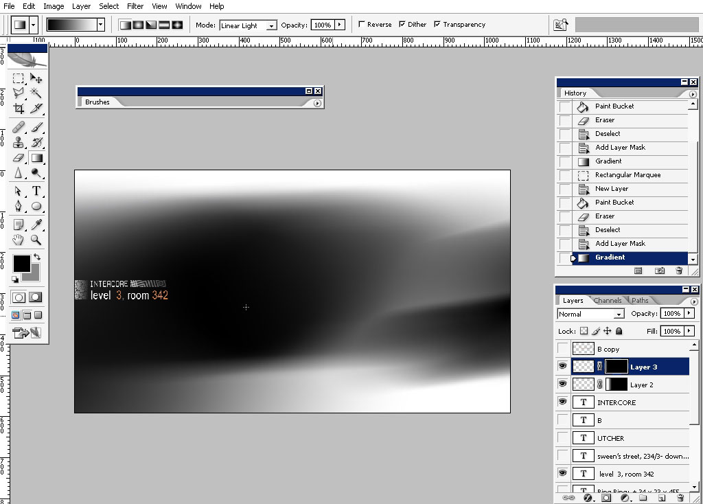
Begin to draw with gradient. When your standard black to white gradient has linear light, or Pin light (maybe more) blending
more – it can react to colors in a very interesting way:
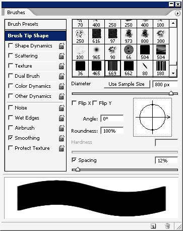
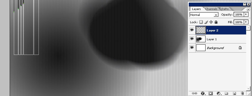
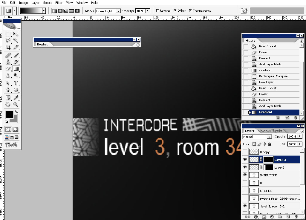
Well this is quite good. Now I really like some textures to be when I’m doing visiting cars. This is why I’m going to drop
some texture using this brush: create a new layer first.
See the texture?
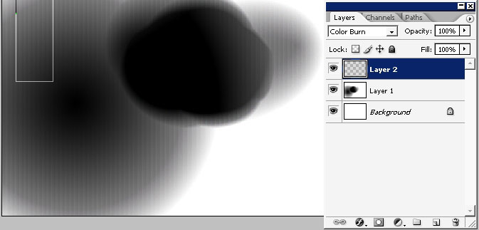
Change the layer blending more to see the texture only on black surface – the look of the card will change anyway during the
print:
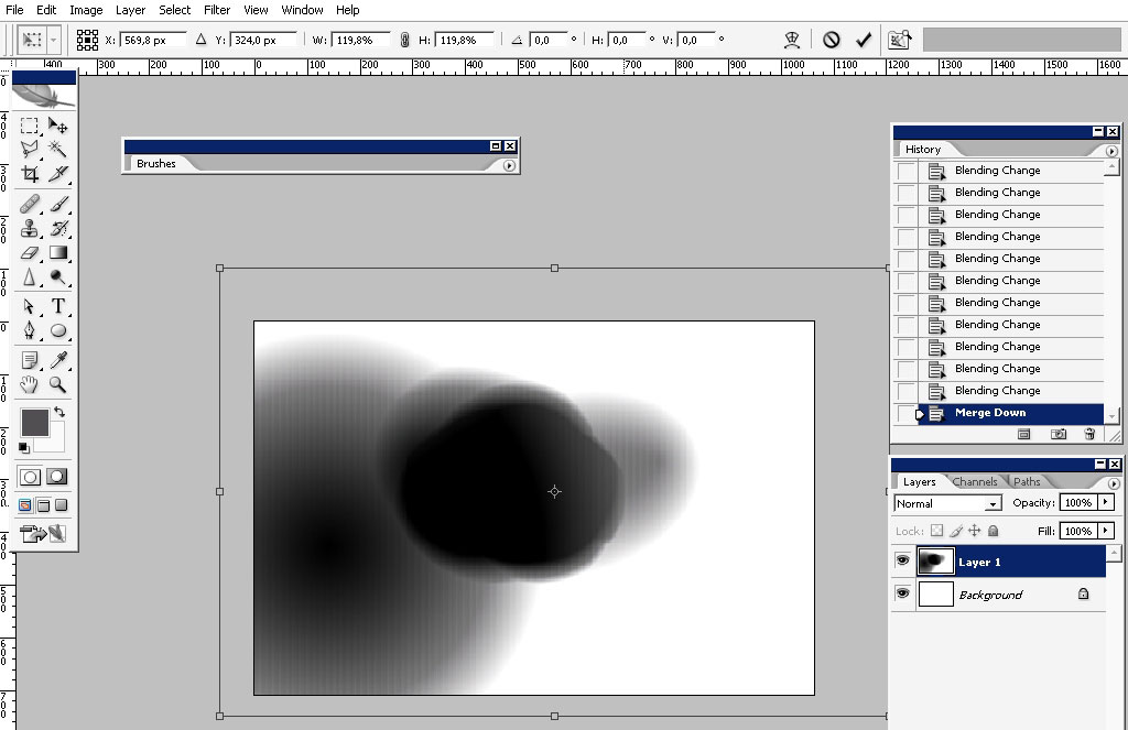
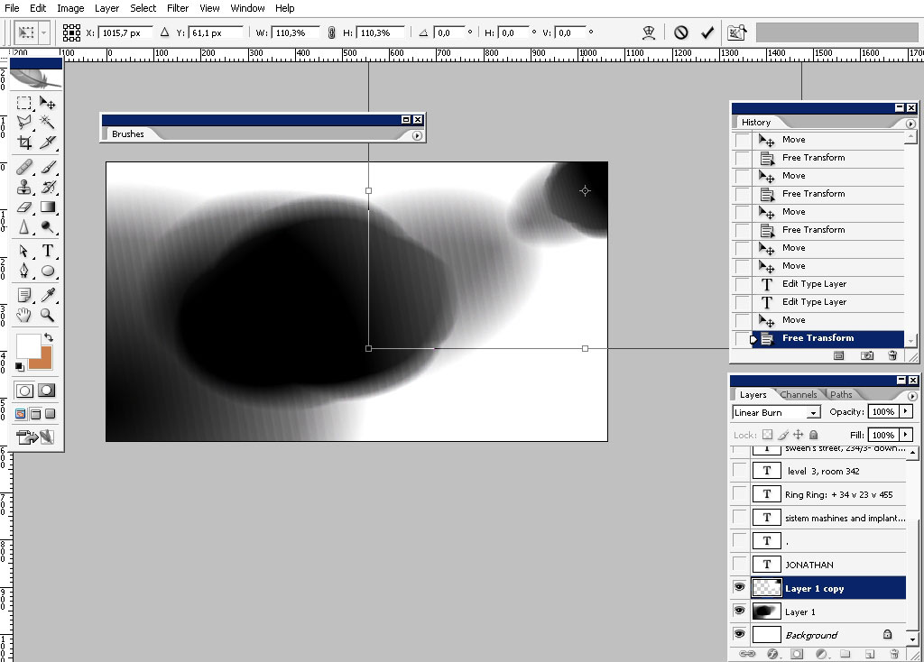
Transform the thing and make it a little bit bigger:
Now we’ll deal with text matter. When you are doing something for a client you should always remember some things. Try to
feel what the client really need or likes. Try to become some king of doctor and figure out his basic principles and ideas.
In most of the cases the clients are basic people (non creative) who admire basic things: meaning that basically all the
visualization is based on the past cliches (in most of the cases). I really know this feeling when you want to go Innovative
and creative but stop on making basic thing whish you may be done before and don’t like to do – but is the thing you be paid
for. I really can tell you a lot of the stuff – but now I get paid for doing this tutorial, so let’s continue, shall we?
So just basic fonts; in this case – I really like straight up, cornered font like this one:
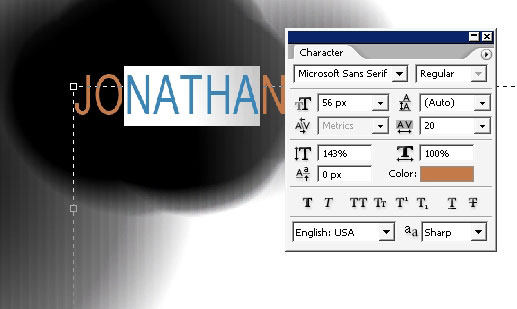
I’m also changing the colors here: don’t be afraid to do this.
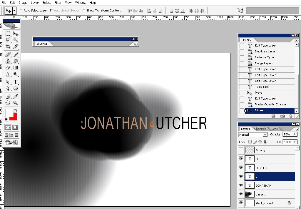
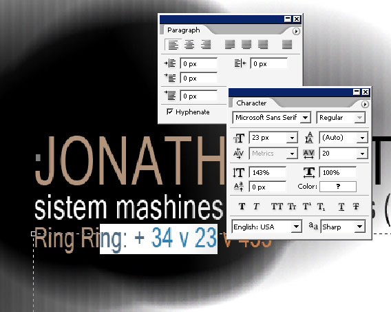
Then I’m changing the font size – this will help you to learn to control the “mass” on the text – and remember that you
should order the viewer to look where you want him to look- ok? Meaning that in this case it is more important the NAME that
his job title.
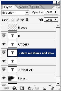
Change the mode to exclusion:
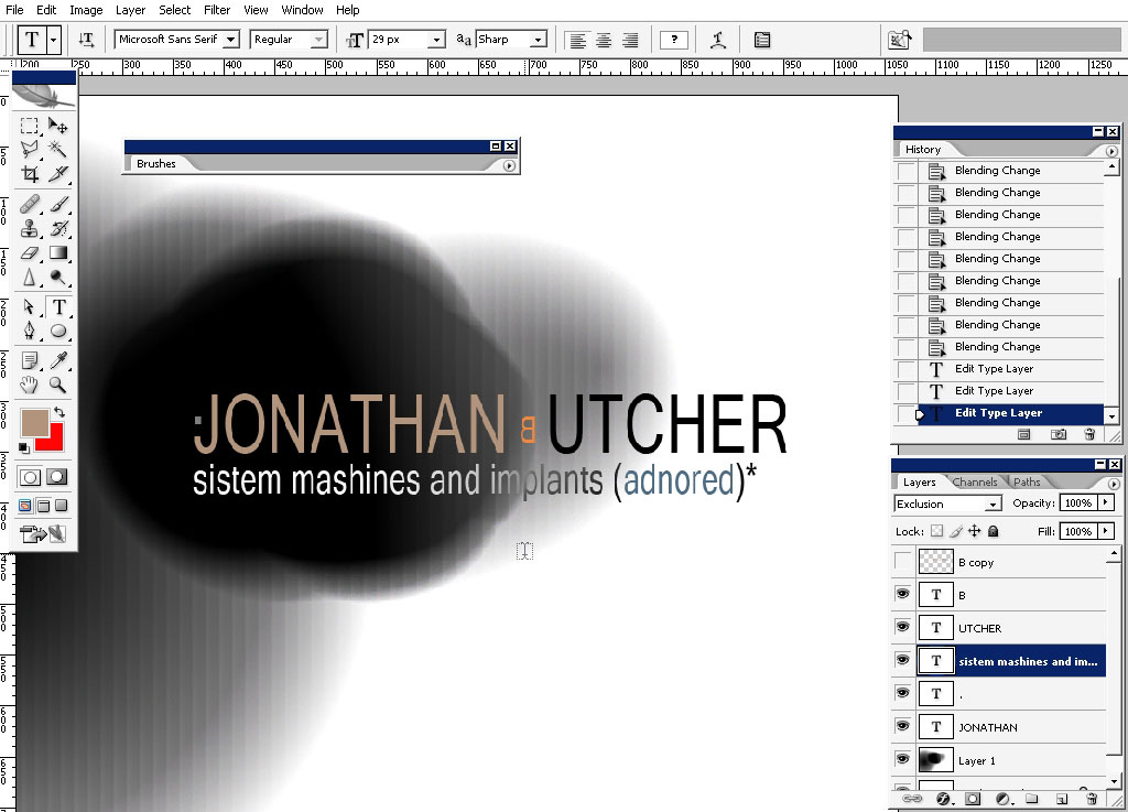
Tell:
Maybe to something like that falls off the basic (straightness) concept – do not forget this feeling (creativity) and
something that the clients don’t; expect you to do.
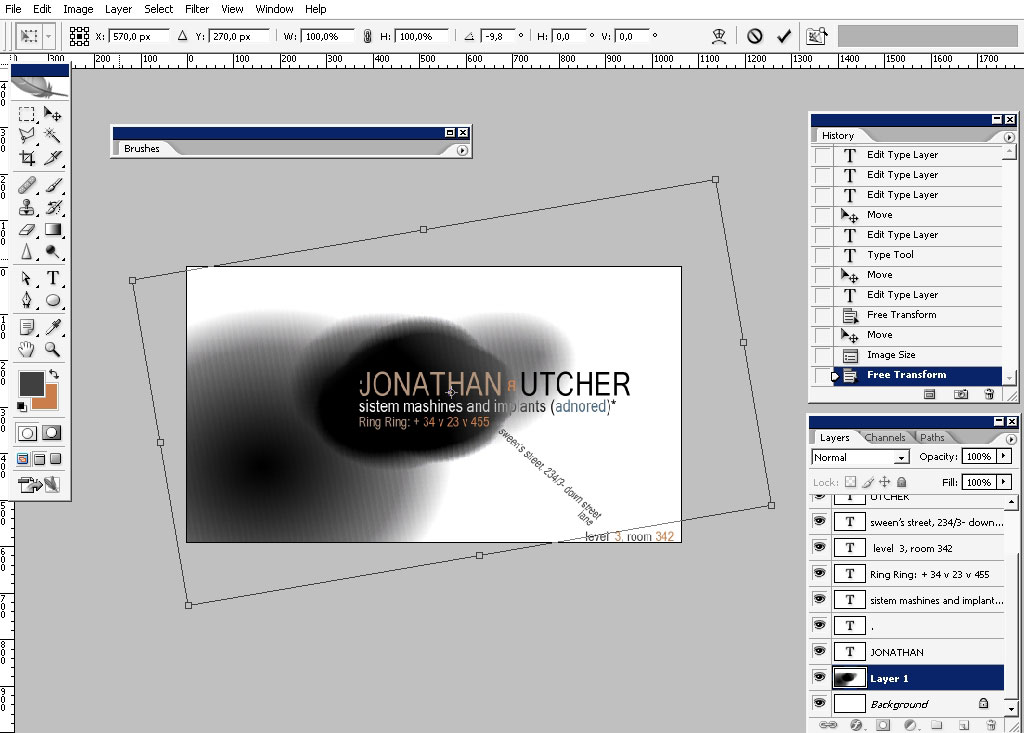
Change the proportions a little bit:
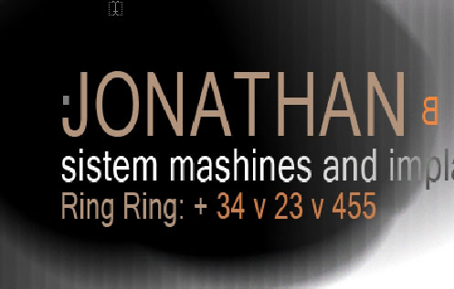
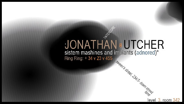
And here is the current look of it:
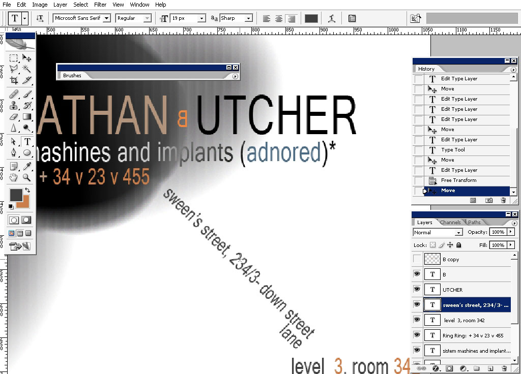
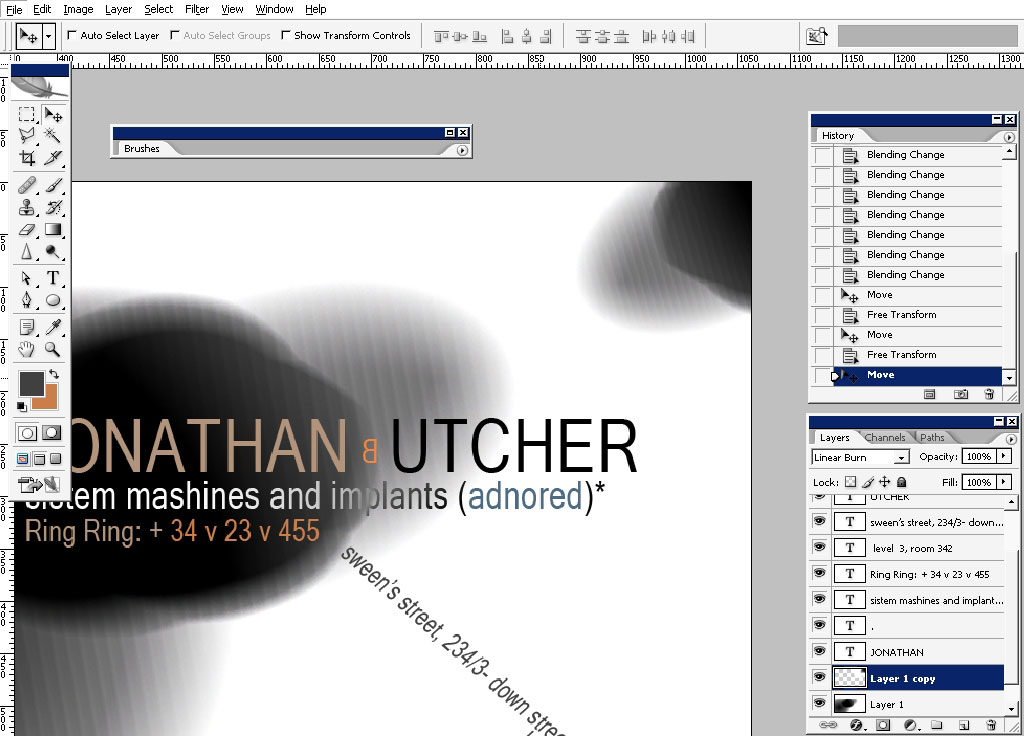
Drag the text: level 3 – room 342 from the lower right corner to here:
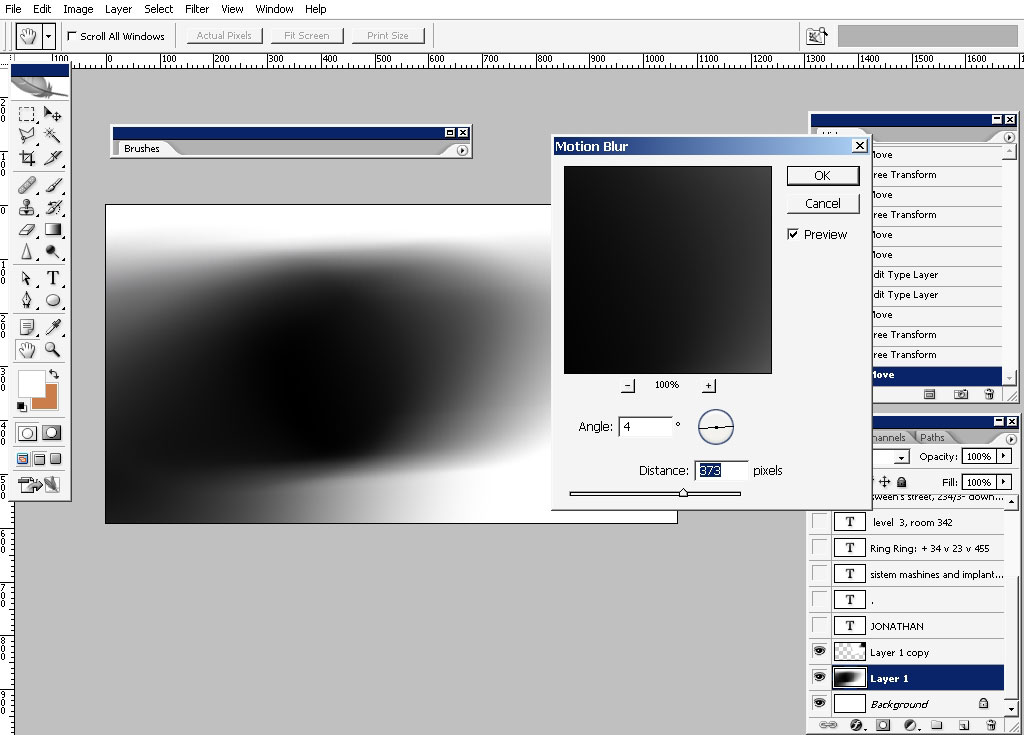
And now we begin to deal with the back of the business card. So we’ll certainly take the elements from the facial side:
Apply motion blur:
..And of course I think it got to be some text there too:
And here we have it: a very fast business card tutorial done in Photoshop.
I hope you found something useful for yourself. So, see you next time on eyesontutorials.com!
Comments