
Design skills
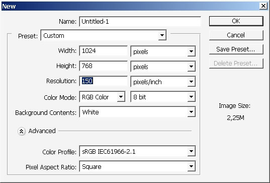
Welcome to the tutorial where I shall practice my design skills along with making wallpaper using the design language. So
basically I will use only PS, but it is very good to use Illustrator or Corel Draw for the text part.
So let’s go then.
This is my brush here (download brush)- it

is basically a right angled shape defined as a brush.
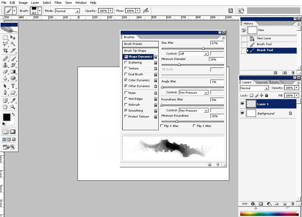
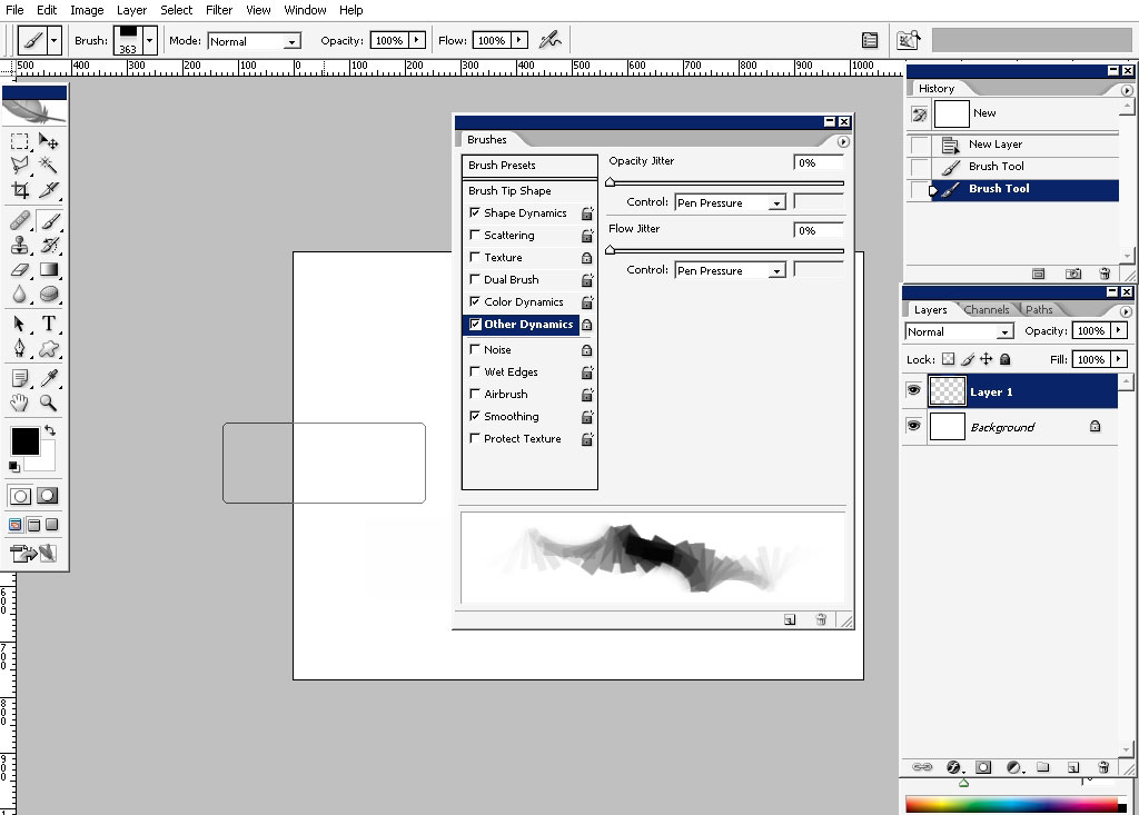
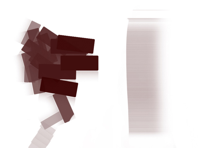
Here I will show you the effect of this brush.
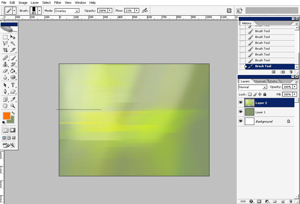
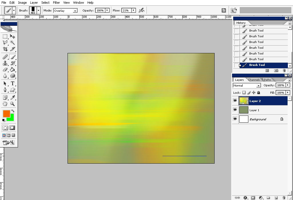
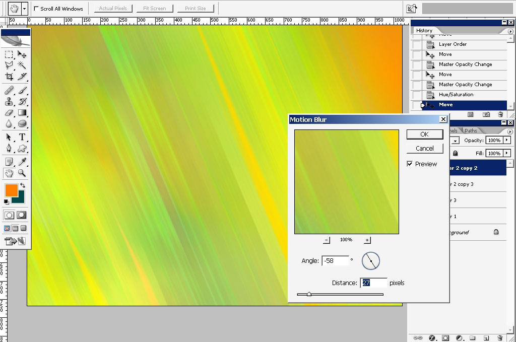
So I’ve just painted some strokes with green and yellow color and applied Motion blur filter to it. I do that most of the
time in my works when I want to define the initial color gamma of my design.
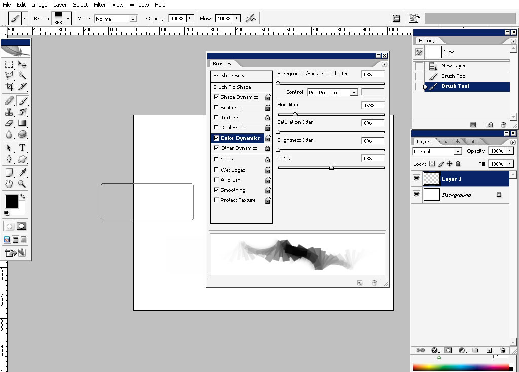
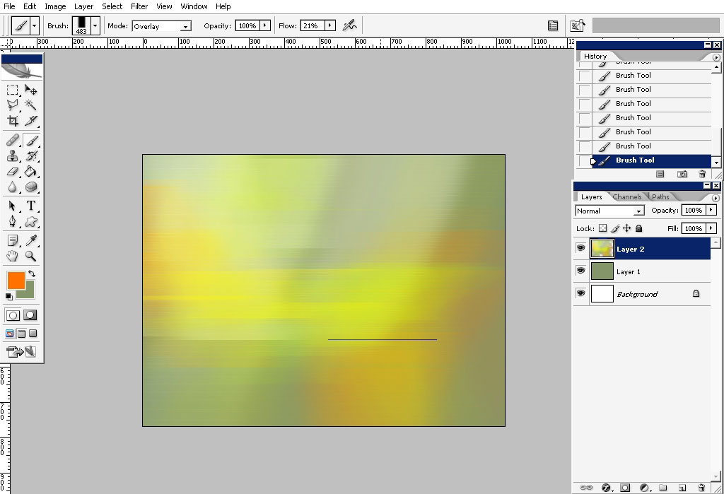
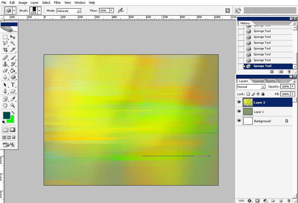
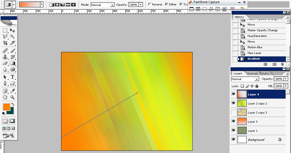
Then I added other colors with the help of flat brush. Create a new layer before that. Moreover change the brush blending
mode to overlay and the flow jitter is set to about 20% (on Wacom G4 with 512 pressure levels) giving that high contrasted
tone.
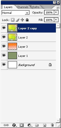
Now I really don’t like my Motion (blur) to go horizontally so I’ve decided to rotate my pattern a little bit. Create a copy
to be more confident.
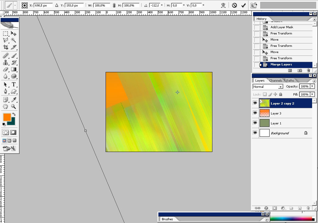
A little bit more of motion blur – try to match the direction of the lines.
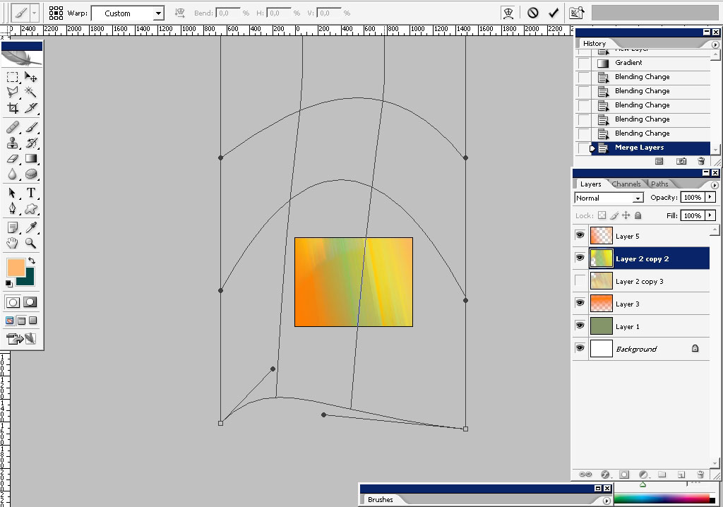
Now let’s add even more color to it. So I did chosen 2 basic colors for my design – it’s orange and green. What I’m doing
right now is finding the balance of colors.
Warp just a little bit to.
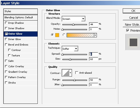
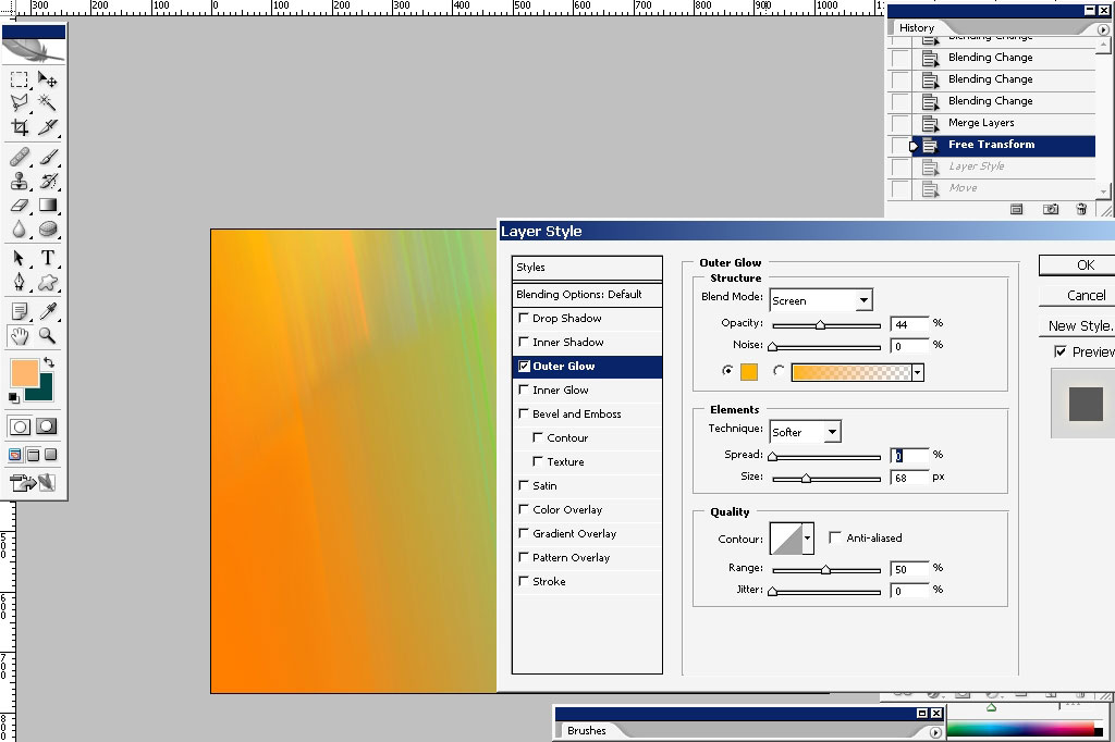
I also want to apply outer glow – the effect could hardly be seen but it did changed the tones a little.
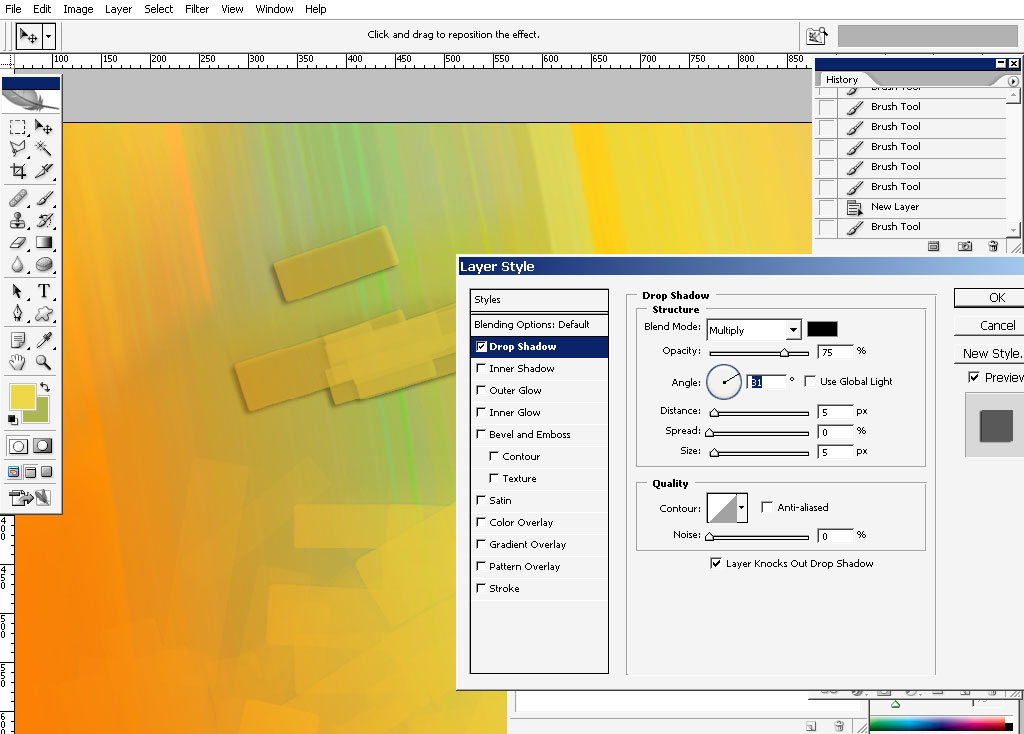
Now comes the brush action:
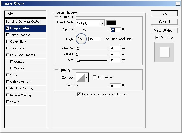
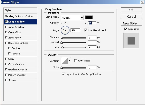
As you can see I’ve also dropped a shadow.
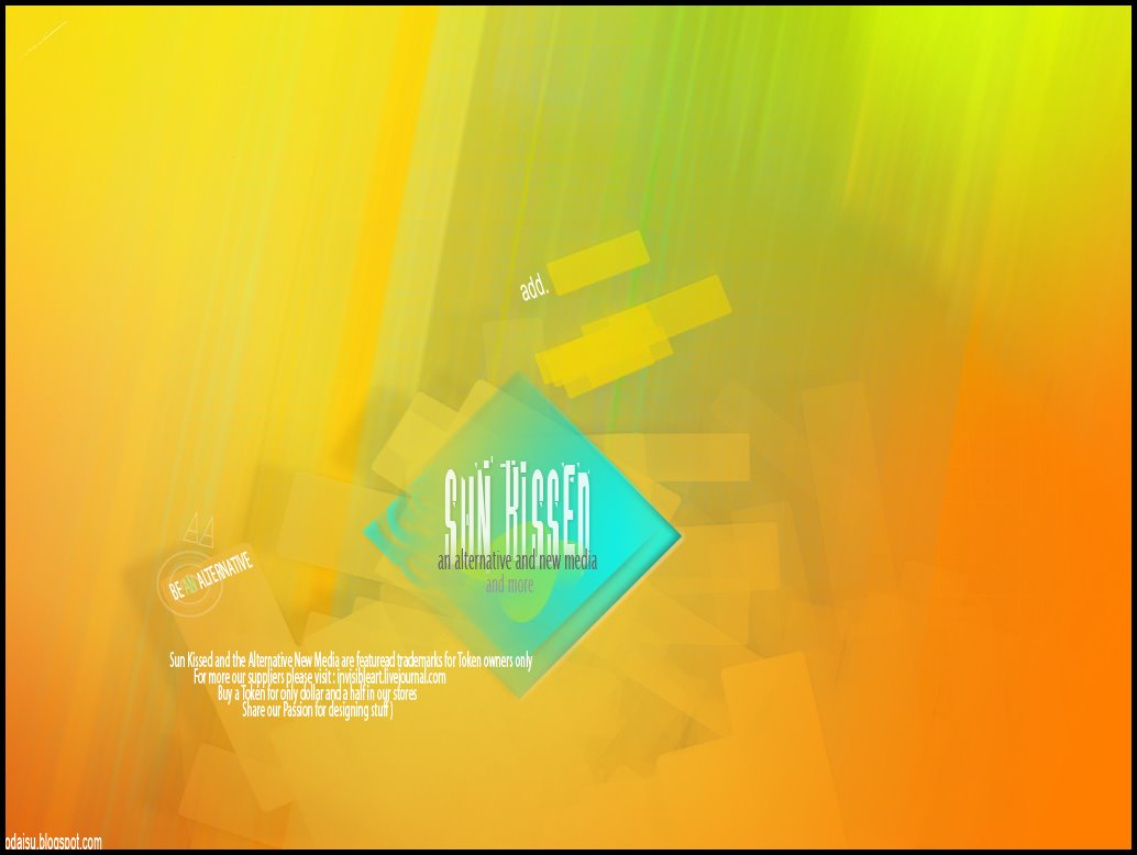
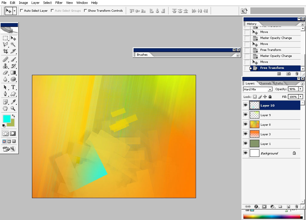
Layout the elements:
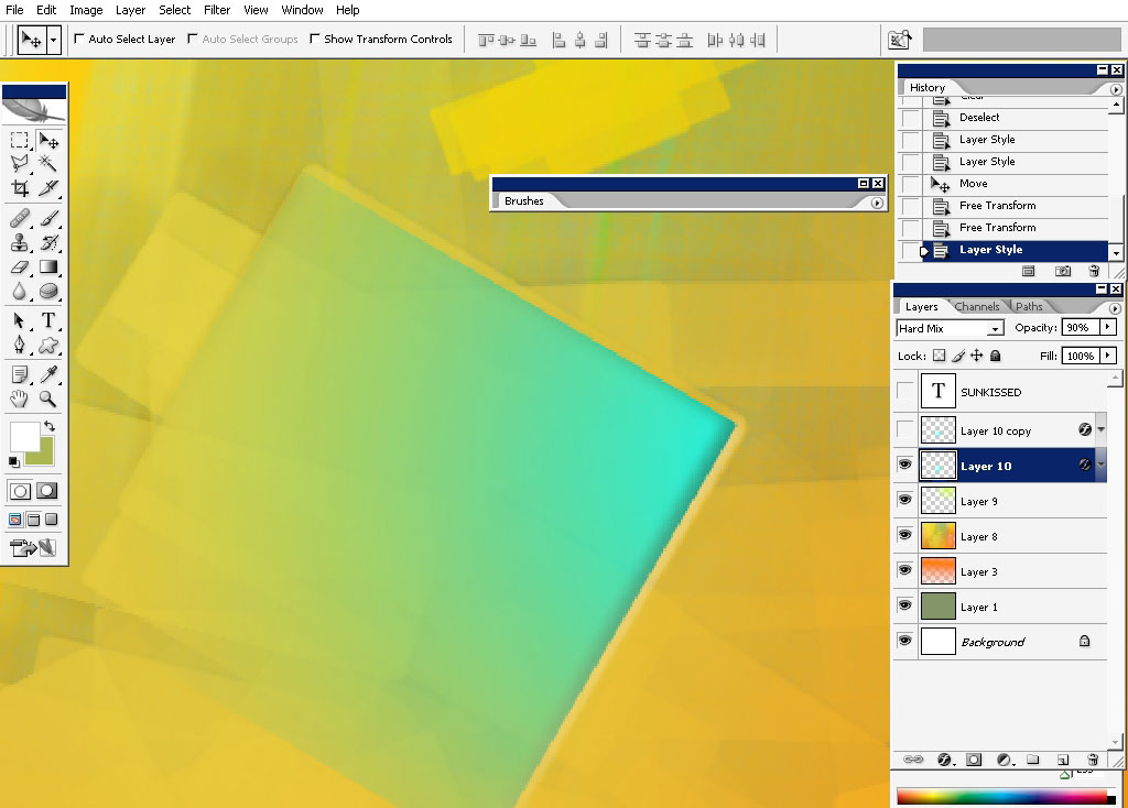
I also want to paste a new color. It was done on a new layer: a cubic selection was made and filled with blue to transparency
gradient.
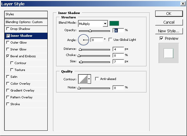
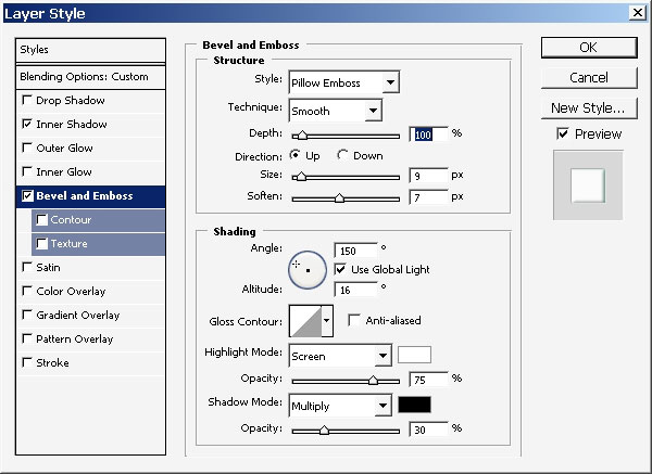
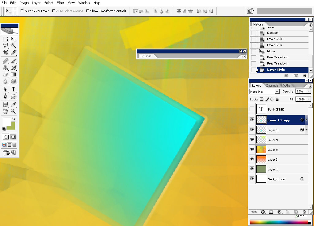
Apply a s layer style to this very cubic layer.
Yet another one.
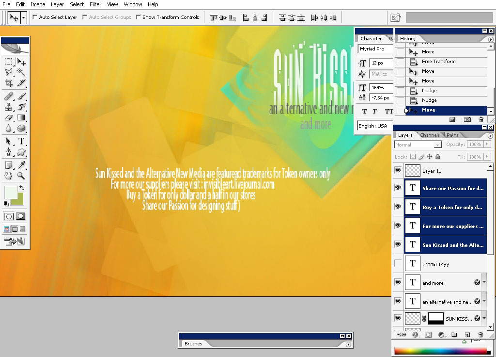
Now we shall deal with text because I think that this is a really powerful element of design.
Enjoy!
Comments